2022 | Professional
Xiaohongli
Entrant
MET Creative Brand
Category
Packaging Design - Rebrand
Client's Name
Country / Region
China
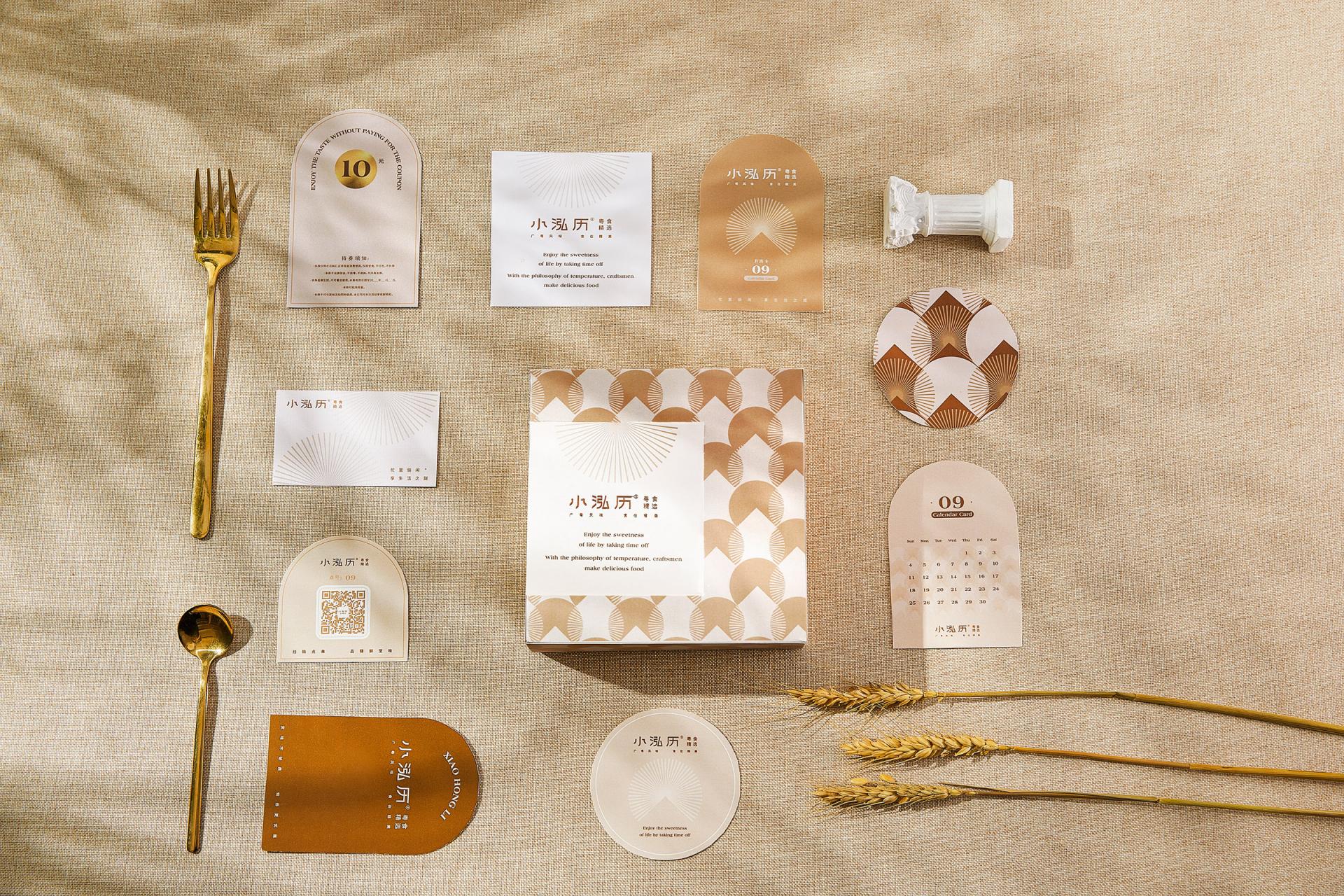
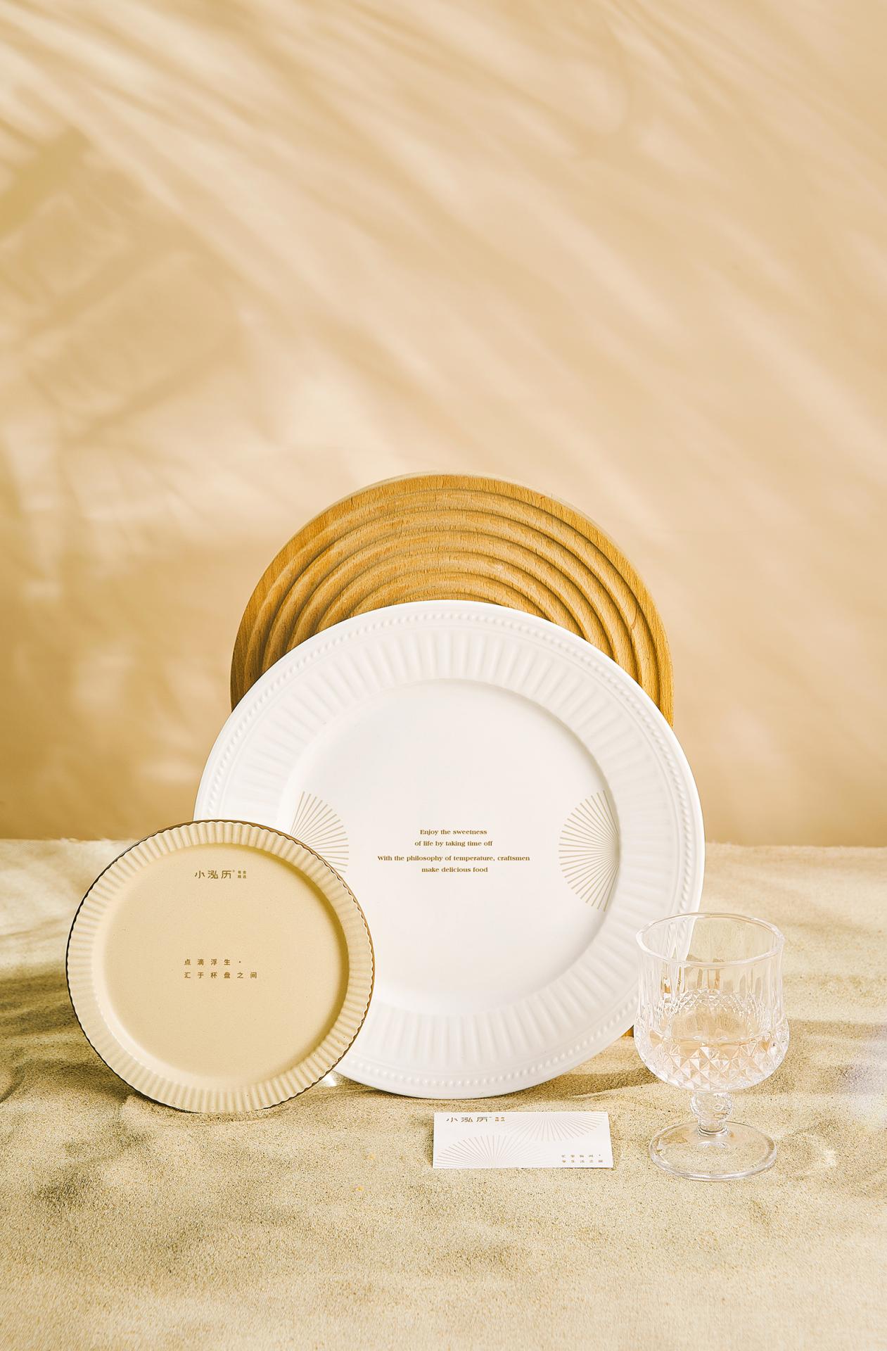
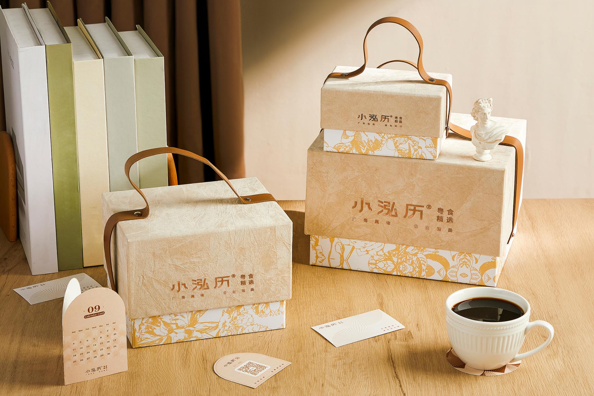
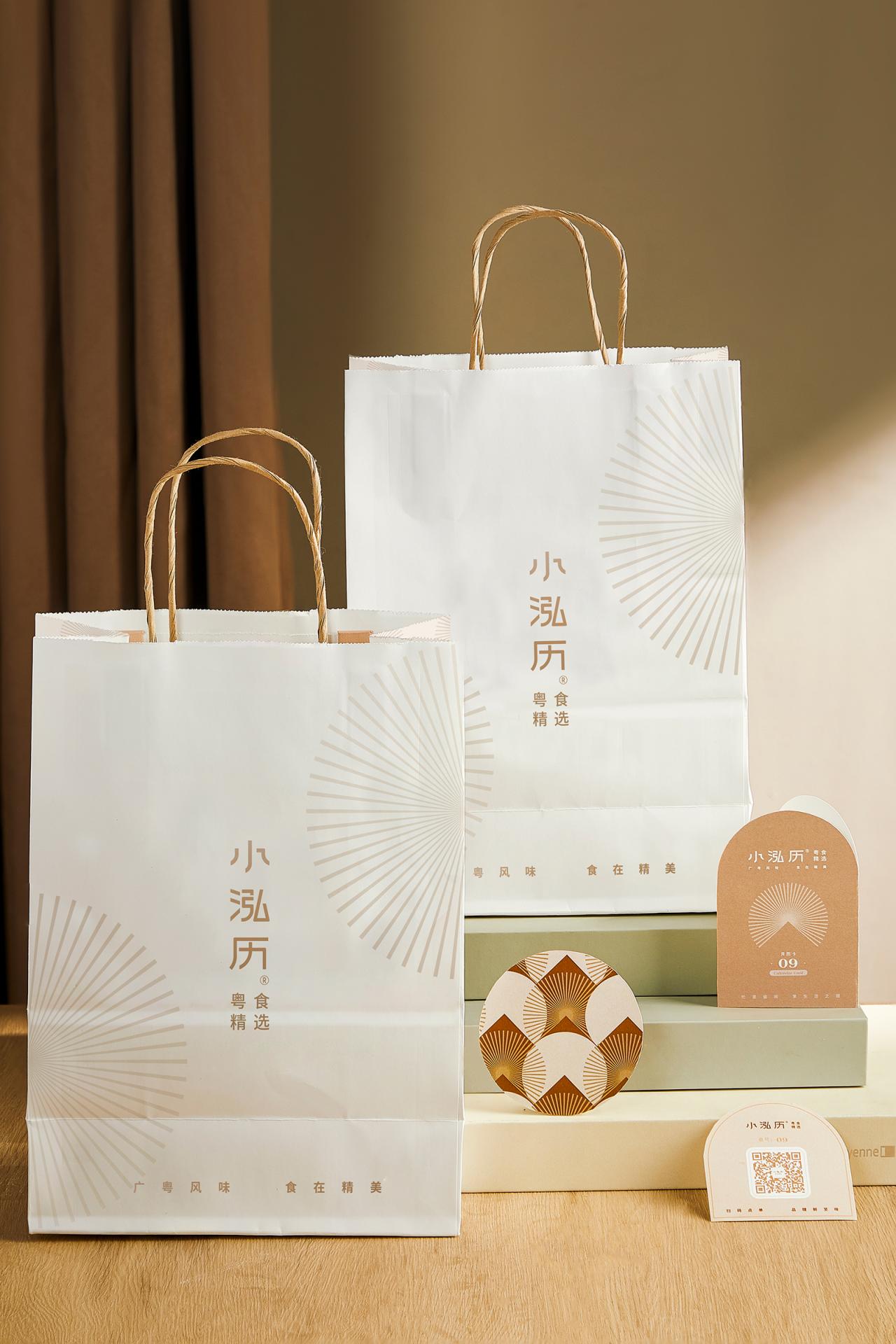
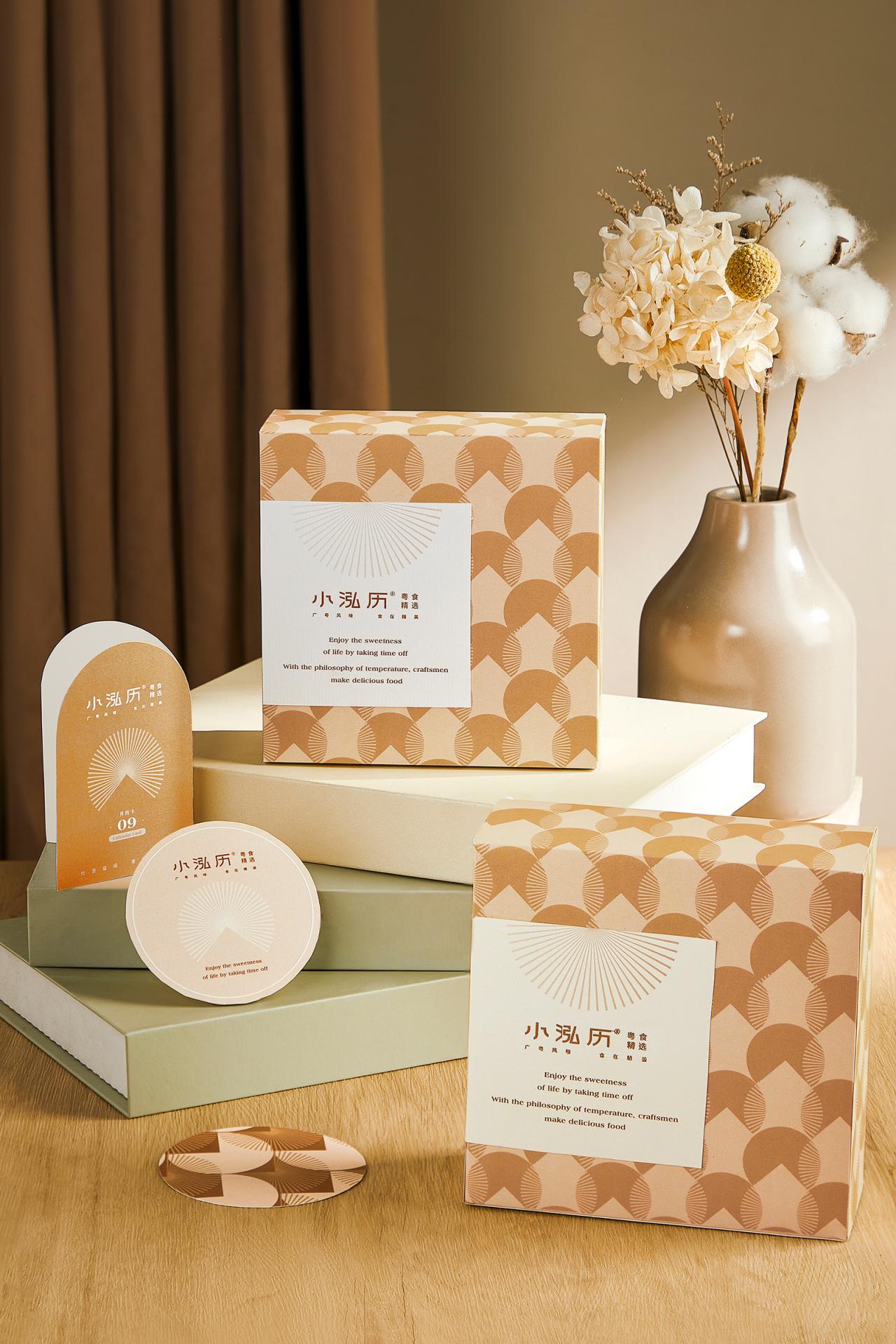
We intend to develop a market-exclusive brand image from the classic Hong Kong style and Internet celebrity ice room, while also providing consumers with a polished, pleasant, and high-end brand image identity, as well as more distinctive brand conceptions for their eating experience. This was also one of the founder's first goals in terms of brand enhancement.
Xiaohongli's brand tonality and visual strategy of "healing, warmth and exquisiteness" have been developed, and the initial surprise sensation with ultra-high appearance has been created, as well as the awakening of "customs" in everyday life. Meanwhile, we have developed a series of tonal copywriting that complement and enhance this concept. Following the clarification of the brand tonality, we started the process of developing a new visual image for Xiaohongli.
For Xiaohongli, not only does it have an extremely high feeling of refinement and tranquility, but it also has a strong sense of temperature, which allows it to enjoy the pleasures of life. In this way, "temperature sense" is both a "invisible" cultural label and a "physical" eye-catching identification.
European tradition holds that Venus, the goddess of love and beauty, was born in a seashell. As a result, we locate this concrete carrier - shell and then include the calm linear aspect of "afternoon sunlight" into the design. It not only reinforces the notion of "temperature," but it also makes it easier to recognize and remember. The new symbol has a stronger feeling of icon, which means it may be used in a broader variety of situations and has a more noticeable application impact than the previous version did.
If a brand's sign serves as its central point of recall, the color of the logo conveys the character of the brand. The Morandi color scheme is delicate and tranquil, rather than loud and conspicuous. It can be seamlessly incorporated into the whole brand VI system. At the same time, the gradual transition from Morandi brown to Morandi warm white depicts the steady increase in temperature. Furthermore, the inclusion of the six supplementary hues might aid in the more methodical expansion and usages.
Credits
Entrant
Liben Design Office
Category
Architectural Design - Cultural

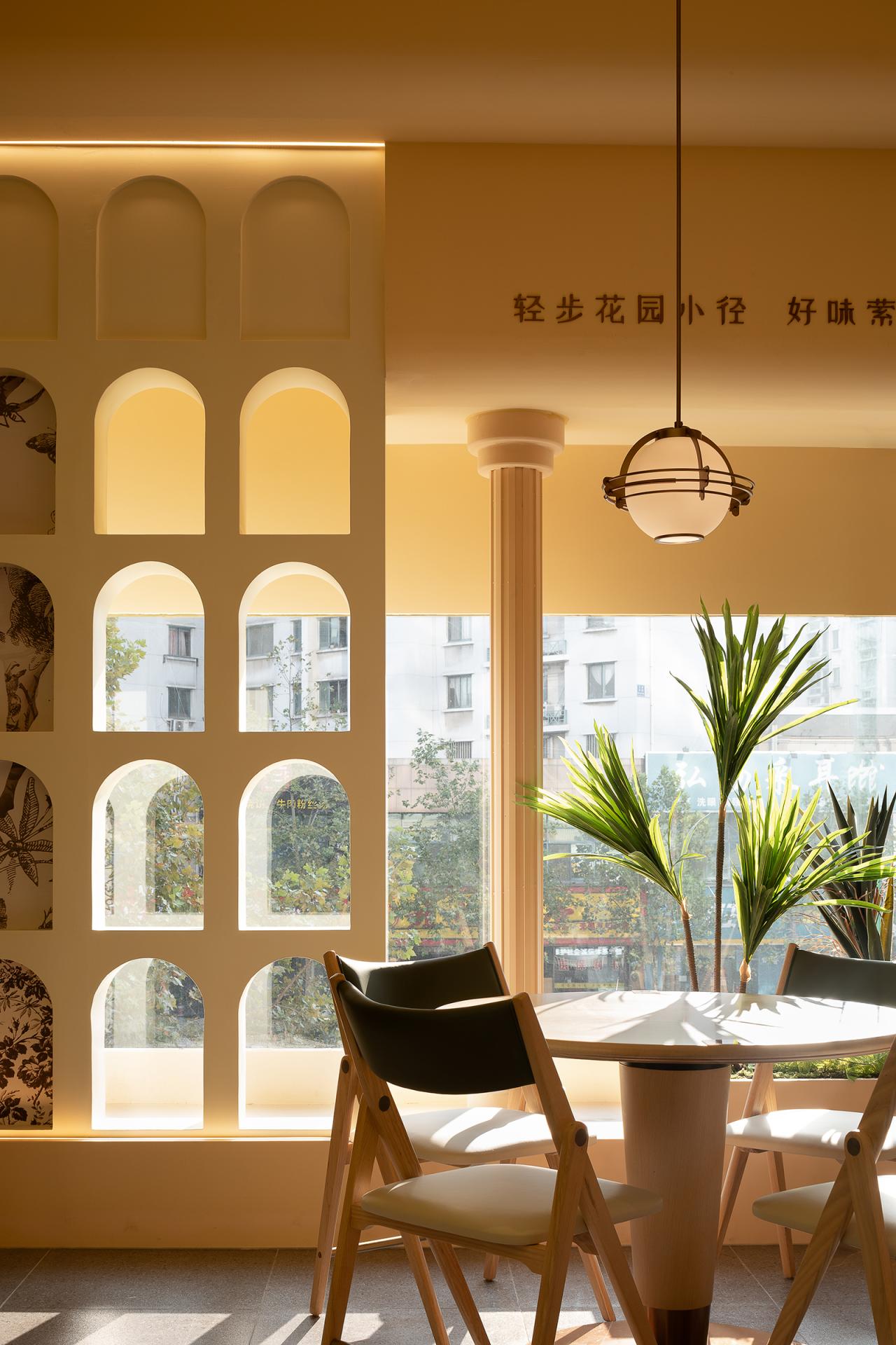
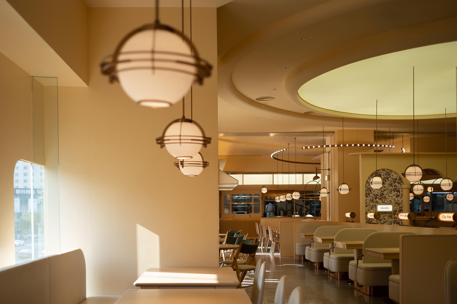
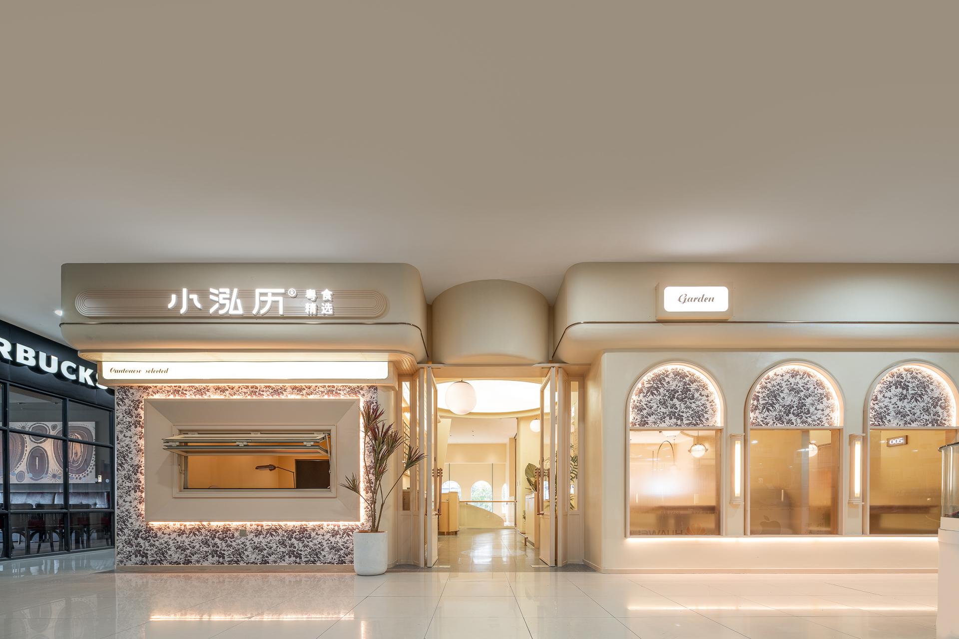
Entrant
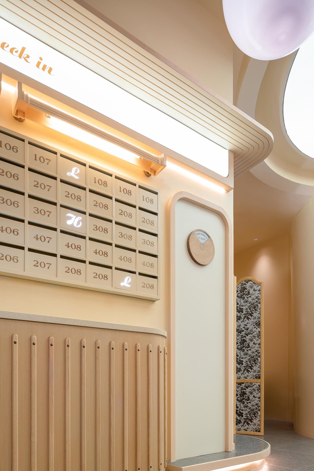
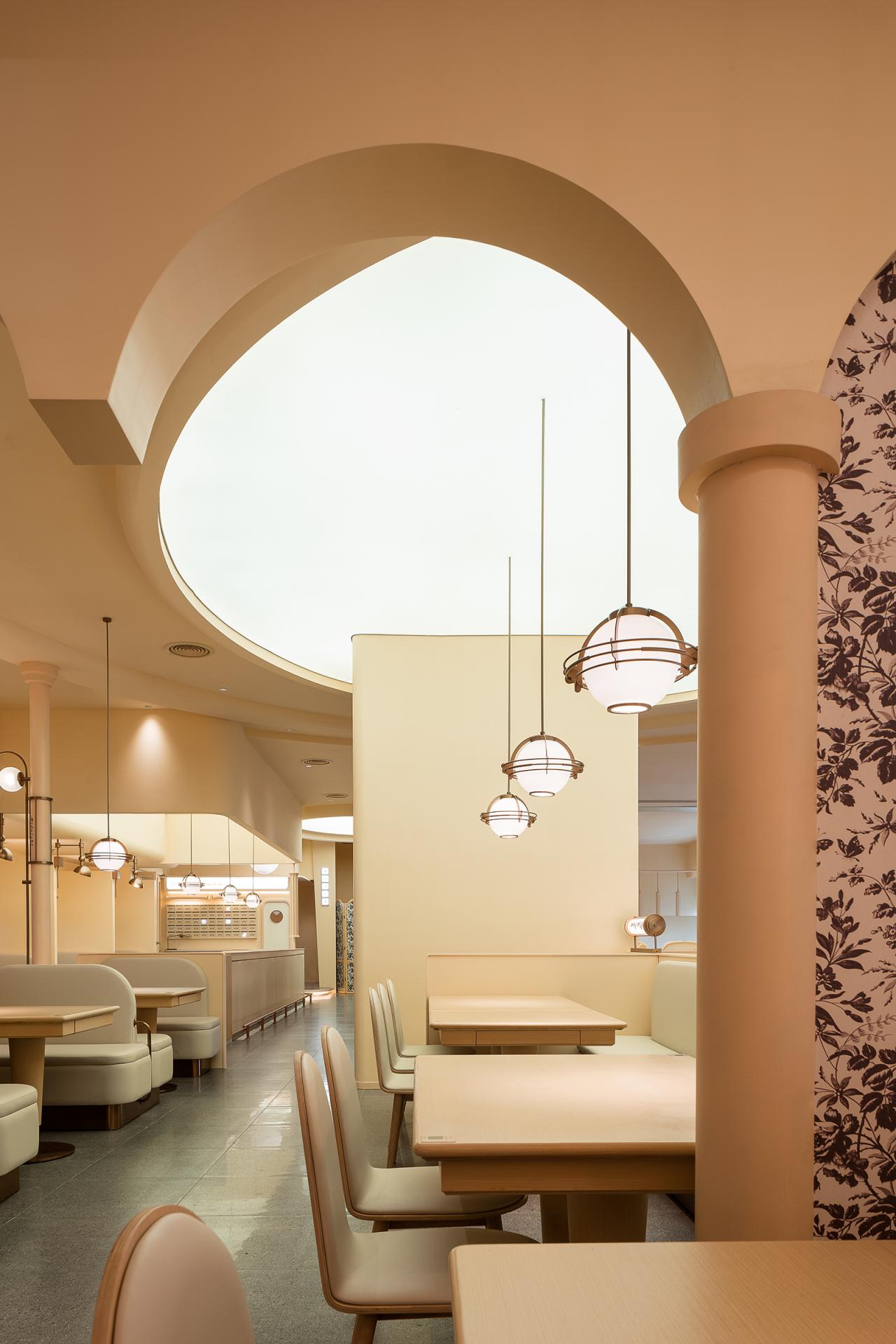
Perform Design Studio
Category
Architectural Design - Hospitality
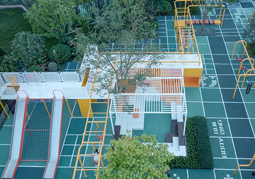
Entrant
ACA LANDSCAPE
Category
Landscape Design - Residential Landscape
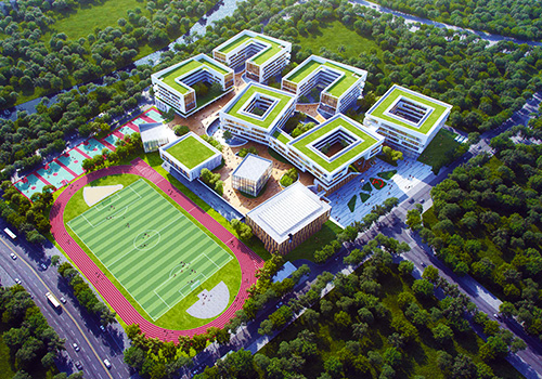
Entrant
LHA ARCHITECTURAL DESIGN CO,LTD
Category
Architectural Design - Other Architectural Design