2026 | Professional

Jinmai Lang Non-Fried Instant Noodles
Entrant
Shenzhen Tigerpan Design Co., Ltd.
Category
Packaging Design - Prepared Food
Client's Name
Tiger Pan
Country / Region
China
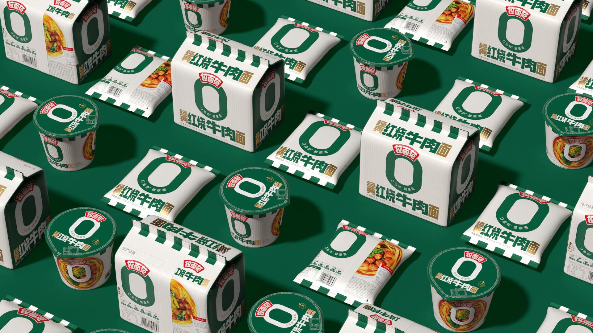
Ramen Fan 0-Fry Design Concept:
This packaging upgrade centers on crafting the “0-Fry” symbol to convey health and appetite appeal through visual expression. The overall design is streamlined and precise:
Visually, the “0-Fry” symbol is elevated as the brand's signature visual hammer. Presented in minimalist form with clean, all-around exposure, it becomes the most striking identifier on the packaging. The base features an off-white striped texture, preserving the health-conscious feel of a clean white label while reinforcing the product's noodle identity through the striped pattern. This breaks the visual stereotype that “instant noodles = unhealthy.”
The series design distills a unified visual language across the entire product line. Shared treatment of symbols, colors, and layouts strengthens the product family identity, ensuring distinct flavors maintain differentiation while retaining high recognizability.
To evoke appetite, a white bowl serves as the visual base, paired with an overhead shot of the noodles. This composition dramatically magnifies the noodle texture and ingredient combinations, delivering a powerful visual impact.
The design eliminates all superfluous elements, employing a clean visual logic. It prominently features the core “0% fried” identifier while balancing health appeal and appetite appeal through material textures, perspective choices, and other details.


Credits

Entrant
Ying Song Brand Design(Shenzhen)Co., Ltd
Category
Packaging Design - Wine, Beer & Liquor
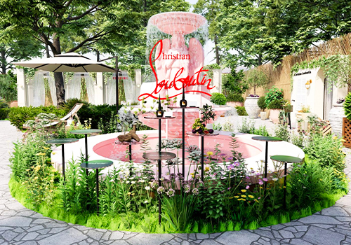
Entrant
Shanghai ci see PR consulting Co., Ltd.
Category
Interior Design - Event Space

Entrant
Jing Jan Sian Design Co., Ltd.
Category
Interior Design - Restaurants & Bars

Entrant
Coolwares Lab
Category
Transportation Design - Bicycles / Motorcycles