2026 | Professional
Light White
Entrant
Chonging Sanhao Paper Co.Ltd
Category
Packaging Design - Retail
Client's Name
Country / Region
The use of naturally non-irritating raw materials and a cloud-like soft tactile experience are the core concepts of the design. The cloud serves as the central symbol throughout the design, intended to create an association in consumers' minds that using this tissue is like touching a cloud. The light green and pure white color combination addresses the psychological need for safety and gentleness among sensitive-skin mothers and infants.
The design removes unnecessary elements. White space and simple geometric contours create a clean, translucent visual atmosphere. Large areas of low-saturation light green gradients evoke a natural, forest-like feeling, while localized high-saturation accent colors enrich the visual hierarchy and prevent monotony.
The cloud motif on the packaging is rendered with a blurred and defined treatment. The tissue paper itself features cloud-curve embossing. This reinforces the cloud brand memory point across both packaging and product.
Edge transparency further enhances the product's lightweight perception. The embossing process adds detail and refinement, extending the softness selling point from the packaging into the actual user experience.


Credits

Entrant
Shuo Han
Category
Landscape Design - Regenerative Landscape Design (NEW)
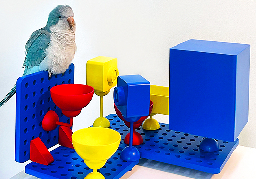
Entrant
Birdy Plat Design Team
Category
Product Design - Animals & Pets
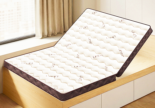
Entrant
Xuzhou Jiaguan Aesthetics Brand Management Co., Ltd.
Category
Product Design - Furnishings

Entrant
Altro Ltd
Category
Transportation Design - Mass Transit Systems