2026 | Professional

Hongjee Tuna Paper Biscuits
Entrant
GUANGDONG HUANGJI FOOD CO., LTD
Category
Packaging Design - Snacks, Confectionary & Desserts
Client's Name
GUANGDONG HUANGJI FOOD CO., LTD
Country / Region
China
Gallery




About The Entry
Introduction:
This packaging design is centered around the concept of "delicate expression of seafood ingredients", aiming to create a visual system that emphasizes appetite, texture, and product differentiation. The overall color scheme is dominated by high-end black, with gold fonts to reflect the premium nature of tuna ingredients. Through real food photography and exquisite composition, a visual contrast is formed to enhance recognition and sophistication.
Concept 1:
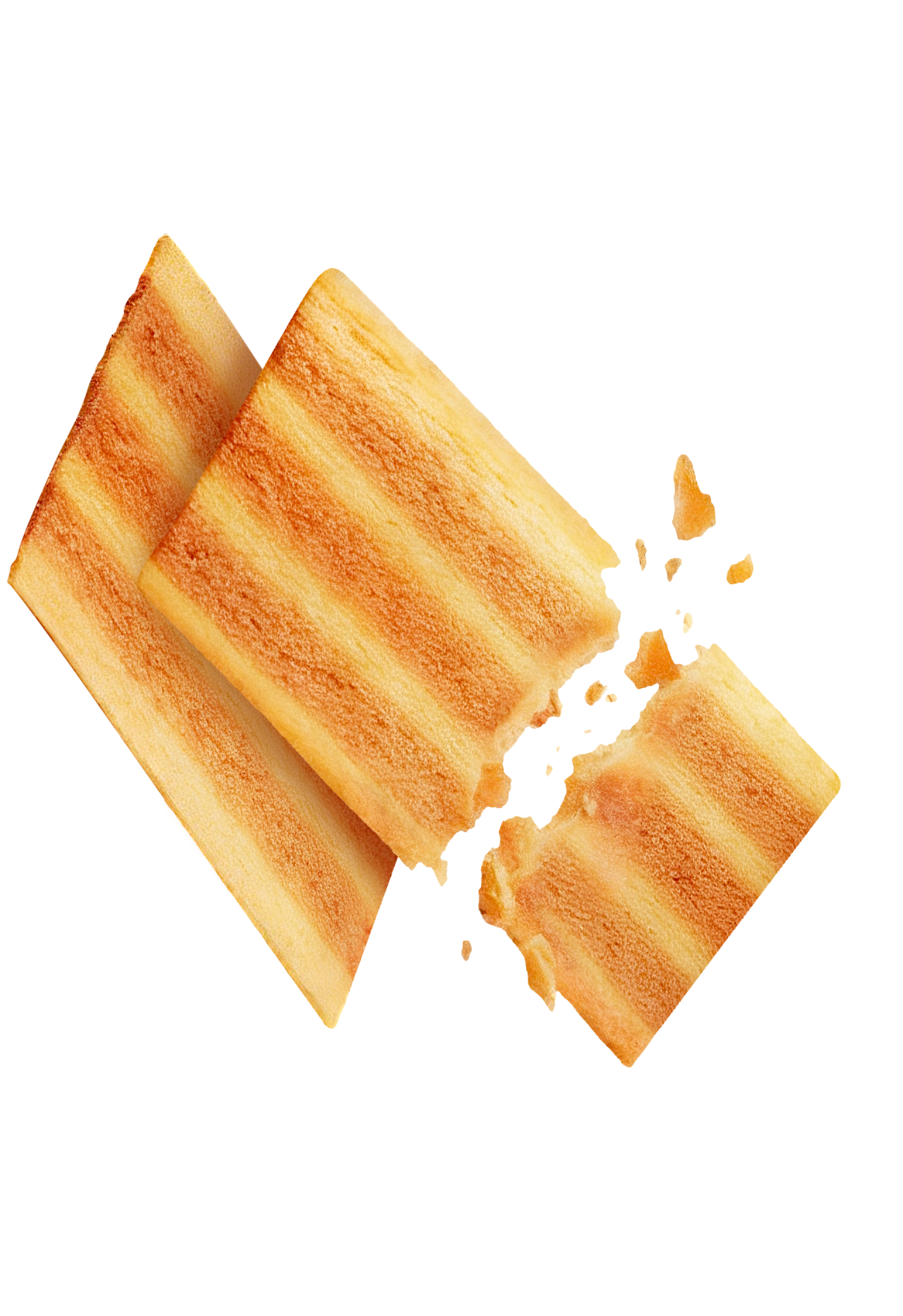
Visualizing unique flavors, enhancing appetite expression. This product innovatively combines three flavors: tuna, butter, and mustard. Visually, the 1.5mm ultra-thin biscuits are represented through their crumbled and layered structure to convey a crispy texture. Real ingredient images of tuna, butter, and mustard are also incorporated to strengthen the credibility of "real raw materials" and create a fresh and slightly spicy taste association. The biscuits are laid out in an irregular scattered manner to add a sense of depth and movement to the picture. At the same time, key data such as: Tuna content ≥ 6.5%, 12-hour slow baking process. Butter content ≥ 2%, is clearly marked on the side, for example:
The design layout as a whole emphasizes simplicity and order, relying not on exaggerated promotion but on raw material data to enhance credibility. The black and gold color scheme eliminates the feeling of cheap snacks, strengthening the mid-to-high-end positioning. The bottom clearly indicates the net content and product information, ensuring compliance while also considering visual aesthetics and professionalism, thereby shaping a reliable and high-end brand image.
Conclusion:
This design integrates seafood flavor innovation, real ingredient presentation, data-based quality proof, and high-end visual system. Through black and gold tones and clear hierarchical structure, it enhances the product's characteristics of "thin, light, and high-quality", creating a differentiated seafood snack image.
Overall, it reflects Hongjee's continuous exploration in flavor innovation and product development, and aligns with the brand's positioning of "leading the new generation of light luxury snack trends".
Featured Media
Credits

Entrant
Royal College of Art
Category
Conceptual Design - Healthcare
Entrant
INNER MONGOLIA YILI INDUSTRIAL GROUP CO., LTD.
Category
Packaging Design - Non-Alcoholic Beverages

Entrant
Shenzhen Root Innovation Technology Co., Ltd.
Category
Product Design - Baby, Kids & Children Products

Entrant
Beijing City University
Category
Conceptual Design - Gaming, AR & VR