2026 | Professional
Moringa Energy Bar
Entrant
Litmus Branding
Category
Packaging Design - Prepared Food
Client's Name
Have Raw
Country / Region
India
Gallery




About The Entry
How do you make an unfamiliar health ingredient like moringa desirable enough to pick up from the shelf?
Health-focused snack packaging faces a difficult balance: communicate what is good for you without making the product feel medicinal. HaveRaw approaches that challenge by making moringa the hero and presenting it with the confidence, colour and appetite appeal of a contemporary snack brand.
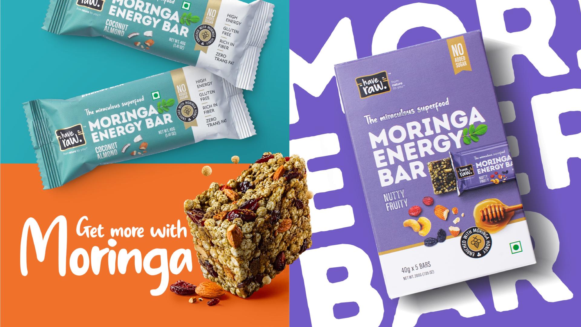
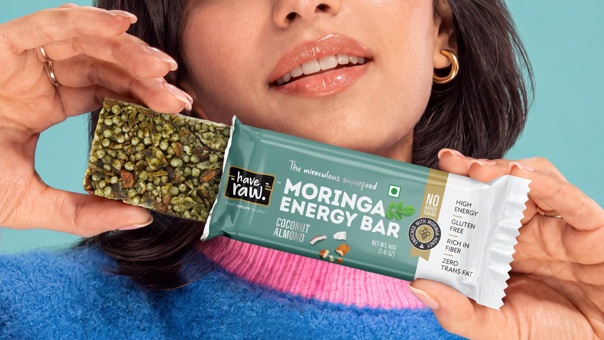
At the centre of the system is a bold message: MORINGA ENERGY BAR. Instead of treating moringa as a hidden functional ingredient, the packaging brings it forward immediately, turning an unfamiliar ingredient into the brand’s strongest point of distinction.
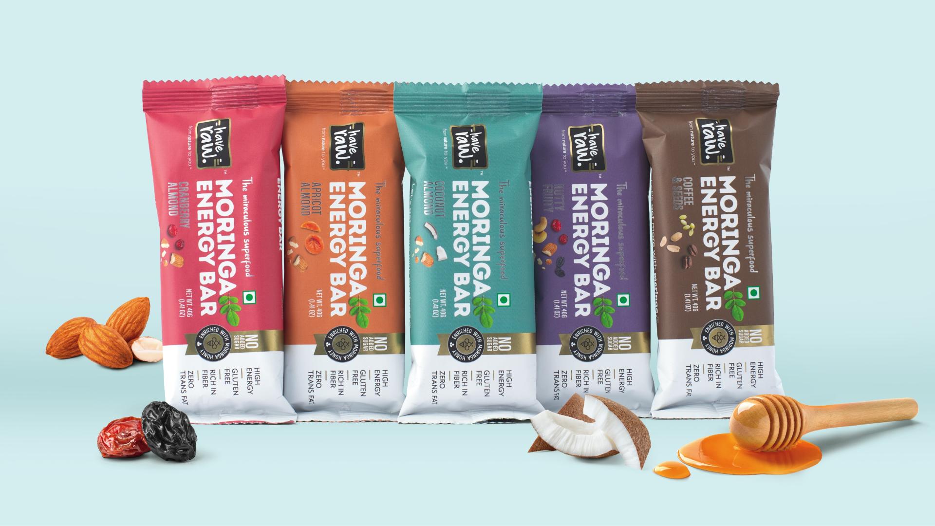
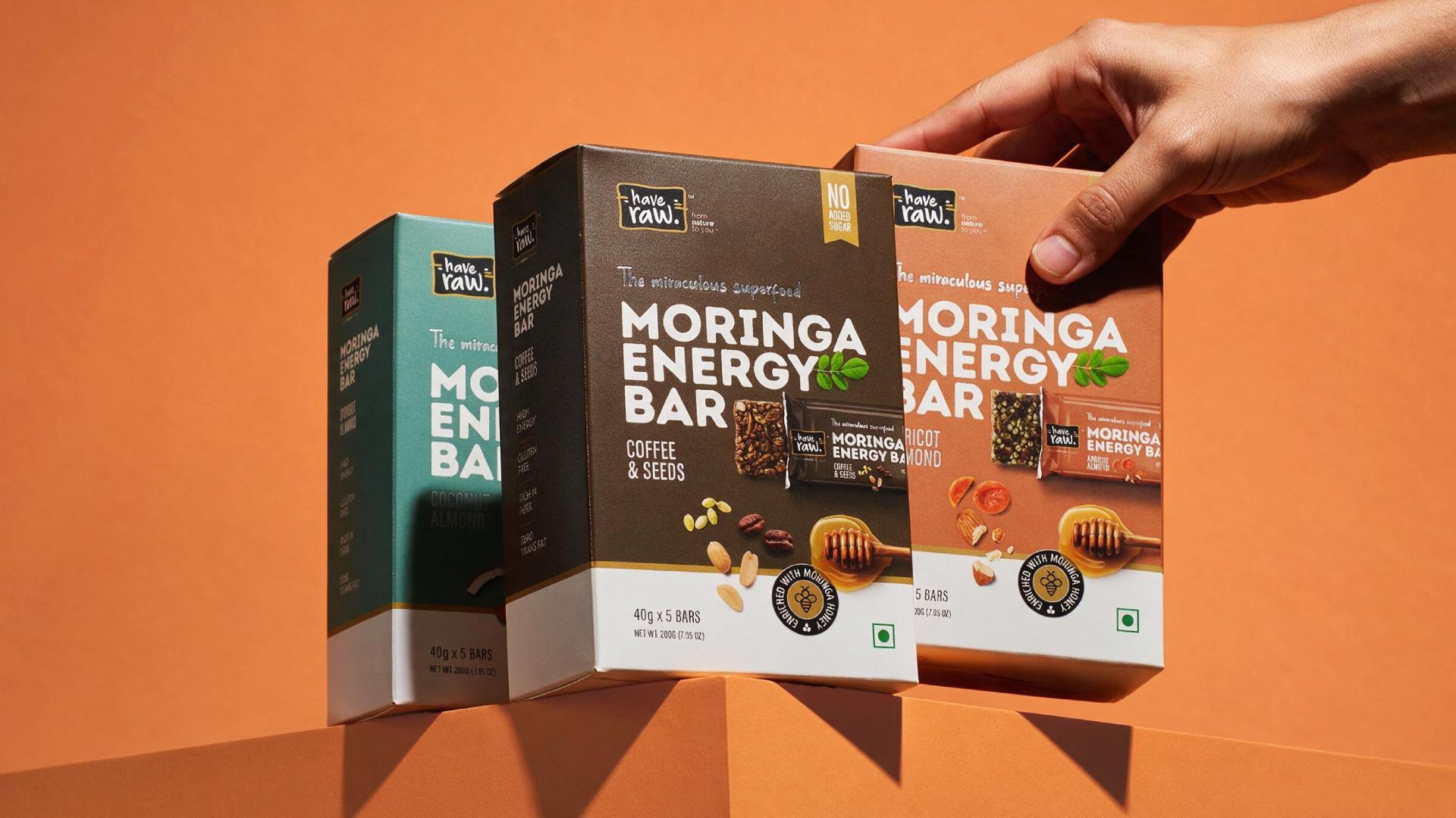
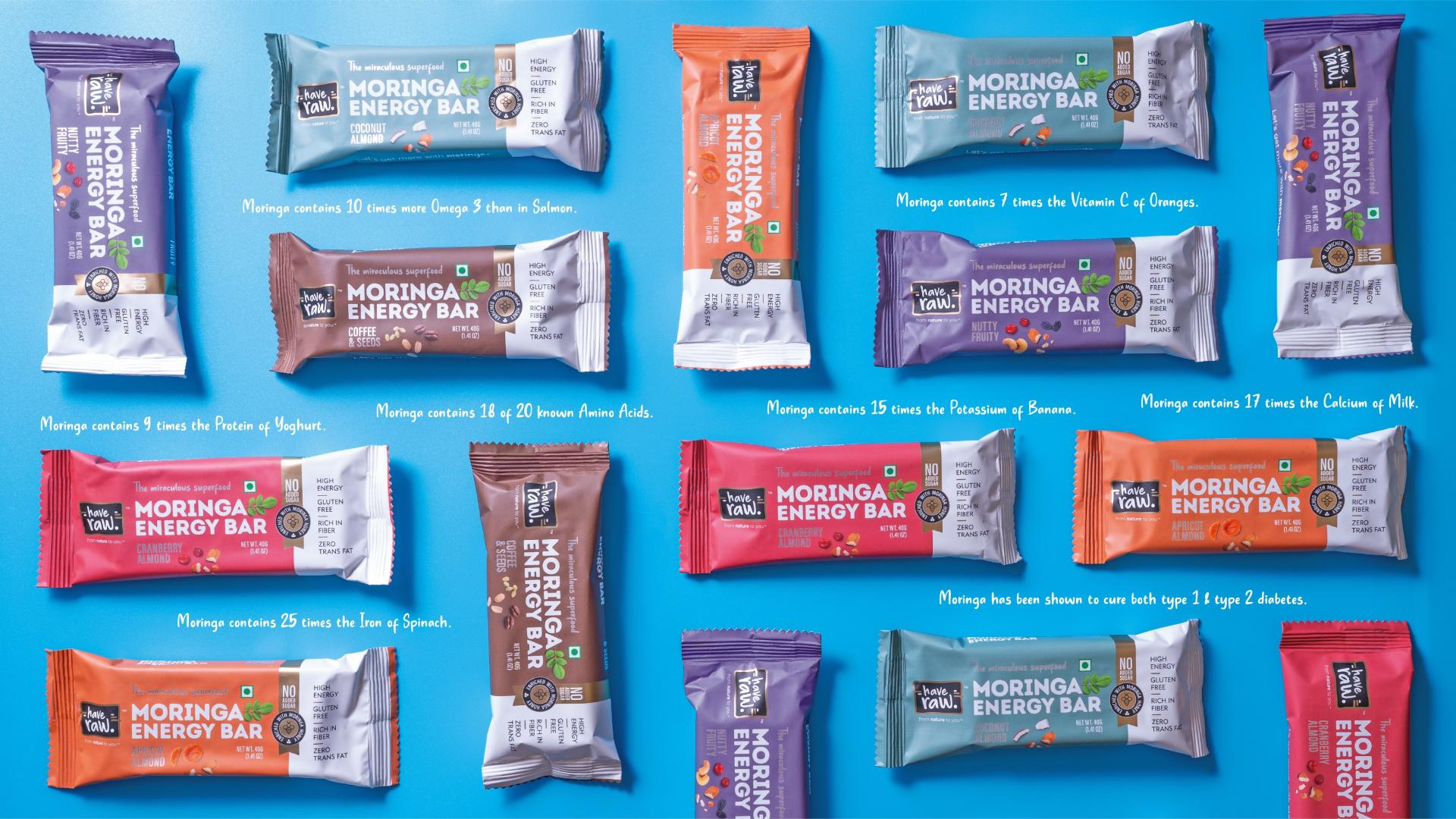
Each flavour is given its own visual personality through colour. Rose defines Cranberry Almond, warm ochre identifies Apricot Almond, teal distinguishes Coconut Almond, deep plum gives Nutty Fruity its richness, and earthy brown grounds Coffee & Seeds. Individually, every pack is easy to recognise; together, the five variants form one cohesive family with strong shelf presence.
The design then shifts into a cleaner white information zone, creating a visual pause between appetite and assurance. Product benefits such as No Added Sugar, Zero Trans Fat, Gluten Free and Rich in Fiber are presented clearly, allowing shoppers to understand the proposition without visual clutter.
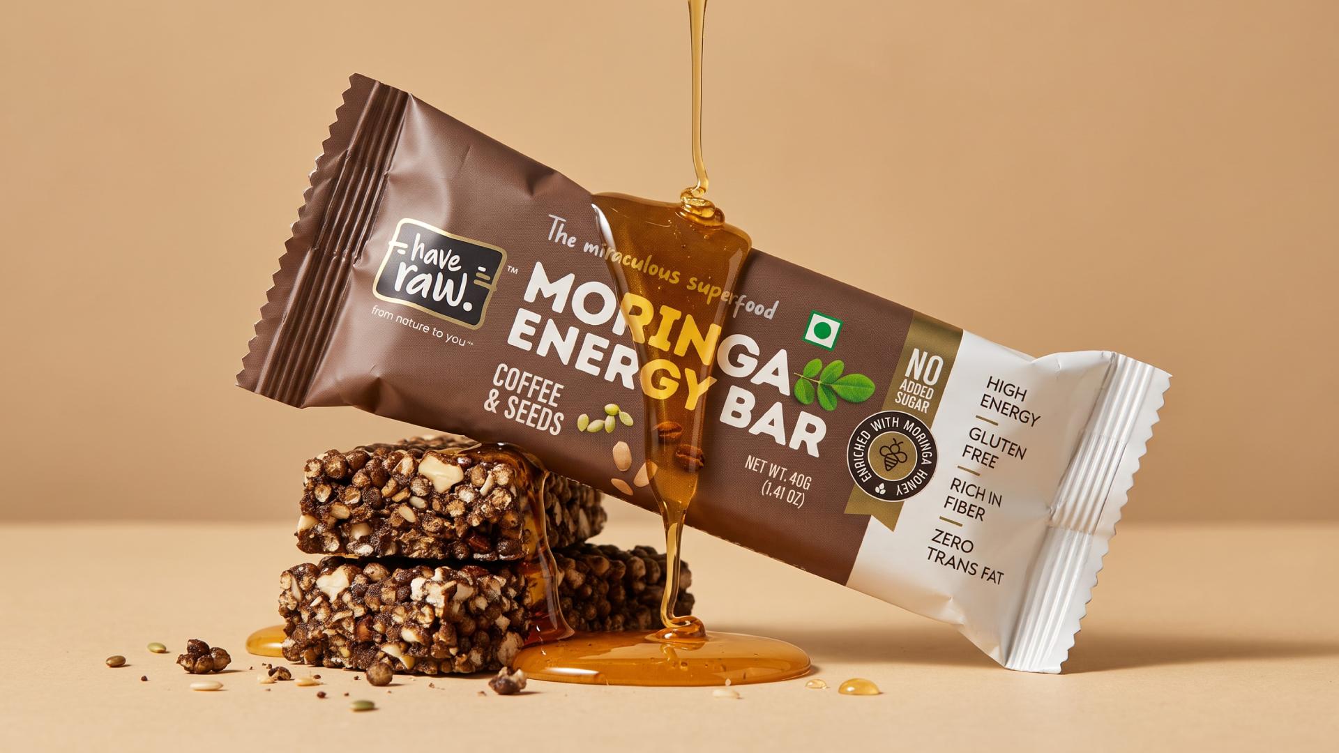
A honeycomb lockup highlights “Enriched with Moringa Honey,” while the “from nature to you” line reinforces the brand’s natural positioning. Ingredient photography of almonds, cranberries, coconut, coffee and other props makes each variant feel tangible, familiar and appetising.
The result is packaging that works on two levels at once. It introduces moringa with confidence, yet surrounds it with the visual language of flavour, enjoyment and everyday snacking. What could have felt niche or overly health-led instead feels contemporary, approachable and easy to choose.
HaveRaw does not disguise what makes the product different. It puts that difference at the centre of the pack and makes it desirable.
Entrant
Shenzhen Jujin Paper Packaging Co.,LTD
Category
Packaging Design - Beauty & Personal Care

Entrant
SensiScan Design Studio
Category
Product Design - Personal Care
Entrant
Shanghaitech University
Category
Lighting Design - Kinetic Lighting (NEW)

Entrant
Shuyu Wang
Category
Product Design - UX / UI / IxD