2026 | Professional
Yuehuo U-Ge Yuexiang Series Packaging Design
Entrant
COFCO NUTRIHEALTH TECH
Category
Packaging Design - New Category: Functional Foods
Client's Name
COFCO NUTRIHEALTH TECH
Country / Region
China
Gallery





About The Entry
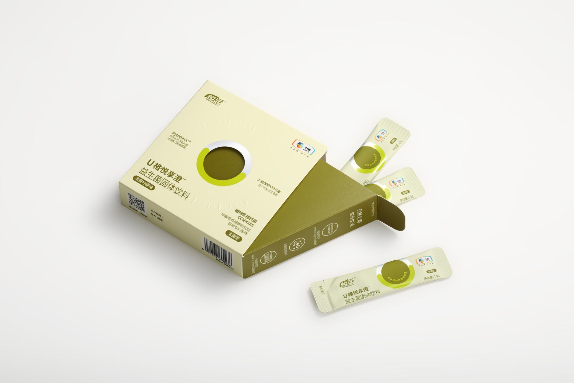
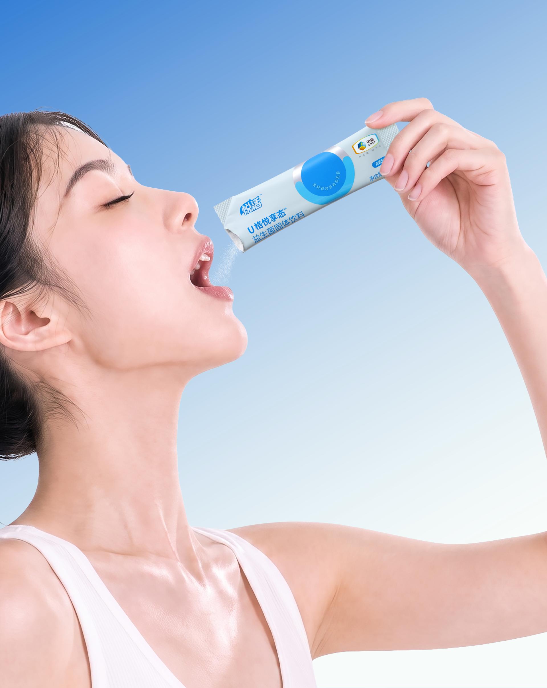
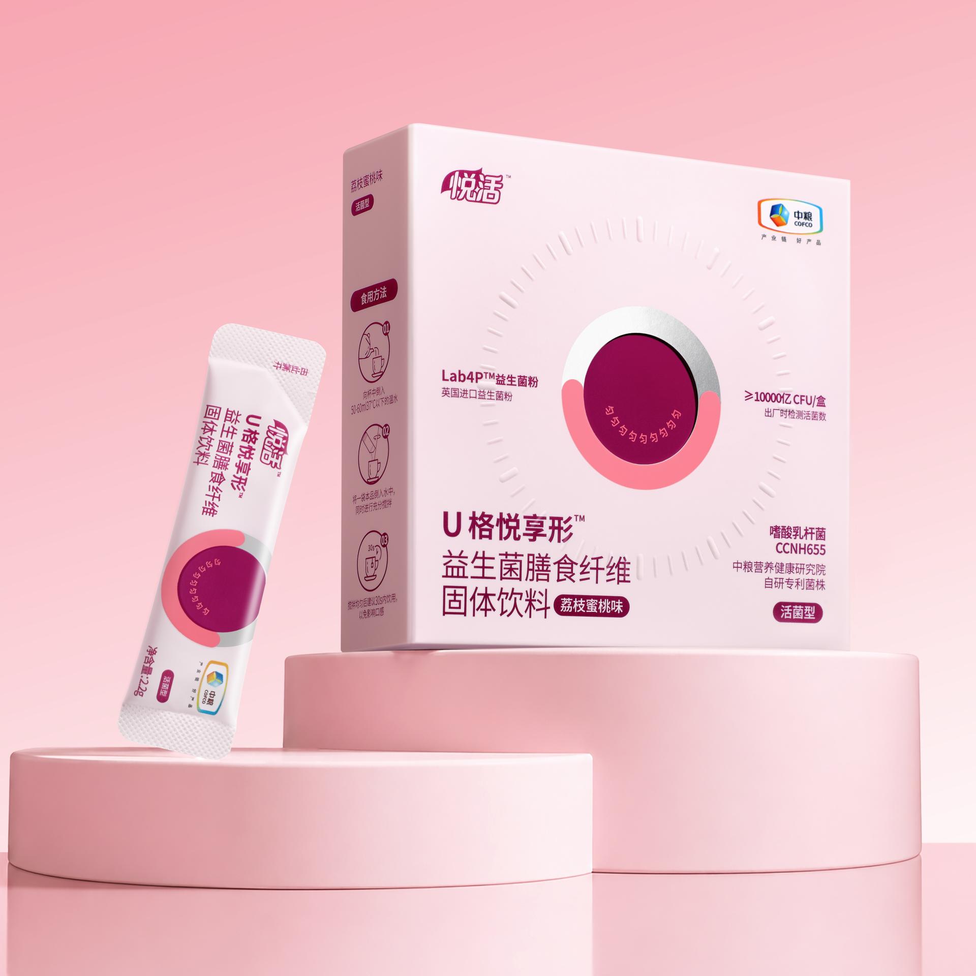
The Yuehuo brand has evolved its positioning from a “natural lifestyle” to a synergy of “functional nutrition and joyful experience.” Through a more youthful, approachable, and highly memorable visual language, it integrates health management into consumers’ daily lives. This packaging design establishes the letter “U” as the brand’s core symbol, transforming it into a recognizable, extendable, and enduring visual asset to build a unique brand identity system for the Yuehuo probiotics series.
The “U” represents “U-Ge” (brand identity), “You” (user connection), and a “smile” (emotional expression). Through this symbolic design, the packaging has been elevated from a traditional carrier of functional information into a visual touchpoint that conveys brand emotions and delivers a sense of companionship to users, achieving the brand value of “instant recognition and immediate recall.”
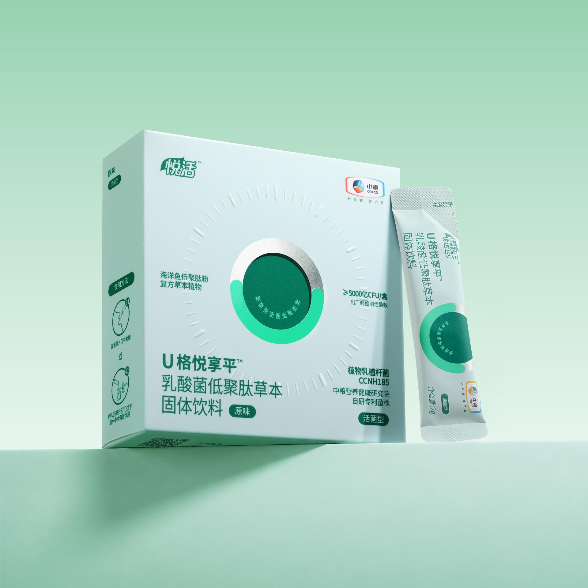
Centered on the circular “U” motif, the visual design employs a top-and-bottom layout to create a stable yet gentle visual language. The upper half features a silver-gray textured finish to convey professionalism, a sense of technology, and trust. The lower half incorporates product-specific functional colors and forms a smiling shape through a gentle curve. This creates a relaxed and joyful emotional experience while delivering a positive feeling of health improvement, achieving a balance between professionalism and warmth.
Crafted with an embossed technique, the "timeline scale" engages both sight and touch to visualize the progressive balancing effects of probiotics, lending the product a sophisticated tech appeal while making the body’s gradual restoration tangible.
The “Nine-Character Smile” system serves as a unified visual language. By integrating emotional keywords such as He (Harmony), Shu (Comfort), Yun (Regularity), Qin (Refreshing), and Heng (Balance) and repeating the respective character nine times to form a smile, the design creates independent visual identities tailored to different product functions. Meanwhile, it maintains the consistency of the “U” symbol system, building a highly extendable brand asset for Yuehuo probiotics.
Credits

Entrant
Polus Group, Chuo Jutaku Co., Ltd
Category
Architectural Design - Residential
Entrant
Chaoyang University of Technology
Category
Fashion Design - Handmade
Entrant
上海纬典家具装饰工程有限公司
Category
Interior Design - Office

Entrant
Foshan Sanshui Auvis Furniture Products Co., Ltd
Category
Product Design - Outdoor & Exercise Equipment