2022 | Professional

W-kid Neural Tactile Sensing Shoes’ packaging
Entrant
Winner Medical Co.,Ltd.
Category
Packaging Design - Baby & Children
Client's Name
-
Country / Region
China
Gallery


About The Entry
W-kid Neural Tactile Sensing Shoes’ packaging adopts a simplistic aesthetic design with elements of flat geometric illustrations. Comics is the main form in selecting color palette and expression forms. The colourful patterns are adopted in the organized grid box to break the framework constraints, reflecting the childlike, loving and atmospheric brand temperament. For colour, white serves as the background with tones of the brand colour. And a sharp colour contrast is formed on this compact package to enhance layers. The visualized and three-dimensional graphics show the brand’s core values of being “comfortable, safe and green”. The embossing process offers tactile communication and texture. The internal partition structure separates the two shoes to avoid rubbing and piling during shipment. The horizontal slot fixes the two shoes firmly to prevent them from being squeezed no matter how they are shaken during shipment. The foot gauge design allows parents to measure their babies’ feet. The drawer-type switch adds a sense of ceremony while taking out the shoes, and also makes the box a storage tool on the table, realizing the reuse and recycle. In a word, this simple yet concise design enables a rich content on the packaging.
Credits
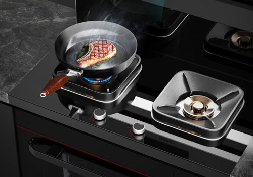
Entrant
Zhejiang Senge Electric Co., Ltd
Category
Product Design - Kitchen Accessories / Appliances
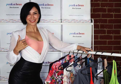
Entrant
Peekabras
Category
Fashion Design - Other Fashion Design
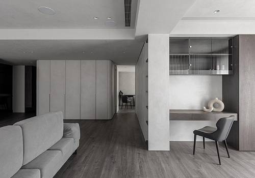
Entrant
CYZS x Hong Chiang Interior Design
Category
Interior Design - Living Spaces
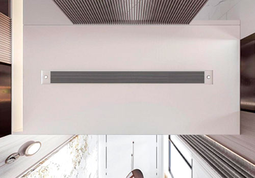
Entrant
AIRBREEZE DESIGN GROUP
Category
Product Design - Accessories (NEW)