2023 | Professional
chagree
Entrant Company
nofans design
Category
Packaging Design - Beauty & Personal Care
Client's Name
chagree
Country / Region
China
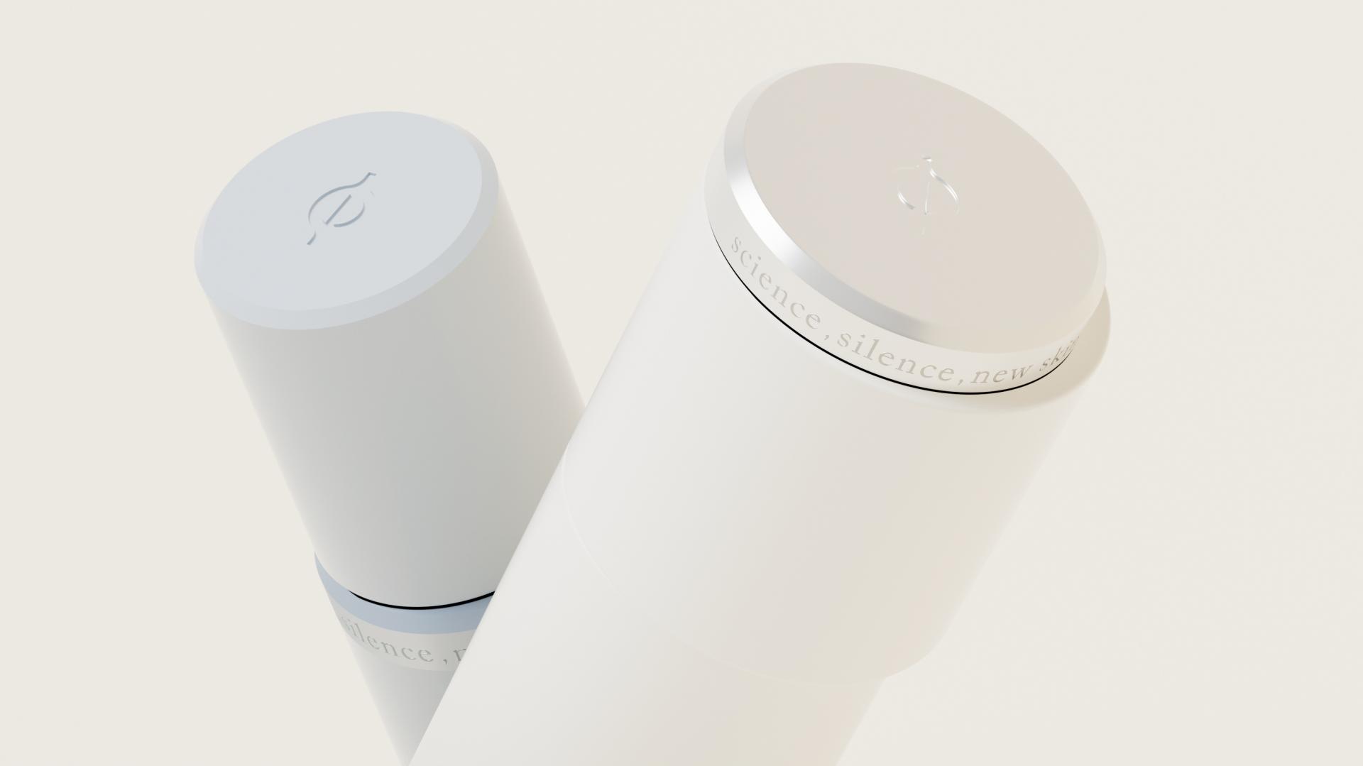
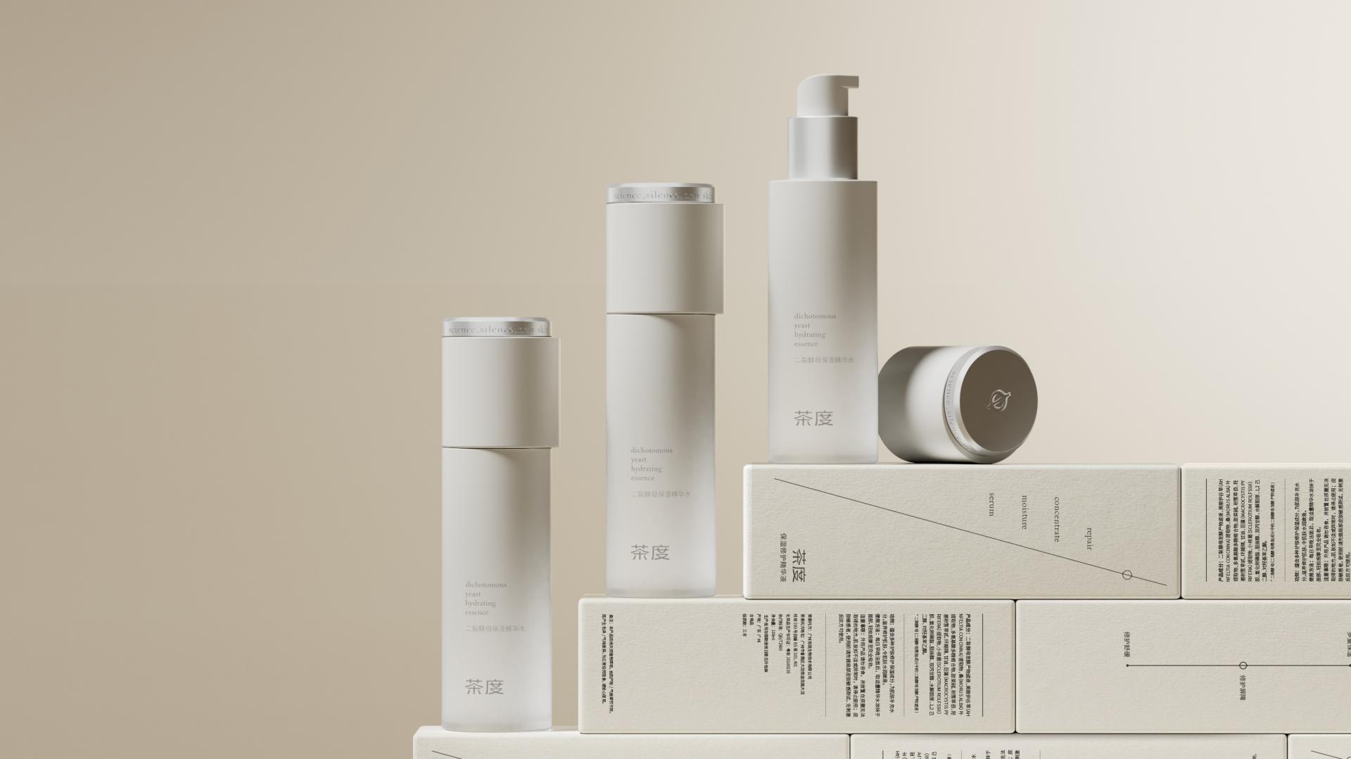
In the VI design, the concept of "度(dimension)" in the Chinese brand name is properly interpreted. The lines leading up and down means the compass of the north-south direction, the "dimension" of the ingredients, and the rational node. The inspiration of the illustration comes from the architectural. The combination of geometric forms conveys the rational perception of the brand, and attaches brand symbols to the key points of the turning point of geometric forms to express the brand's grasp of the key "dimension".
Irregular shape transformation is used in the product design form, and the cream bottle is inclined. The matte alumina process creates a silver frosted ring, which enhances the sense of value of the product. The protruding form at the mid-end has become the core identification part of the product. From the top view, it also brings a geometric rational order of layering.


Credits
Entrant Company
Shenzhen Xishang quality packaging co., LTD
Category
Packaging Design - Snacks, Confectionary & Desserts
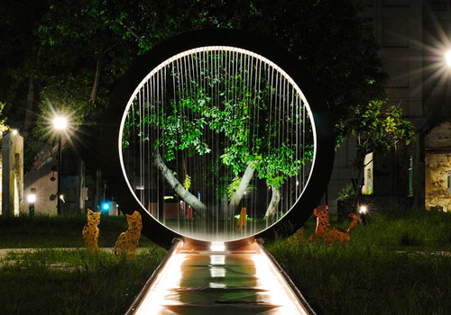
Entrant Company
Rooster Lighting Co. Ltd.
Category
Lighting Design - Other Lighting Design
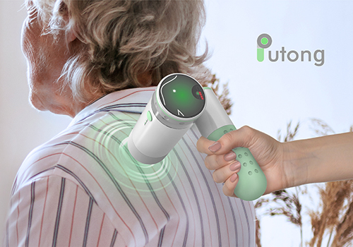
Entrant Company
National Taipei University of Education
Category
Product Design - Medical Devices
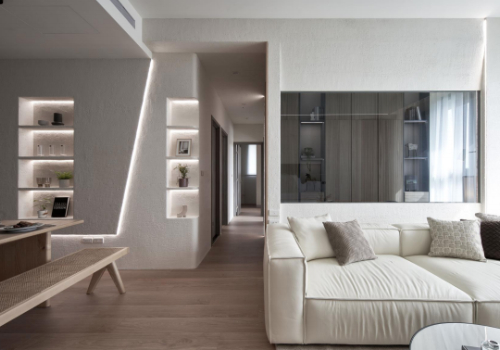
Entrant Company
G. A. O.(Glocal Architecture Office)
Category
Interior Design - Bedrooms