2020 | Professional

Liquid Metal / Perfume
Entrant Company
Sol Benito
Category
Conceptual Design - Beauty & Cosmetics
Client's Name
SBD
Country / Region
India
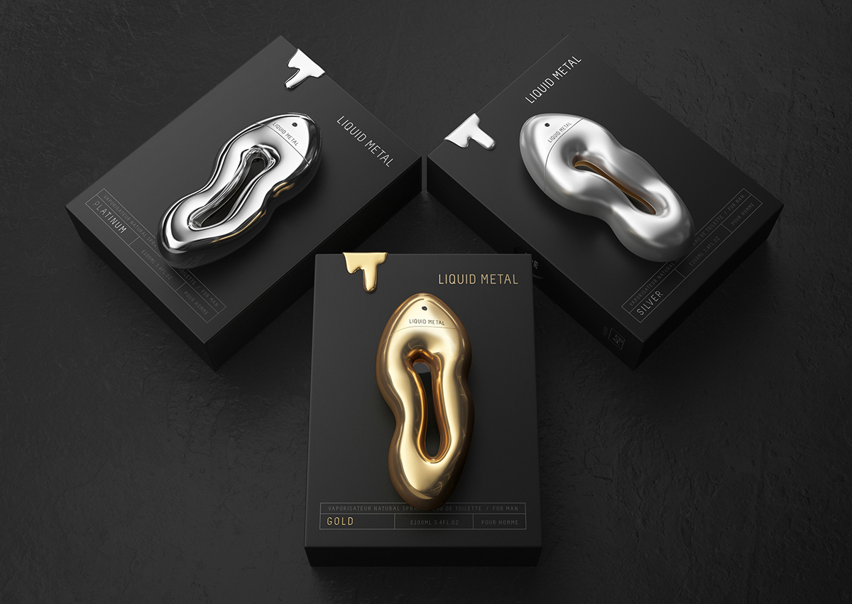
Brand: LIQUID METAL Perfume
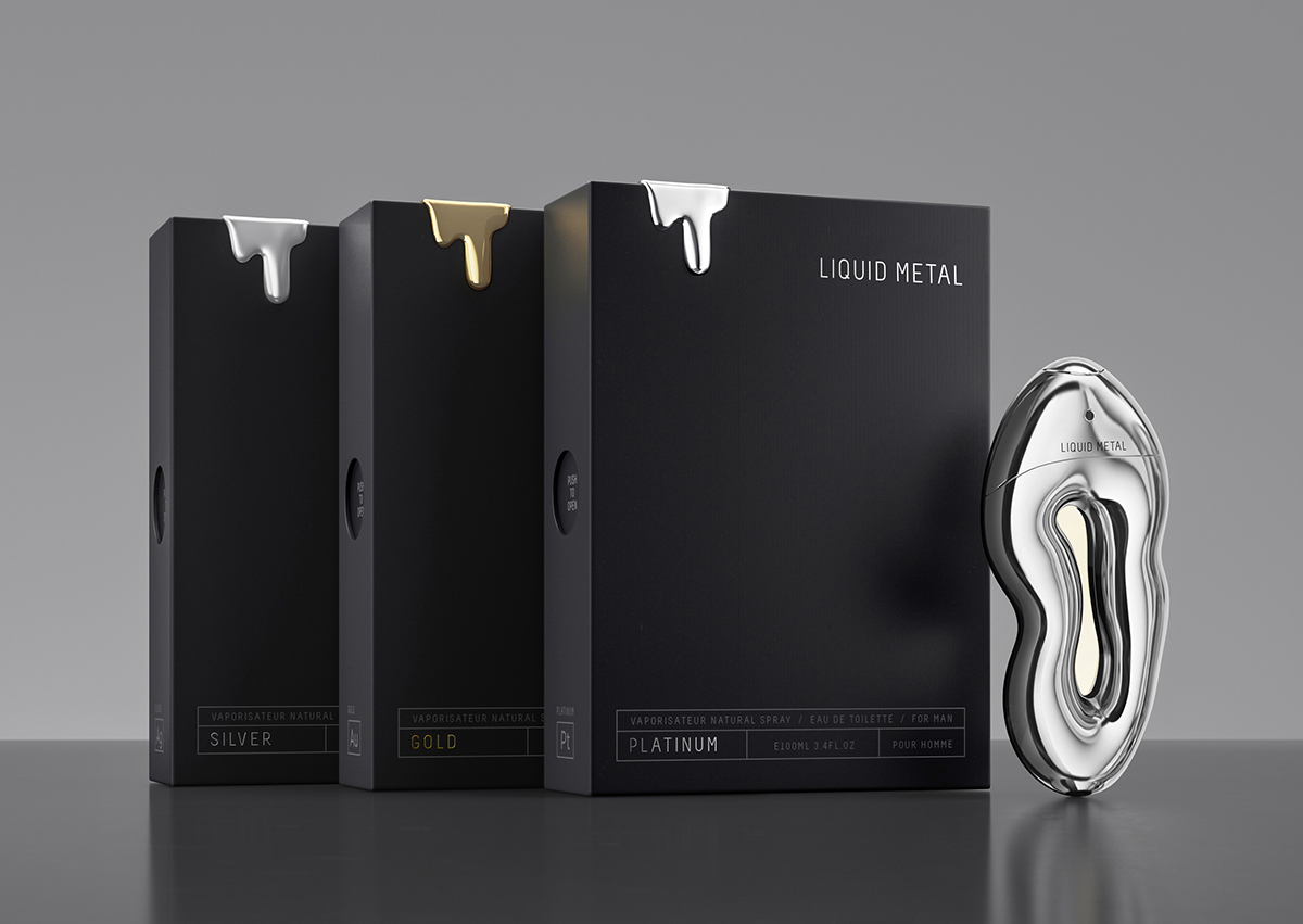
Variants: Platinum | Gold | Silver
Fragrance is as precious as precious metal is a metaphor for design for 3 variant Platinum, Gold and Silver,
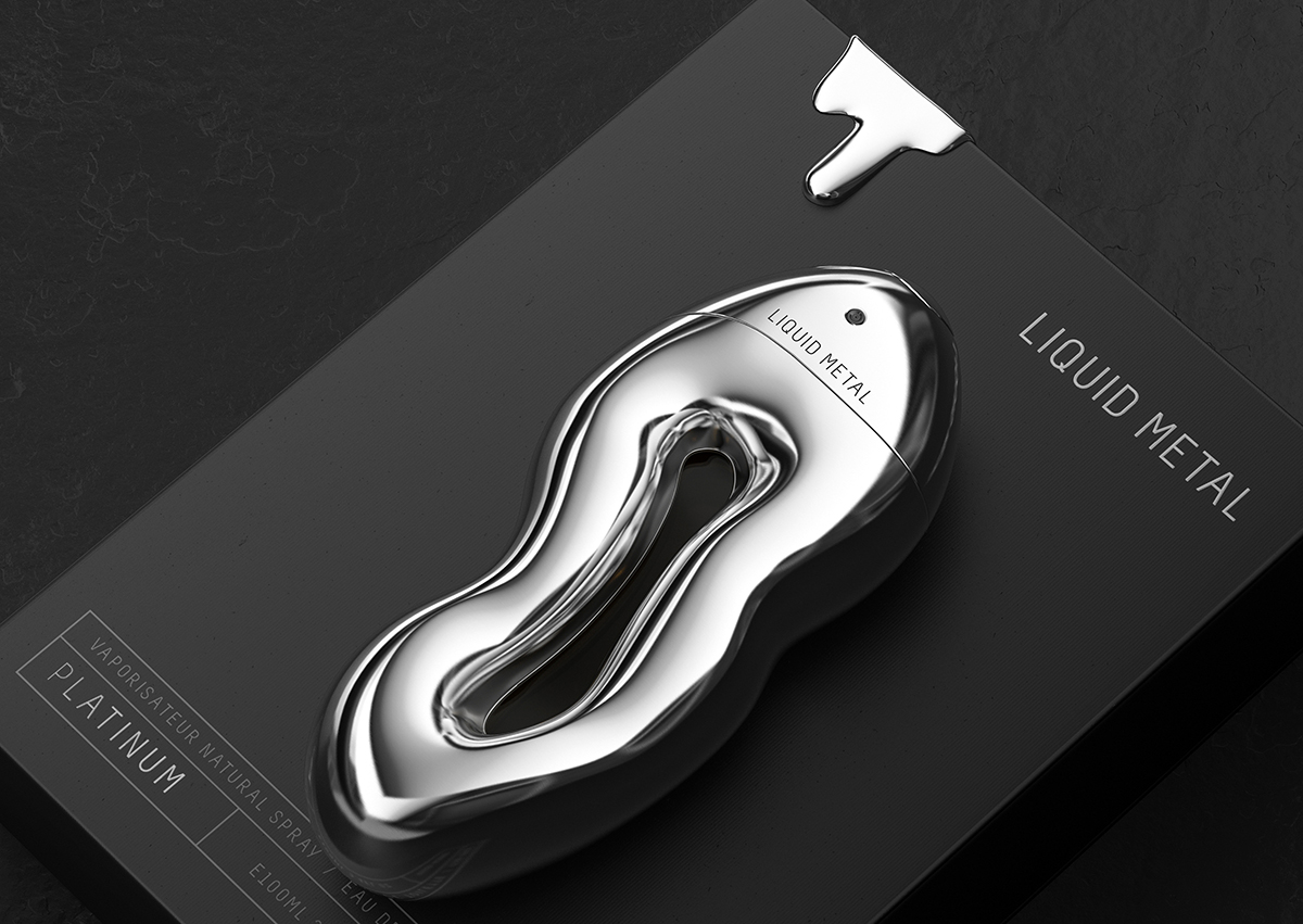
A flacon of perfume that was designed around principles of ‘Fluidity’, from name to packaging design to material – was kept like a melting metal. Its organic shape was a proposed design strategy to make it ergonomically correct in size and stand out from the cluster of products in market place.
The idea was very clear for product development at the same time: “to create a luxury product meant for Global region with masculine and feminine personality.”
Objective of design was to create an unconventional and exceptional product and packaging; hence, we integrated two basic thoughts – Liquid and Metal – and transformed it into a flawless organic shaped glass bottle that expresses femininity and masculinity in a charismatic way. Also, a suggestive name like Liquid metal was derived from the ‘shape concept’ of Liquid form that served here as the symbolic representation of ever evolving and disruptive nature of universe and mankind.
In order to achieve premium look of a luxury brand overall packaging kept very minimal,
Anatomy of Product:
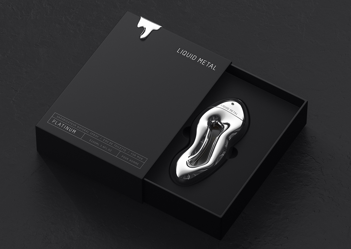
Bottle: Silver UV (Galvanised) Plated glass bottle with central part transparent so that inside colour of liquid can be seen,
Cap: Spray through ABS cap with Silver Metalizing
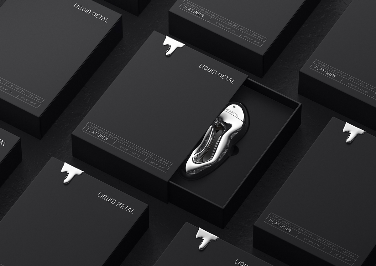
Packaging: Outer box is kept very minimal matt Black Hard box with silver melting ABS piece works as a strong design hook,
Bottle is lying in Vacuum forming black flocking tray
Credits
Entrant Company
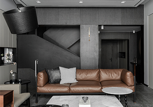
Qingyu Design Studio
Category
Interior Design - Residential

Entrant Company
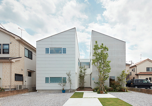
wipe
Category
Architectural Design - Residential

Entrant Company
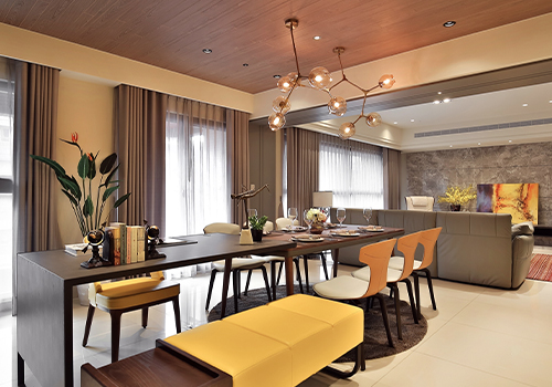
HOE-SEN INTERIOR DESIGN
Category
Interior Design - Living Spaces

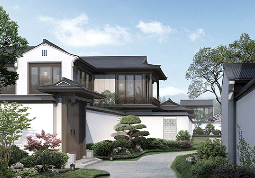
Entrant Company
China Railway Construction Real Estate Group (East China) Co., Ltd.
Category
Architectural Design - Conceptual
