2020 | Professional

Sprite Packaging Concept Design
Entrant Company
Essence Design Global
Category
Packaging Design - Retail
Client's Name
Country / Region
Taiwan
Every time when I pour Sprite into a glass, I see the clearness of the beverage, then the sparkles lively moving in the glass. Once I open my mouth and drink Sprite, I taste the richness of lime & lemon flavors; and feelings of the sparkles bursting in my mouth. It always gives me an indescribable cool & refreshing experience.
Therefore, when I was designing this packaging, I wanted to think outside the box; wanted to break away from "less is more" idea. I want to illustrate everything I feel into my design; every customer can have same special experiences as mine of this classic beverage.
I added more elements into the design, it makes the design visually more lively and colorful. The differences between my design and the previous Sprite packaging are that I only use the Sprite blue as main theme color this time. (except Sprite Zero) it can give the customers even more strong feelings towards refreshments & coolness. Furthermore, it can also make the lime & lemon illustrations to be seen even more clearly on the package; which can convey the main features of the beverage more directly through the visuals.
Credits
Entrant Company
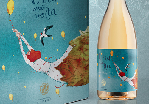
Redfish di Giovanni Murgia
Category
Packaging Design - Wine, Beer & Liquor

Entrant Company
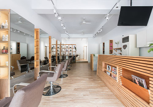
Shuei Design
Category
Interior Design - Beauty Salon

Entrant Company
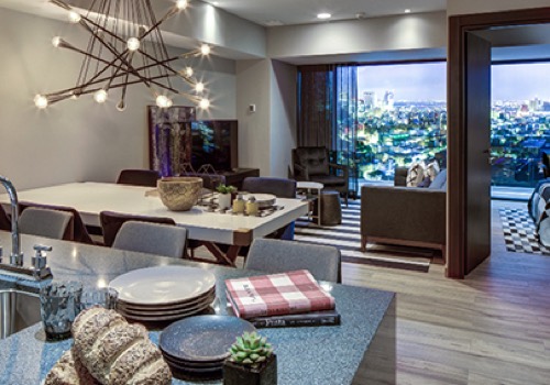
OH STUDIO
Category
Interior Design - Showroom / Exhibit

Entrant Company
Ching Interior Design Studio
Category
Interior Design - Residential
