2023 | Professional

Dove Body Wash Redesign
Entrant
forceMAJEURE Design
Category
Packaging Design - Beauty & Personal Care
Client's Name
Unilever - Dove
Country / Region
United States
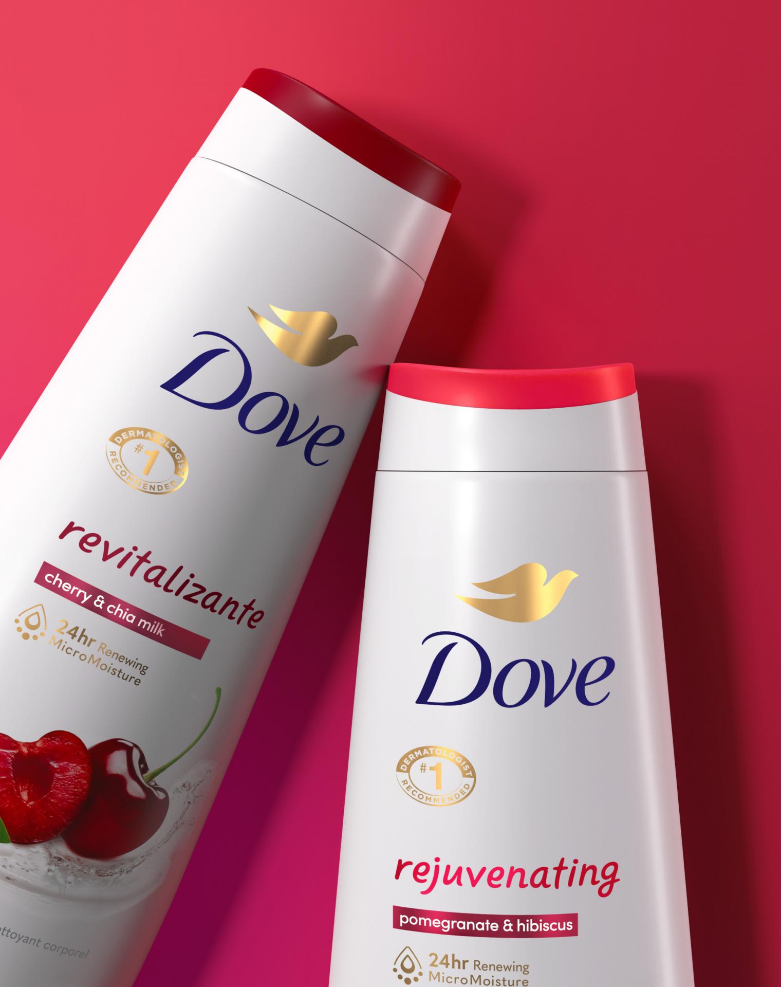
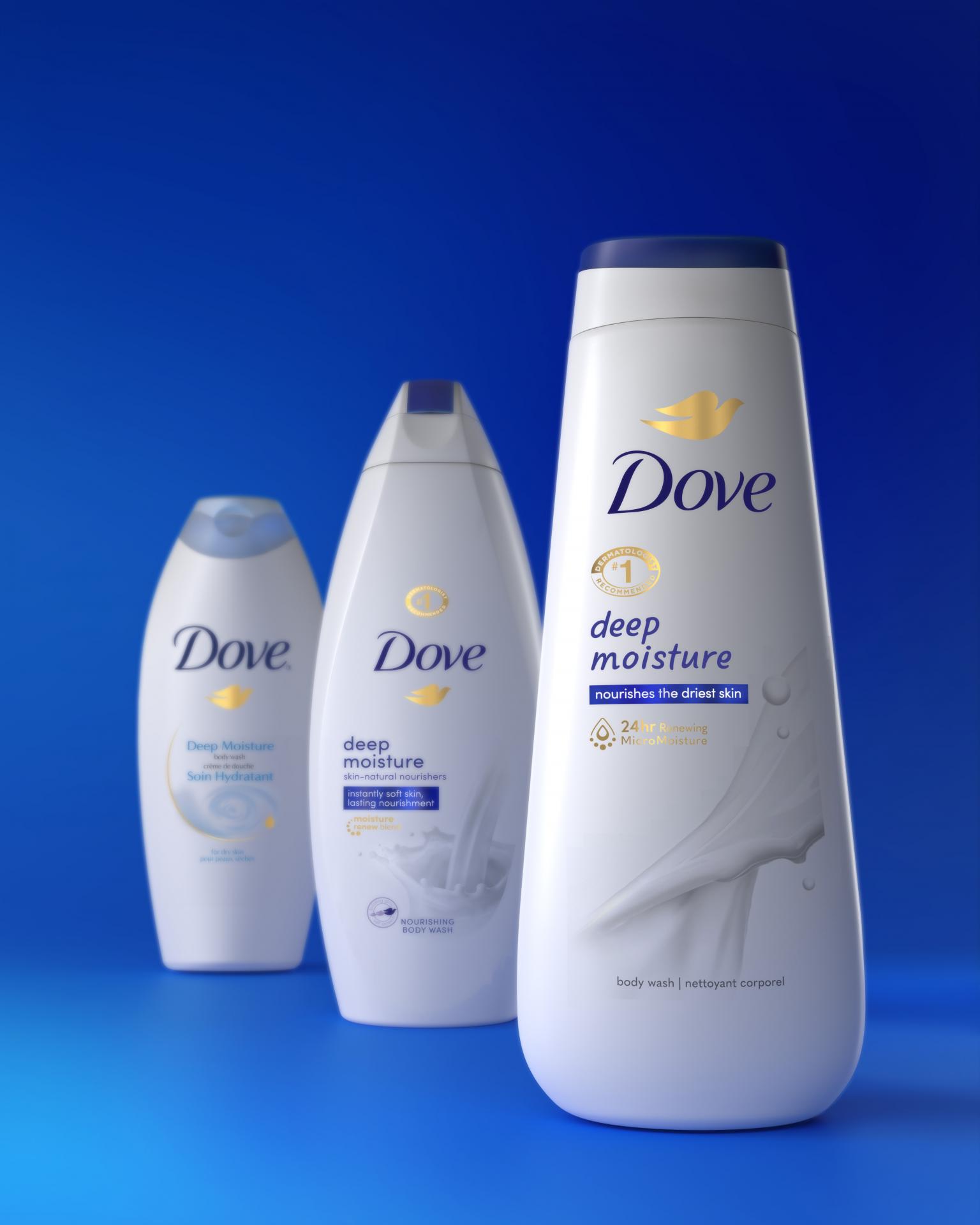
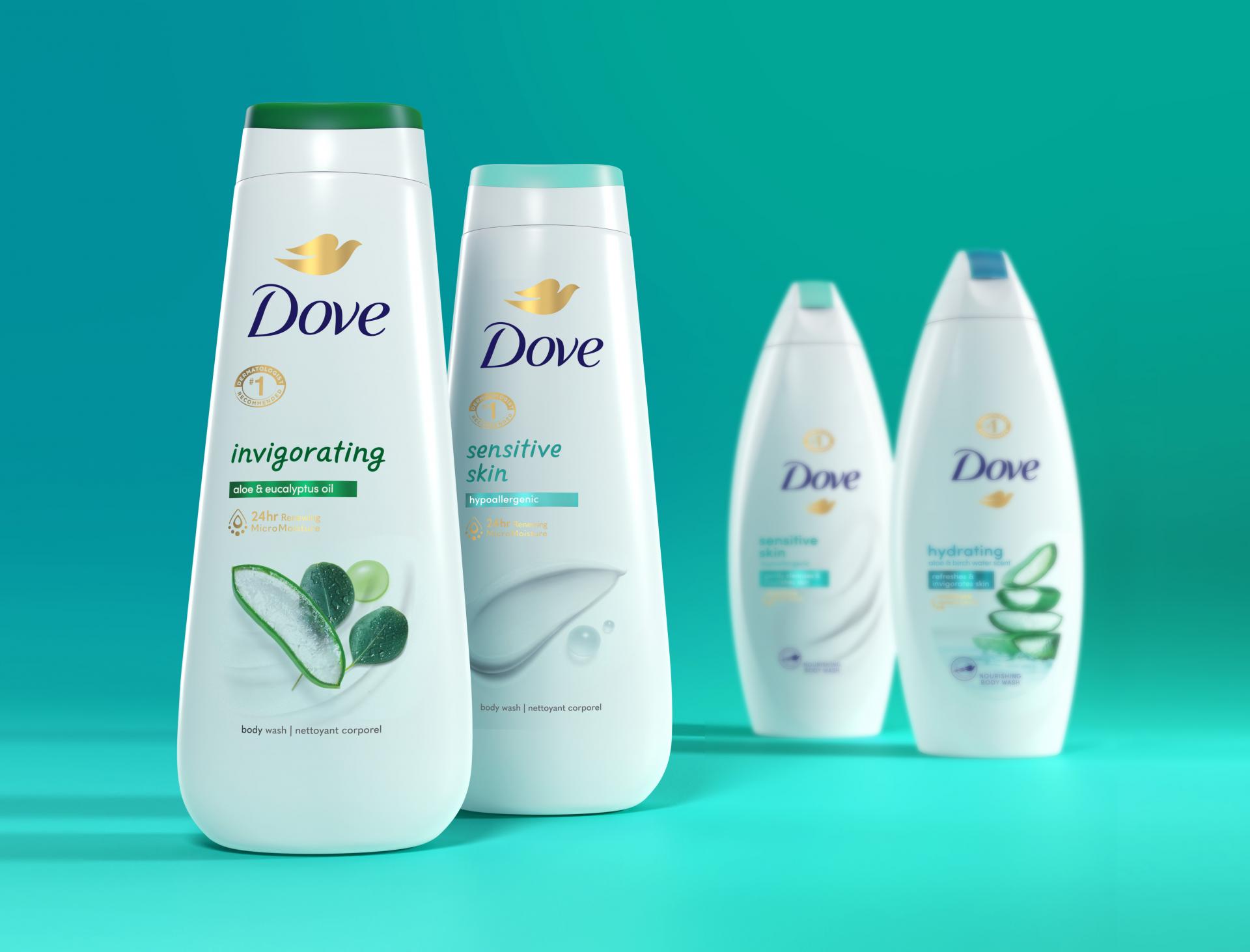
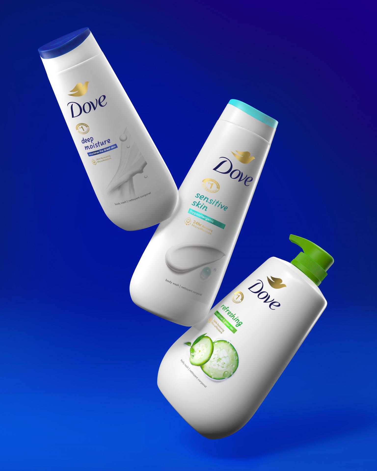
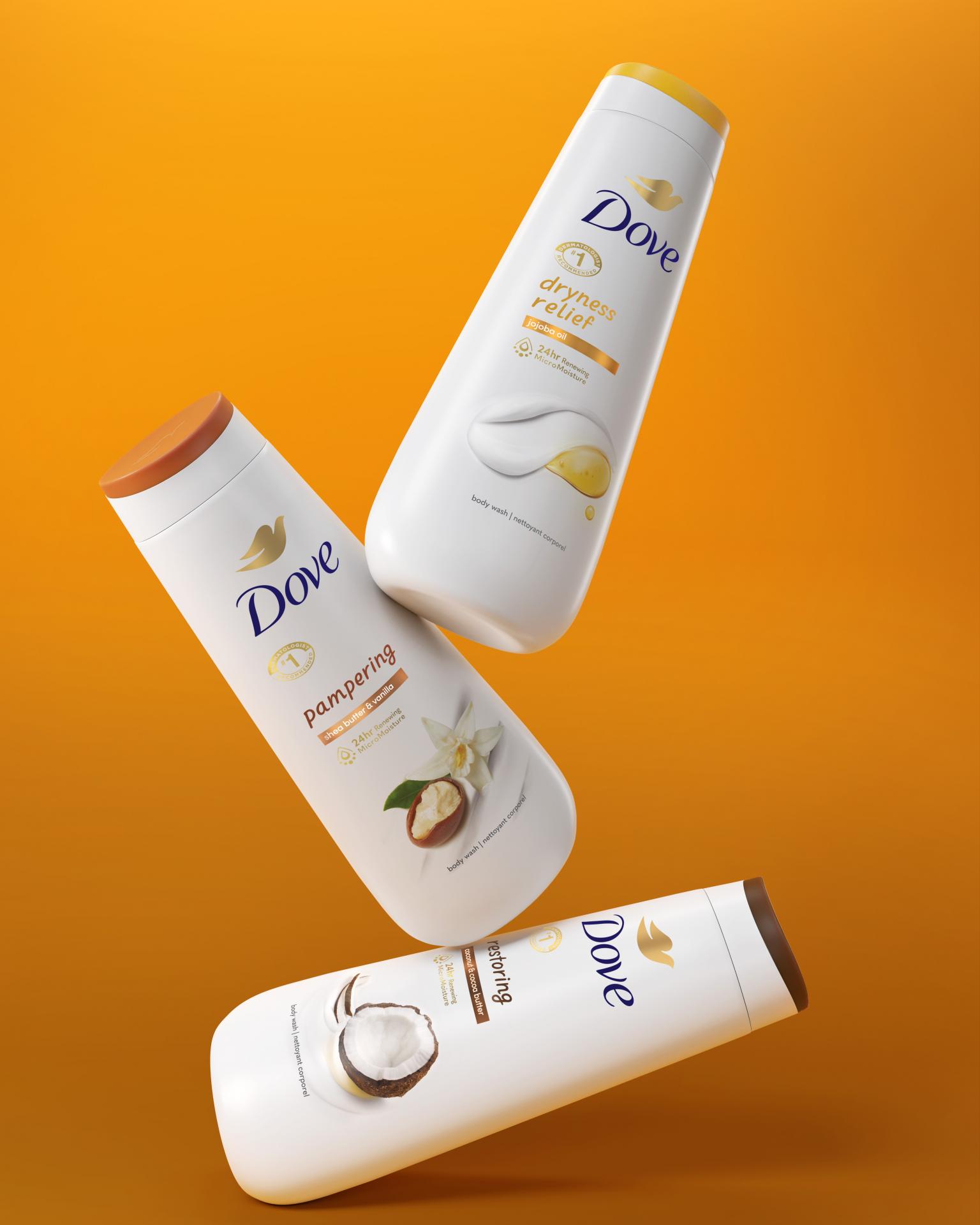
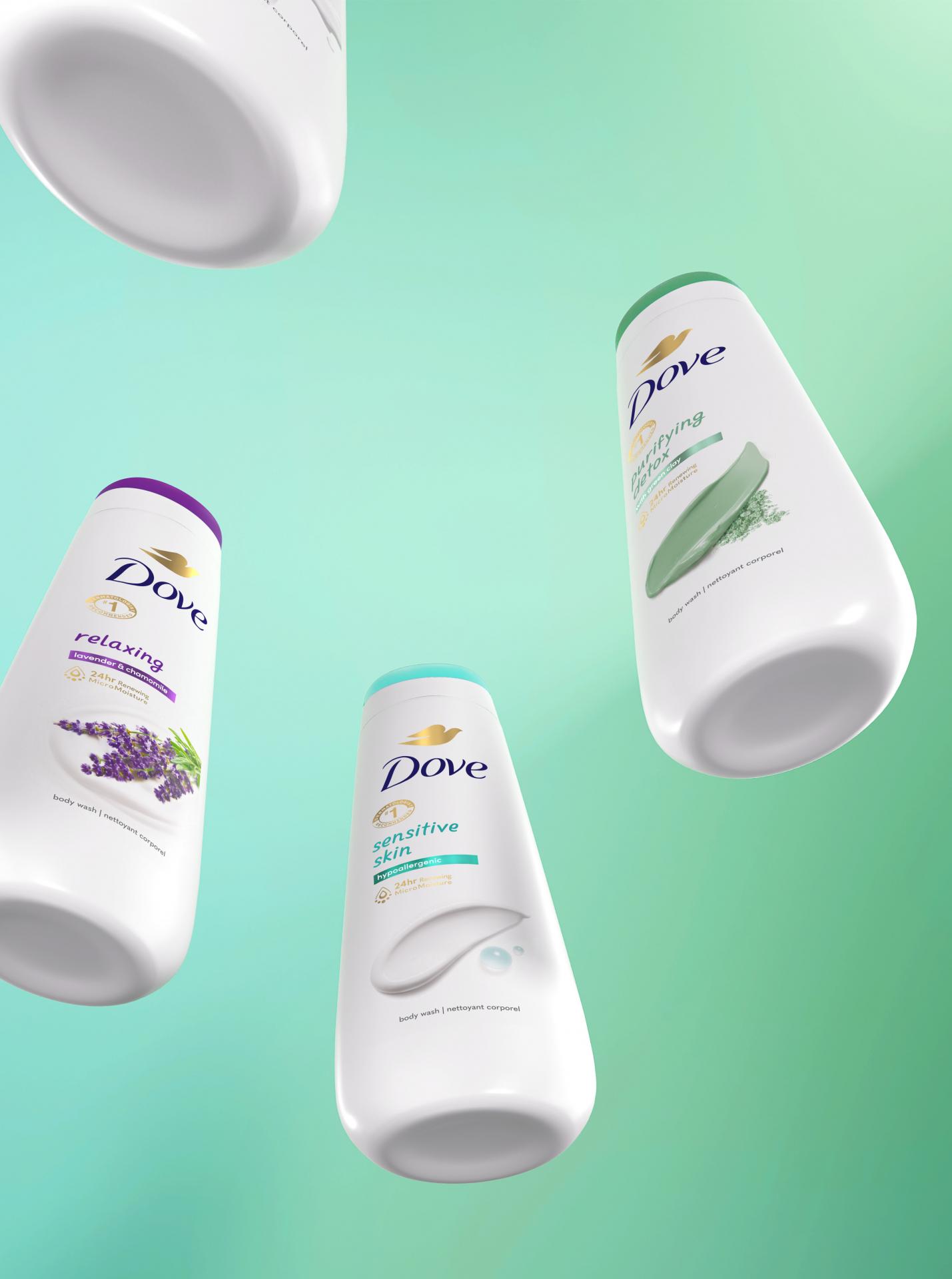
We updated the branding by creating a new brandmark lockup that places the bird icon above the Dove wordmark and increases its prominence and visibility. The layout improvement allows clear communication of the benefits and heroes of the product's new formulation. The new layout also features a fully bilingual pack with English and French in North America. To bring expression, spirit, and warmth to each variant name, we created a bespoke handwritten typeface that brings joy and friendliness to each variant.
The star of the pack's graphic is a new take on the beautiful ingredient imagery, featuring a photography and composition style that magnifies sensories and beauty cues as the brand evolves. We created unique product ingredient expressions for each variant within an ever-expanding portfolio of fragrance stories, combining the living warmth of nature with a dynamic balance of nourishing claims that are easy to read. The newest addition to this portfolio is a variant created explicitly for the Spanish-speaking market: "Revitalizante"—with cherry and chia milk—is the first Dove Body Wash in the US to launch with both English and Spanish copy on its bottle, reflecting Dove's commitment to inclusivity straightening its global leadership as the #1 body wash in the world.
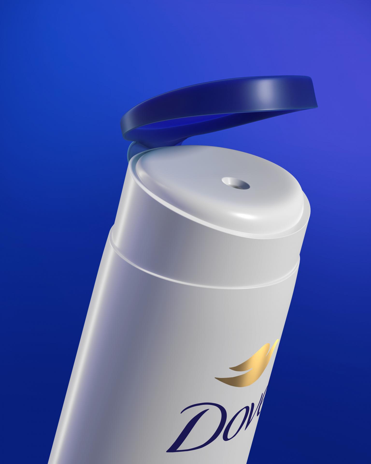
Every bottle is made from post-consumer recycled plastic, in line with Unilever's new global commitments to address plastic waste by reducing virgin plastic use and plastic weight in packaging. In addition, with all moisturizing ingredients being plant-based, the focus on sustainability continues with the new formulation, which garnered PETA's seal of approval as a cruelty-free vegan formula. The revolutionary upgrade to the formula introduces nanotechnology to nourish skin via millions of moisturizing microdroplets to simultaneously boost and help skin retain 24-hour moisture.
The evolution of Dove's body wash is reflected in all critical elements of the pack: the communication of the innovative and ethically sourced formula, the upgraded branding and variant recognition color system, and the striking ingredient graphics that illustrate the story of each variant and serve as the focal point of each bottle.
Entrant
ChengDu W&Y Interior Design CO.,LTD
Category
Interior Design - Home Stay / Airbnb

Entrant
Arch Interior Design
Category
Interior Design - Showroom / Exhibit

Entrant
LUSTYdesign Inc.
Category
Interior Design - Restaurants & Bars

Entrant
Shunde Kingtec Appliances Co., Ltd.
Category
Product Design - Home Appliances
