2024 | Professional
Pentavite Packaging Design
Entrant Company
BYHEALTH Co., Ltd.
Category
Packaging Design - Health & Wellness
Client's Name
Country / Region
China
Pentavite is an Australian specialty nutrition brand with 80 years of history. Nearly 50 years of focus on children's health, is committed to providing children with relaxed and pleasant, rejuvenating body and mind of high-quality nutrition products. In order to expand sales, Pentavite began to enter the adult nutrition field, transforming into a whole-population dietary nutritional supplement brand.
The design task of this time was to build a visual system of Pentavite adult wire products, which need to be different from children's wire products and inherit the brand tonality of Pentavite.
Therefore, we take the overlapping color geometry as the visual core of the packaging, inheriting the unique color geometry overlapping style of the brand logo, and retaining the original sunshine and health breath. The packaging of Pentavite adult line is rich in color, giving users a dynamic, stylish, relaxed and pleasant visual experience, which is different from the stiff style of most competing products similar to drugs. A simple and clear ICON is designed above the label, which not only reflects the functionality of the product, but also helps consumers quickly identify the products they need. Research data prove that such a design layout, online sales click-through rate is significantly higher than the industry average.
The bottle adopts environmentally friendly HDPE material, the label adopts non-film treatment technology, is 100% recyclable environmentally friendly paper, the label uses environmentally friendly ink printing, the packaging material conforms to SGS testing certification, which is conducive to the sustainable development of the earth.
The caps feature industry-leading tri-color cap technology for superior sealing performance. The handle of the 13mm tear ring has been tested 500 times, making it easy for women and the elderly to tear. The crescent-shaped canopy is designed with the average thumb thickness in mind, ensuring that it can be pushed away with one hand. The design of the bottle cap is connected to the bottle body to avoid the loss of the bottle cap. The design of this bottle cap takes into account the considerations of product quality and user experience.


Credits
Entrant Company
Sheng design
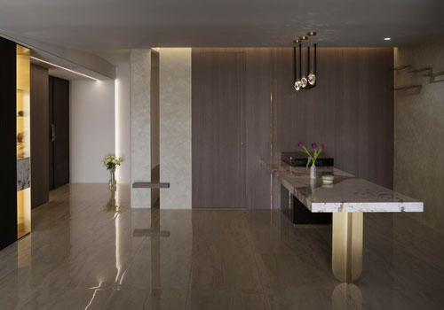
Category
Interior Design - Residential

Entrant Company
hm-LI Studio
Category
Furniture Design - Seating & Comfort
Entrant Company
Feng Shi / Noble Paragon Pte.Ltd
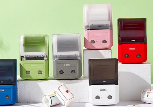
Category
Product Design - Digital & Electronic Devices

Entrant Company
Shenzhen Skyworth Photovoltaic Technology Co.,Ltd
Category
Architectural Design - Sustainable Living / Green