2025 |

Moon Back In Chang’An Mooncake Gift
Entrant
Xi'an Yiwen Brand Design Co., Ltd
Category
Packaging Design - Snacks, Confectionary & Desserts
Client's Name
Country / Region
China
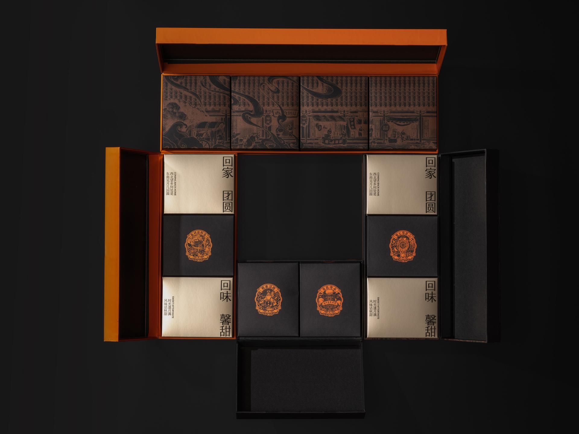
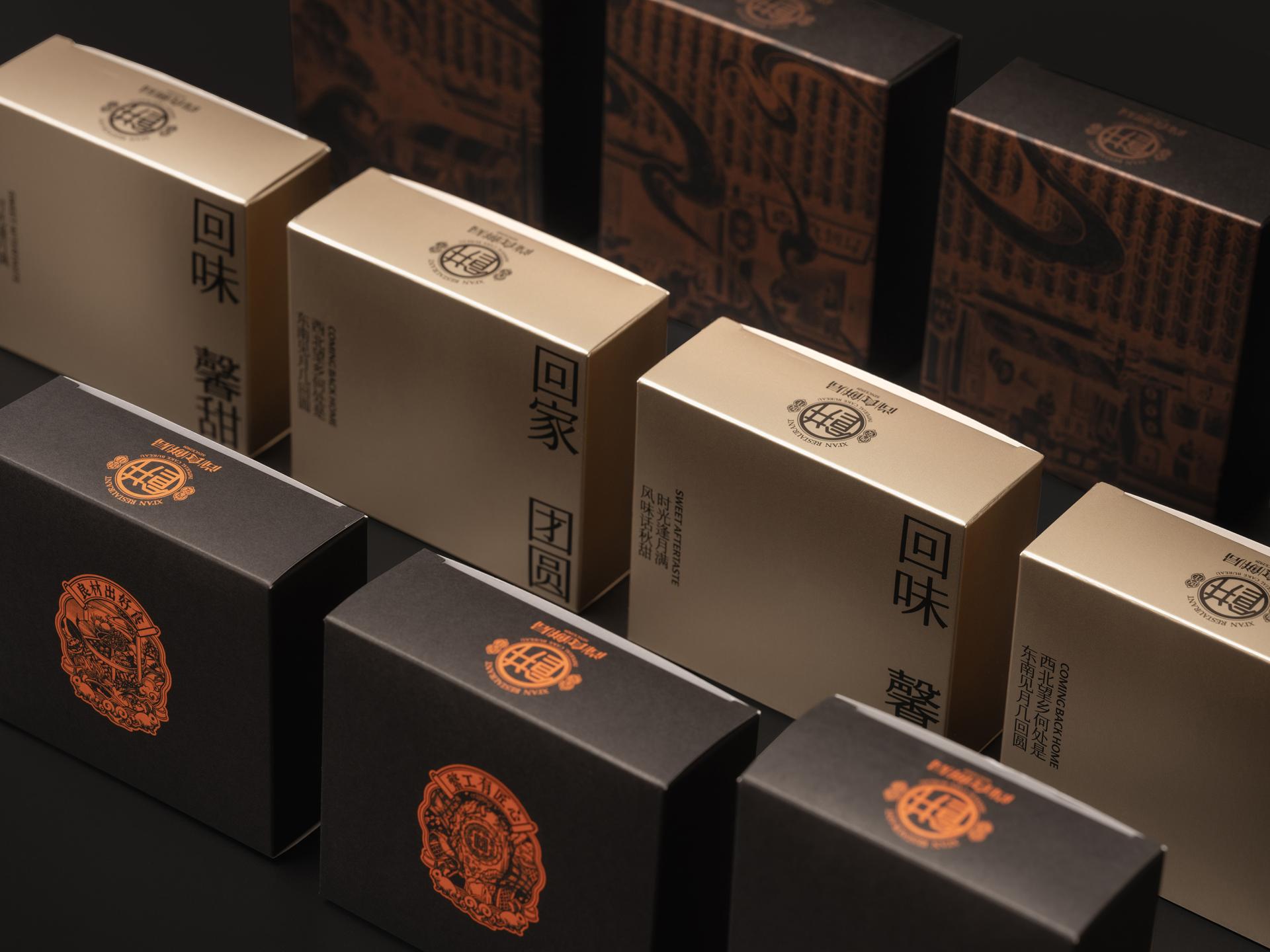
Designed in the shape of the character “回” (meaning “return”), the Moon Back In Chang’An mooncake box recalls the structure of traditional Chinese courtyards, where family reunions take place during the Mid-Autumn Festival. It’s a form that conveys both the physical act of returning home and a more emotional longing for connection and celebration. The packaging captures this duality by combining scenes of bustling street festivities with the quiet intimacy of home, creating a detailed and emotionally resonant design. A detailed illustration on the outer box captures the rooftop of a traditional Chinese courtyard, with interior elements like pebble paths and low wooden tables depicted in a realistic style. These quiet indoor scenes are mirrored by lively street scenes illustrated on the sides, creating a warm visual contrast between the tranquility of home and the energy of the festival outside. The main color tone, a muted brown, conveys a sense of nostalgia, like looking at an old photograph. A vibrant orange block on the opposite side of the box adds a contemporary touch and draws attention to the product information, keeping the design from feeling overly traditional or subdued.


Credits
Entrant
Zengyihai Architecture Studio, China Construction Fifth Engineering Division Corp. Ltd
Category
Architectural Design - Urban Design
Entrant
YA-MAN LTD.
Category
Product Design - Personal Care
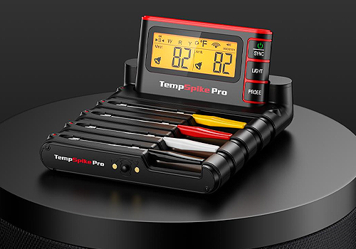
Entrant
Shenzhen ECARE Electronics Co.,Ltd
Category
Product Design - Tools

Entrant
Guangzhou Huancheng Culture Media Co., Ltd.
Category
Product Design - AI-Integrated Devices (NEW)