2025 | Professional

ASL Anti-wrinkle Firming and beauty Pearl Cream packaging
Entrant Company
Zhongshan LAPRO Advertising Media Co., LTD
Category
Packaging Design - Beauty & Personal Care
Client's Name
Country / Region
China
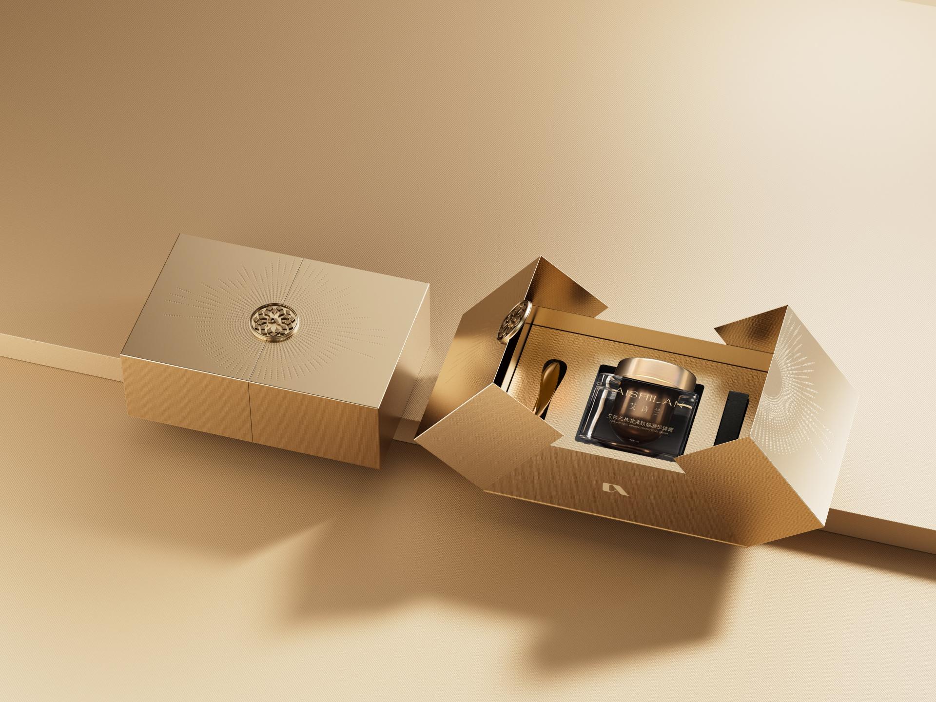
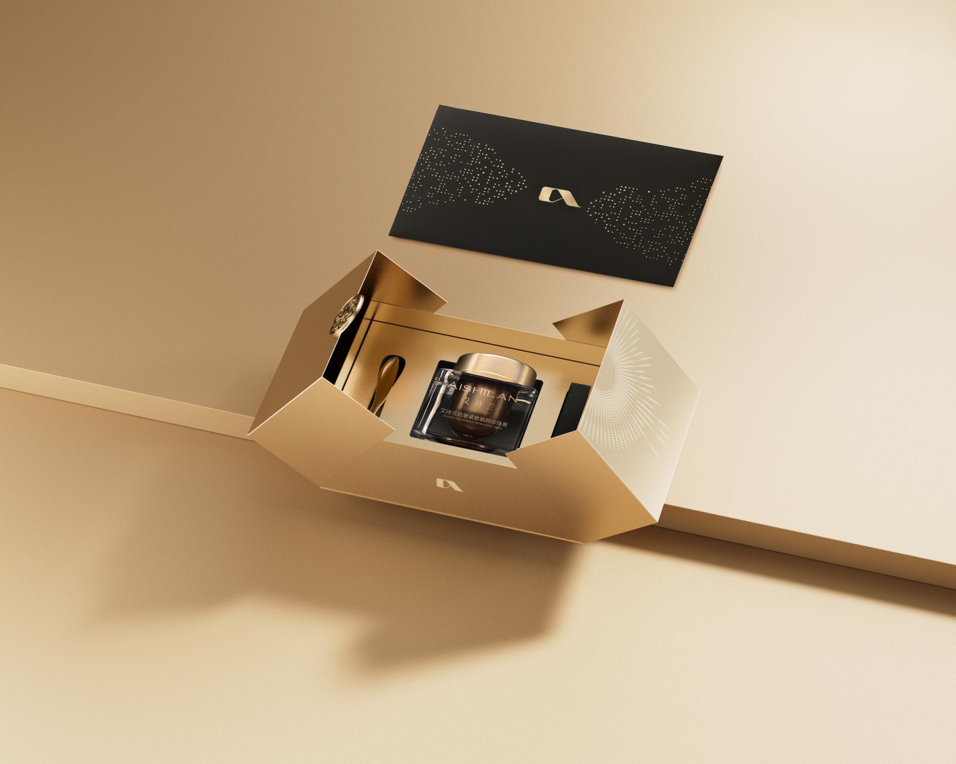
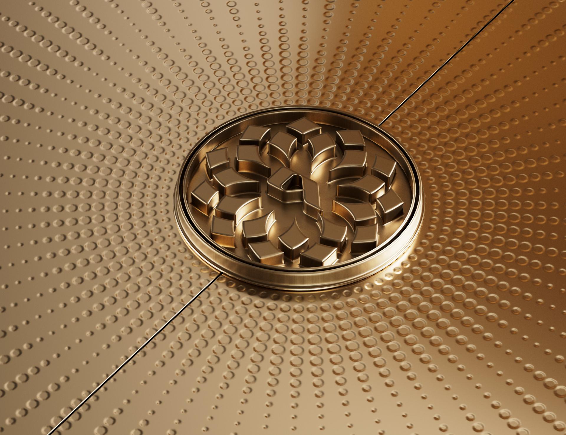
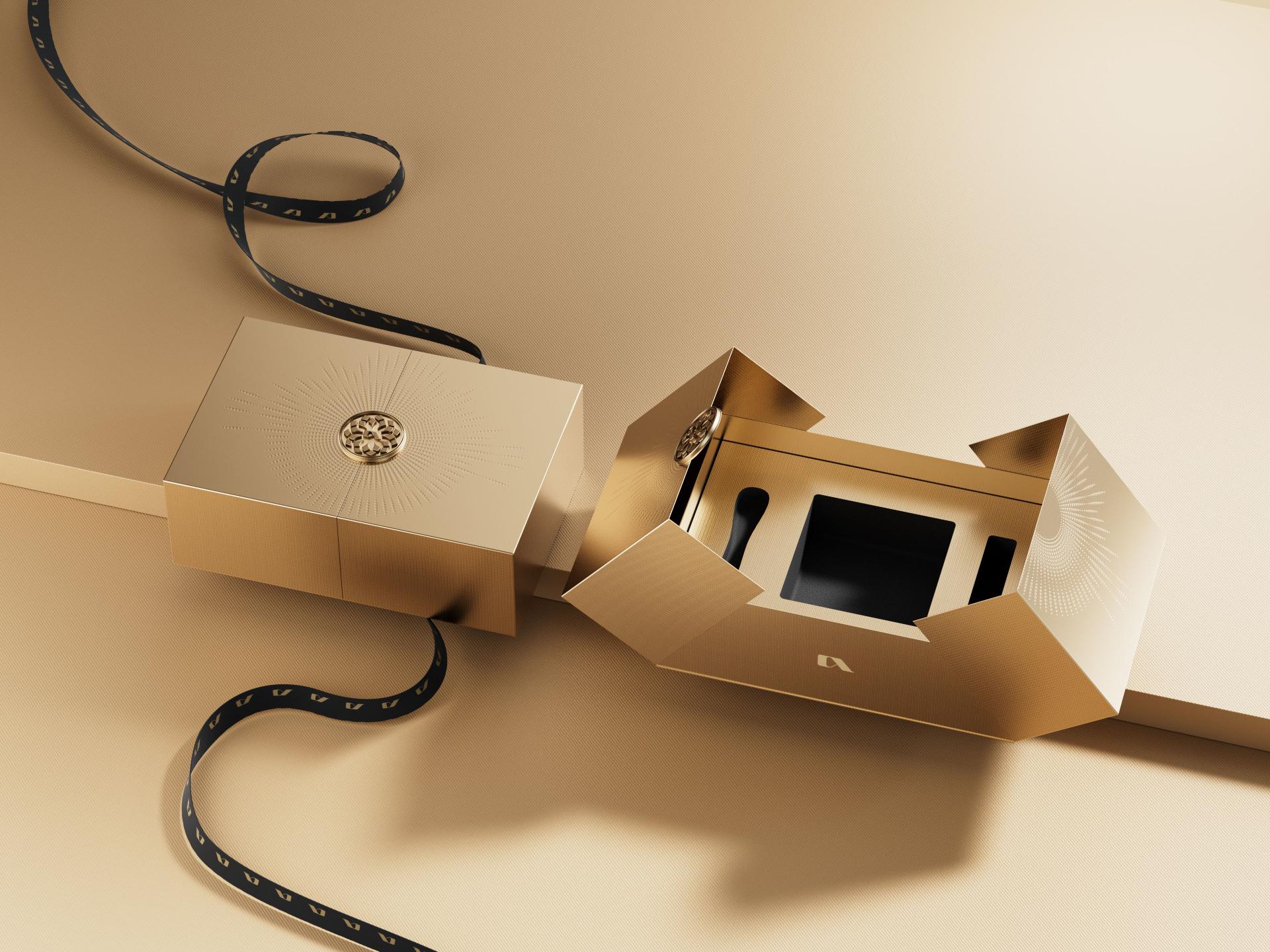
This packaging design breaks the homogeneity in pearl cream packaging through thoughtful differentiation, offering a premium skincare experience with its unique visual narrative and unboxing ritual. This approach creates an irreplicable identity for the product. Inspired by pearls’ natural luminescence and radiating formations, along with the embossed metal buttons of ancient Chinese jade burial suits sewn with golden threads, the packaging harmoniously fuses Eastern pearl symbolism with modern design principles, aligning with the rising “Eastern Aesthetics Renaissance.” Beyond mere packaging, it channels the brand ethos: “True Pearl Radiance—Deeply Nourished, Visibly Luminous.” It speaks directly to consumers seeking glowing skin and refined lifestyles, while demonstrating how tradition and modern design can unite to create something timeless and fresh.
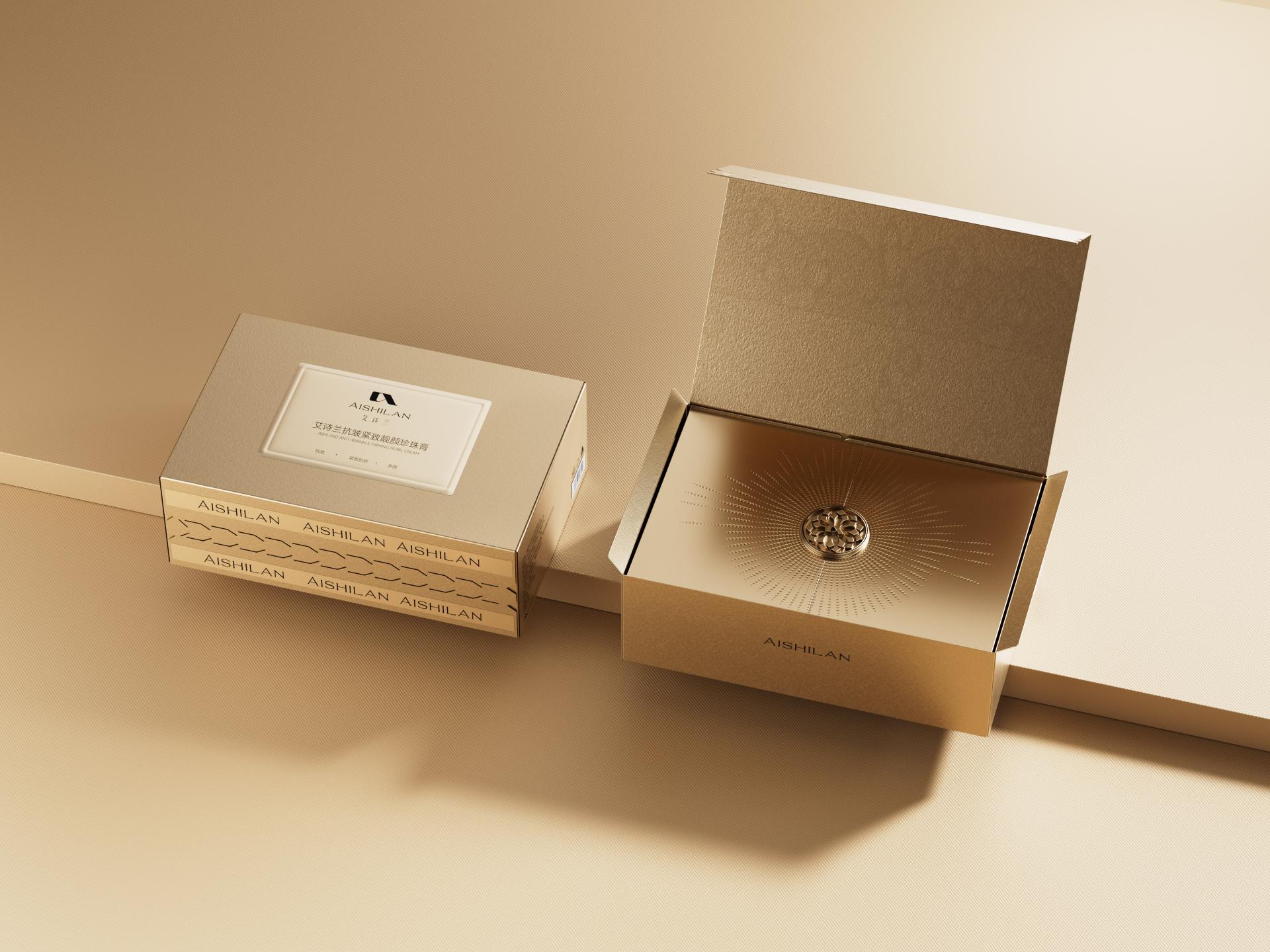
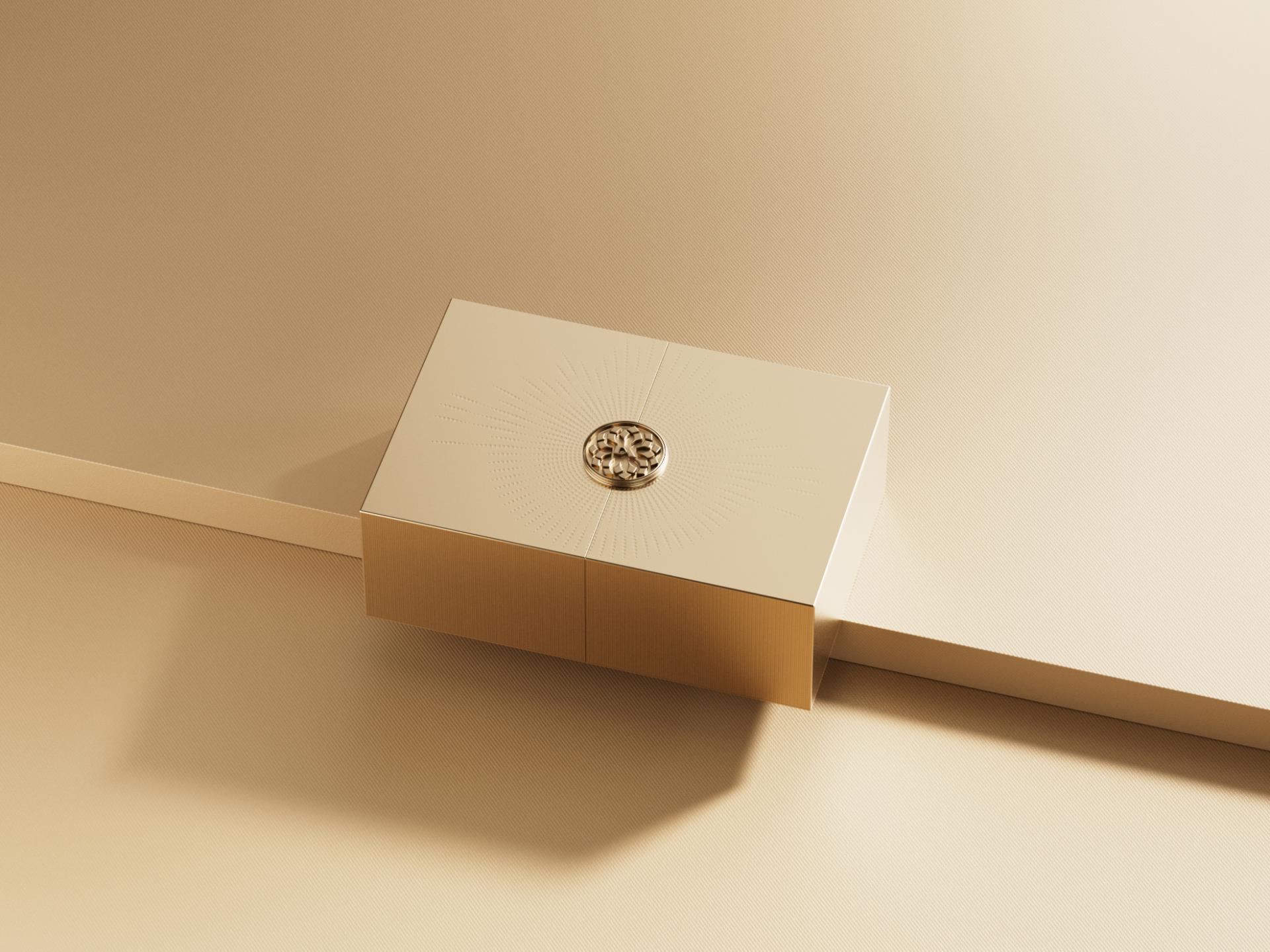
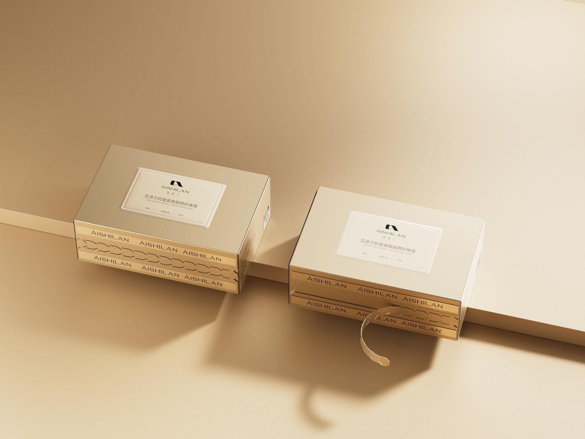
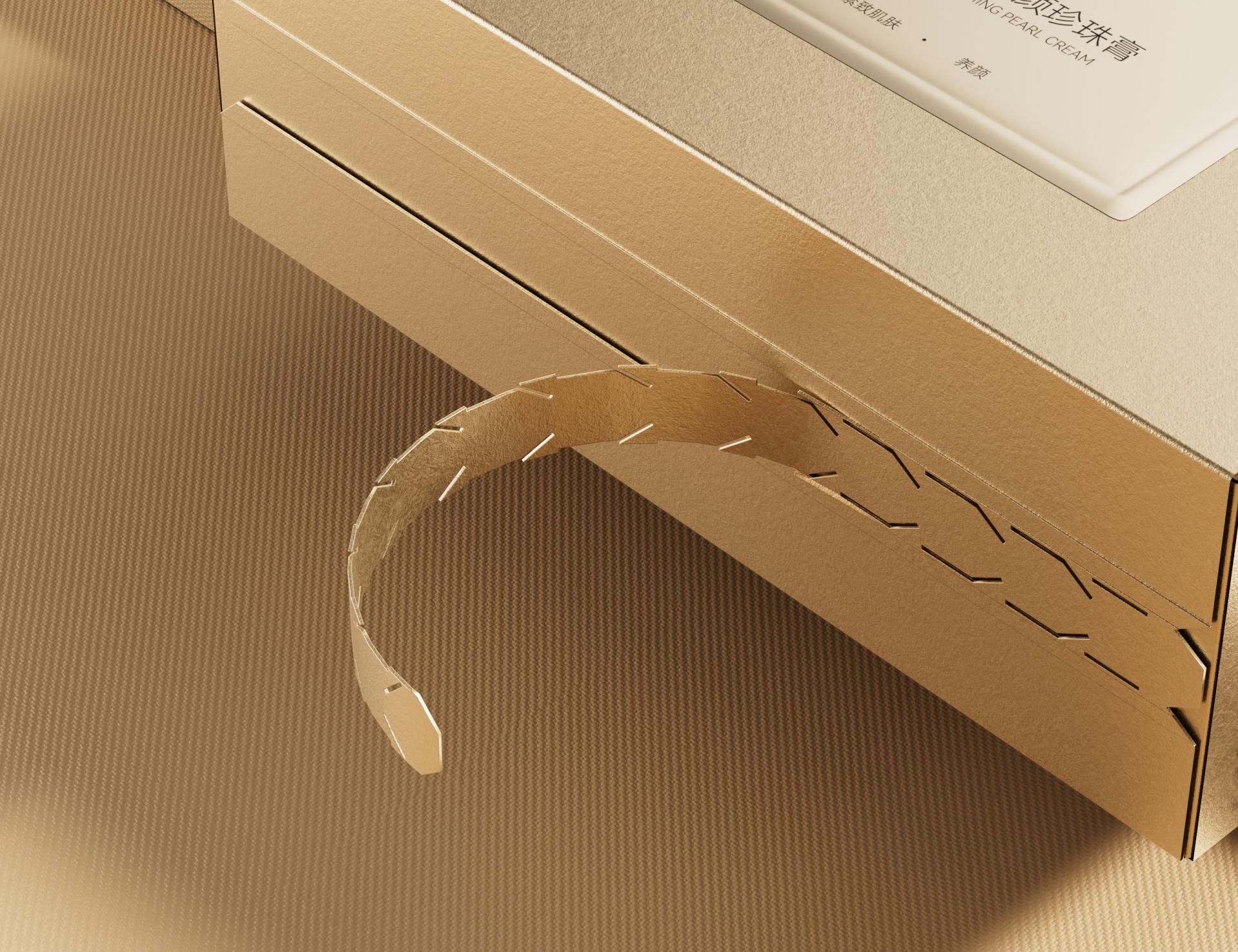
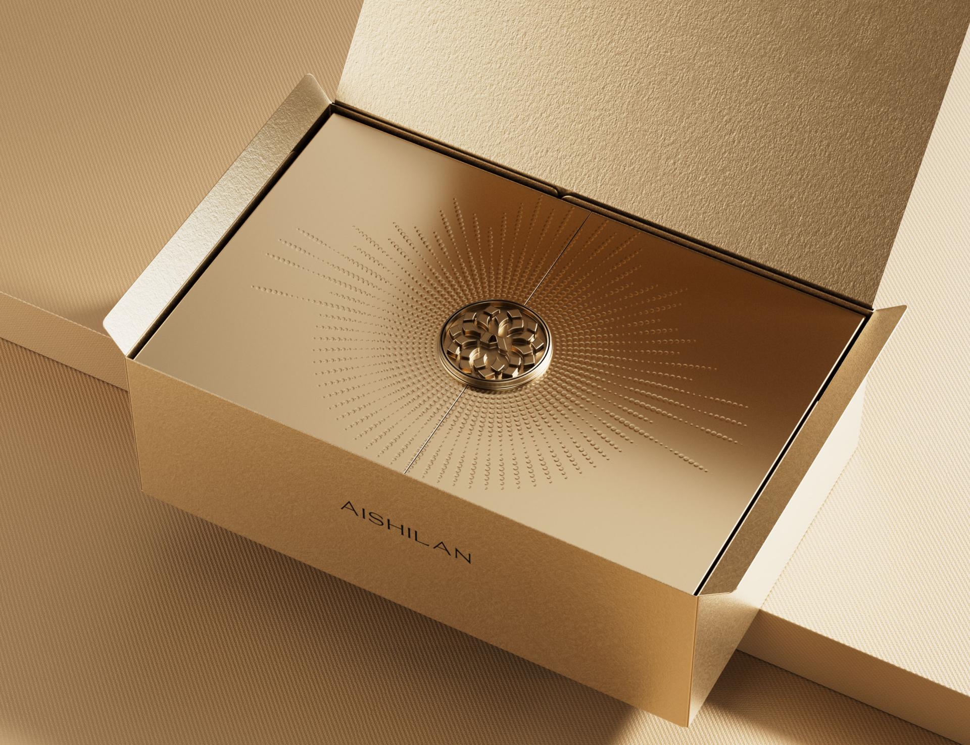
The packaging design introduces two key innovations: an easy-access outer box and a uniquely crafted inner box. The outer box features a side tear strip that simplifies opening and offers anti-counterfeit assurance. This detail turns unboxing into a moment of ritual and delight. Its top panel prominently displays the brand logo, followed by clearly organized product name and key benefits below. Parallel to the side tear strip are two lines of repeating band name “AISHILAN,” reinforcing visual consistency and brand presence. Design ingenuity extends to the inner box. Its top cover features a dimpled texture radiating outward like natural pearl formations, and its dual-flap opening design immediately reveals the product’s exquisite metal finish. Moreover, custom-molded inserts ensure the product and its accessories are securely held in place.
The packaging design exudes simplicity and elegance. The outer box is crafted from textured paper with a soft touch, conveying understated luxury. In contrast, the inner box features a smooth, glossy surface that creates a striking visual and tactile difference, adding depth to the overall design. At the center of the inner top cover is an antique-style metal button, surrounded by a radiating, dimpled texture that evokes the soft luster of pearls—a refined and graceful detail. The color scheme reflects pearl-like tones with gold and champagne gold, conveying nobility and refinement. Product information is presented on an off-white background, ensuring readability without compromising aesthetic harmony.
Credits
Entrant Company
Shanghai Yinshe Home Decoration Design Co., Ltd.
Category
Interior Design - Residential

Entrant Company
O&O STUDIO
Category
Furniture Design - Furniture Sets

Entrant Company
XIAMEN ANTA TRADING CO.,LTD.
Category
Fashion Design - Footwear
Entrant Company
GIN.SPACE Interior design
Category
Interior Design - Residential