2025 | Professional
Packaging Design for Mayve’s Hair and Body Care Products
Entrant
Yango University
Category
Packaging Design - Beauty & Personal Care
Client's Name
Country / Region
China
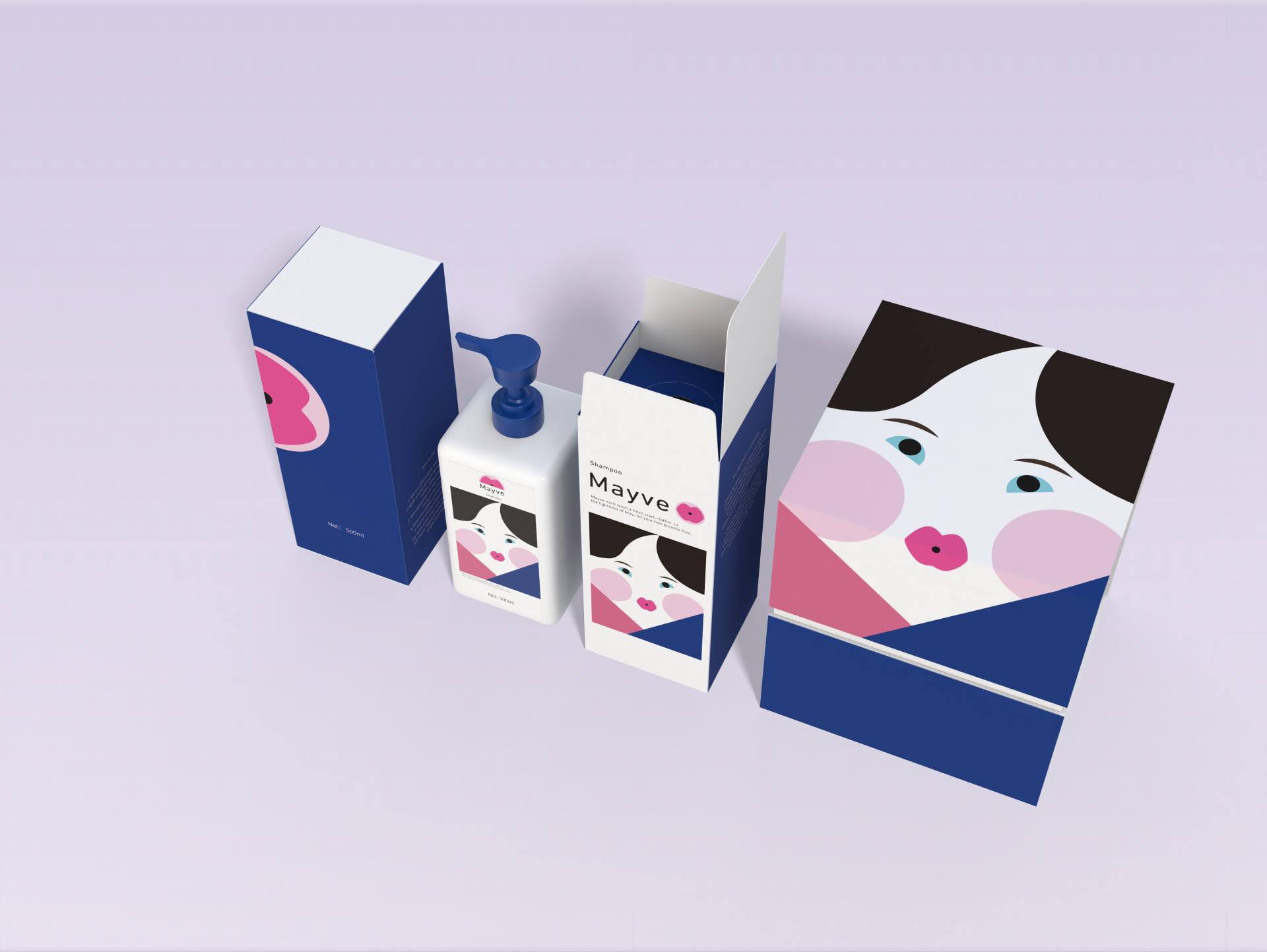
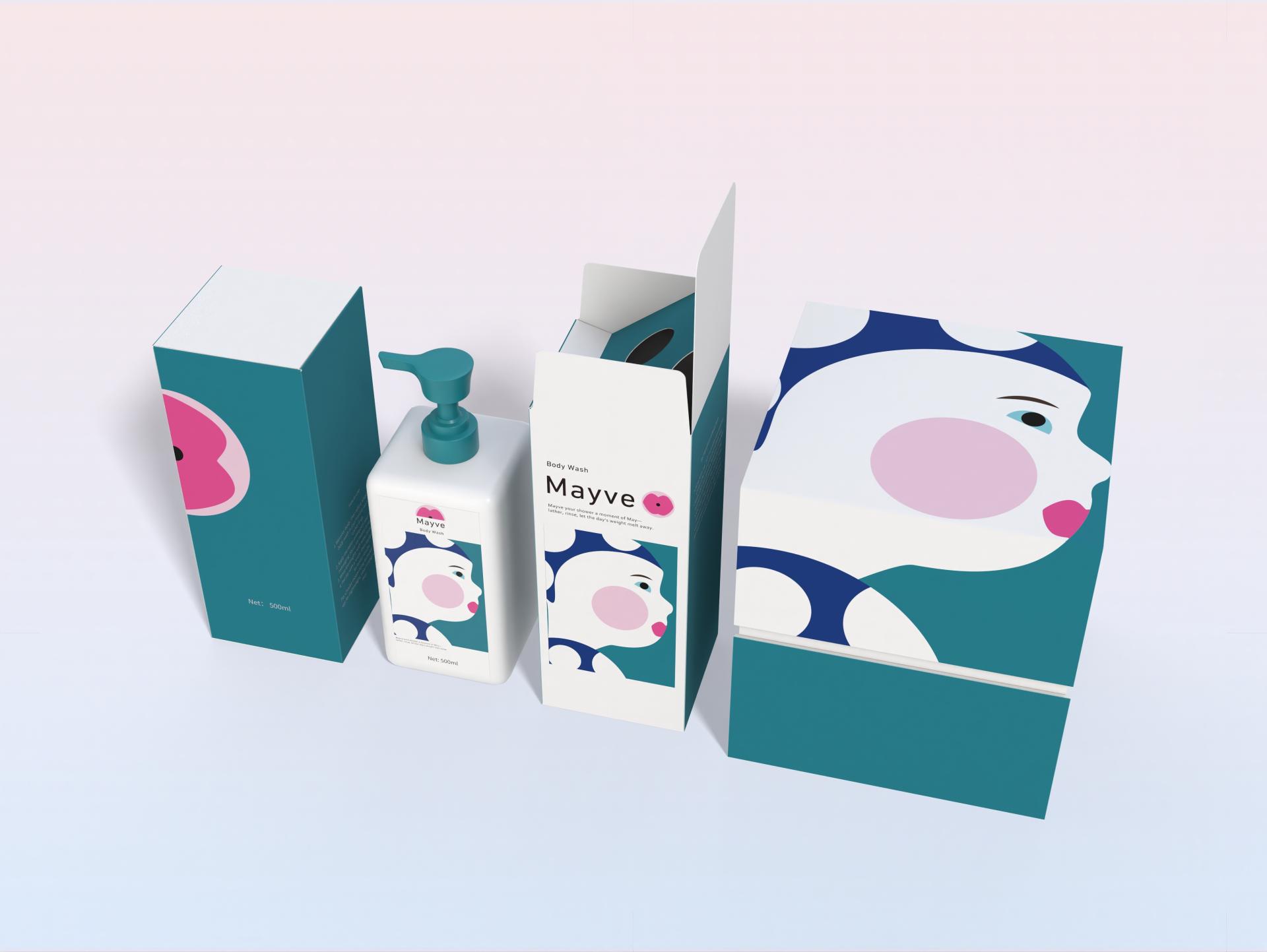
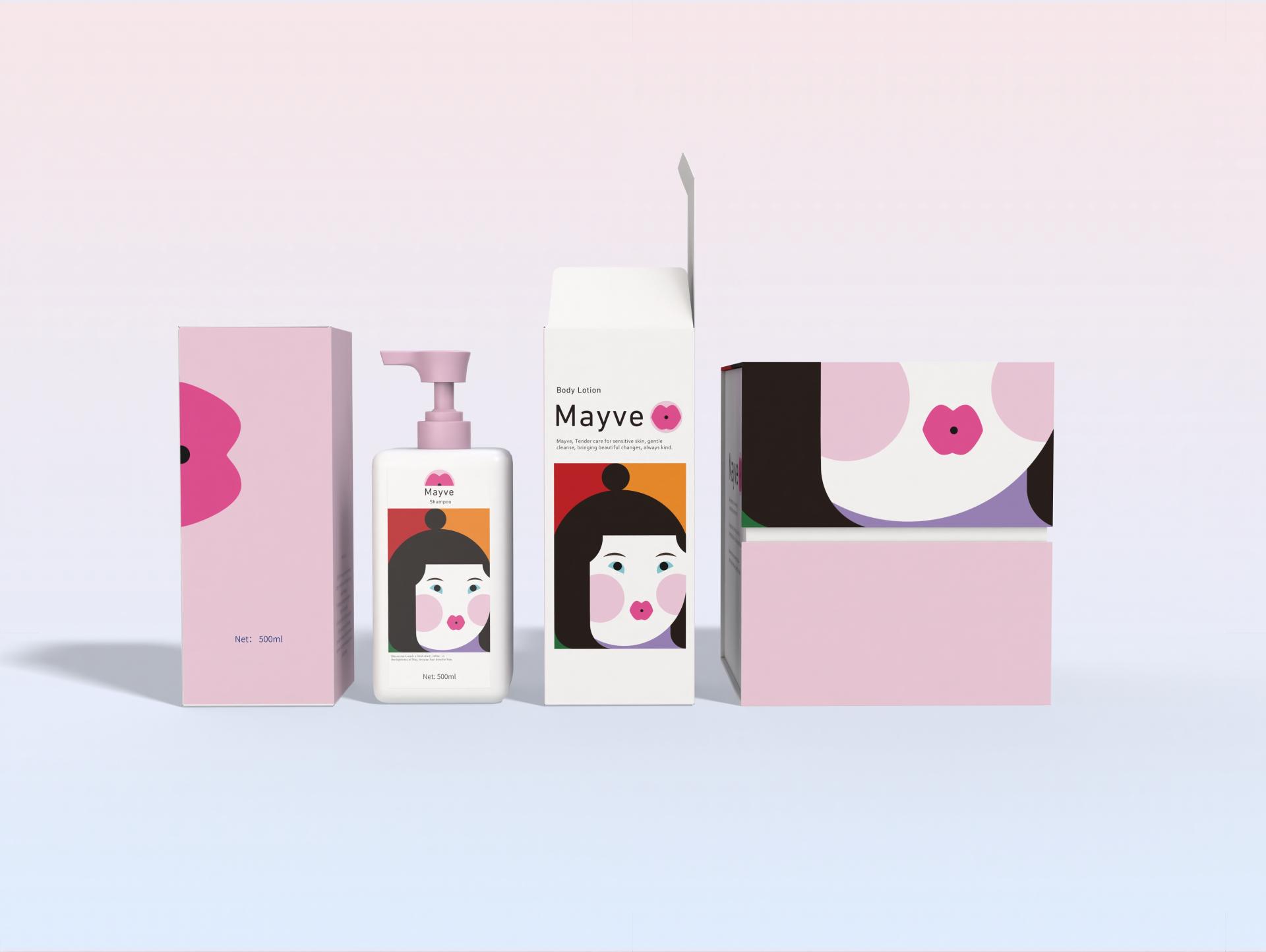
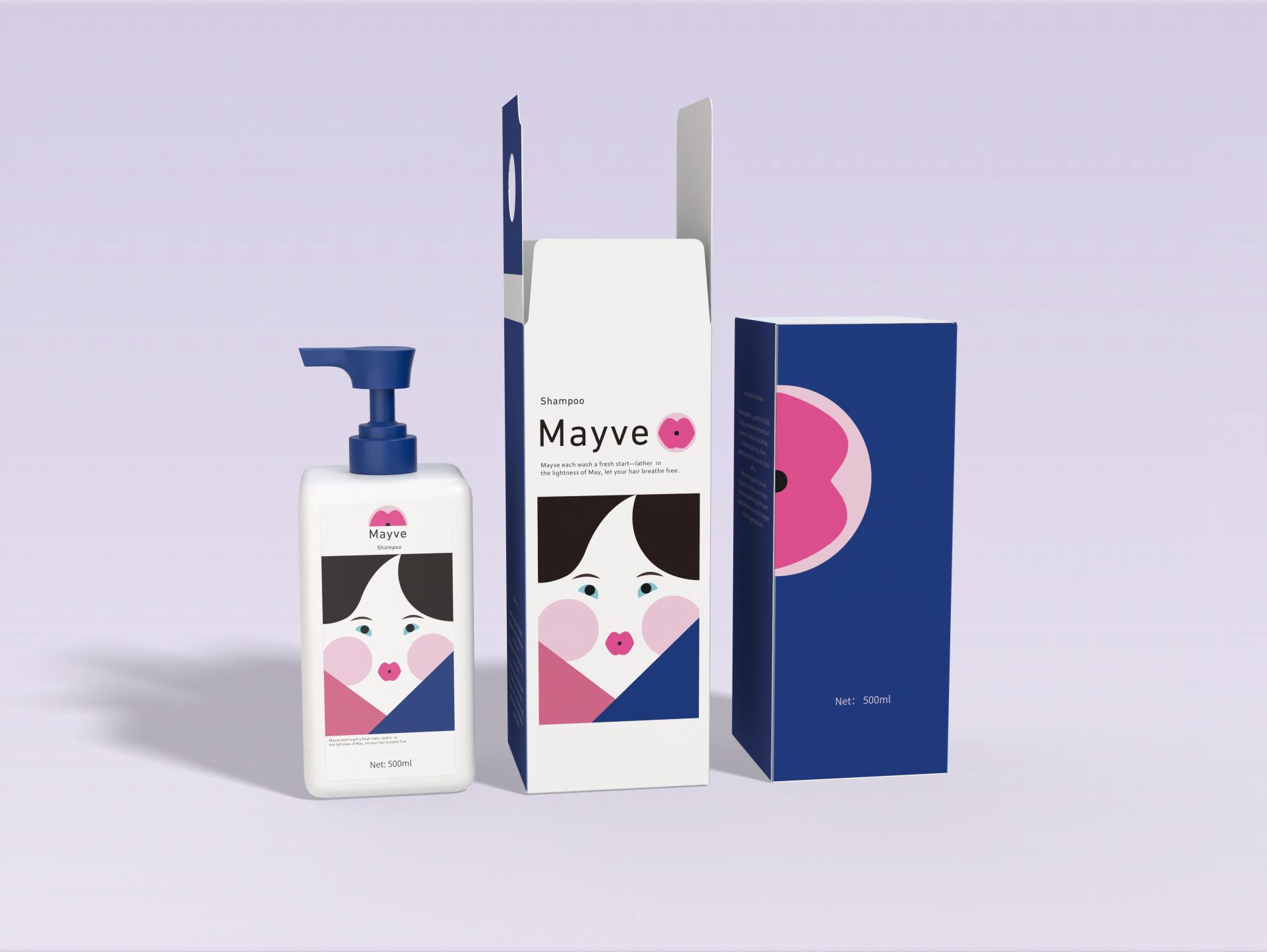
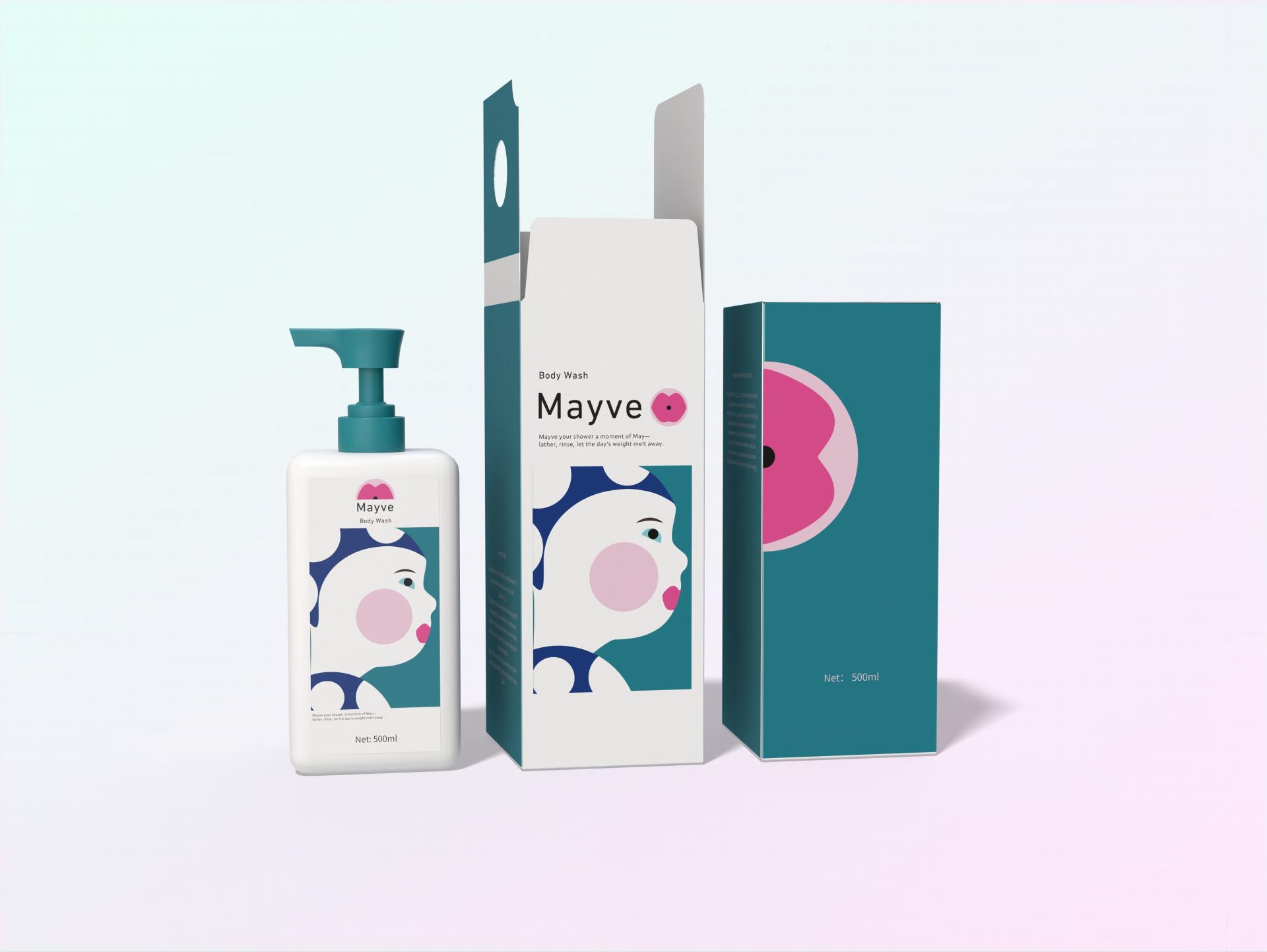
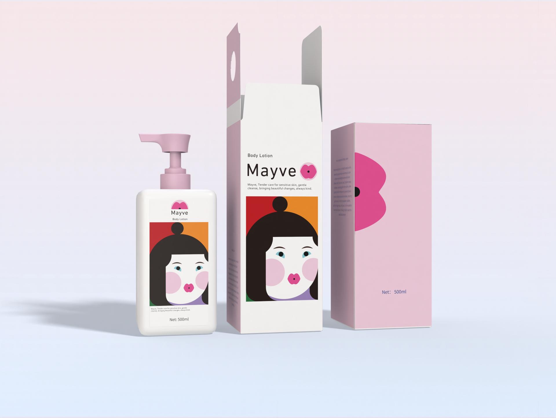
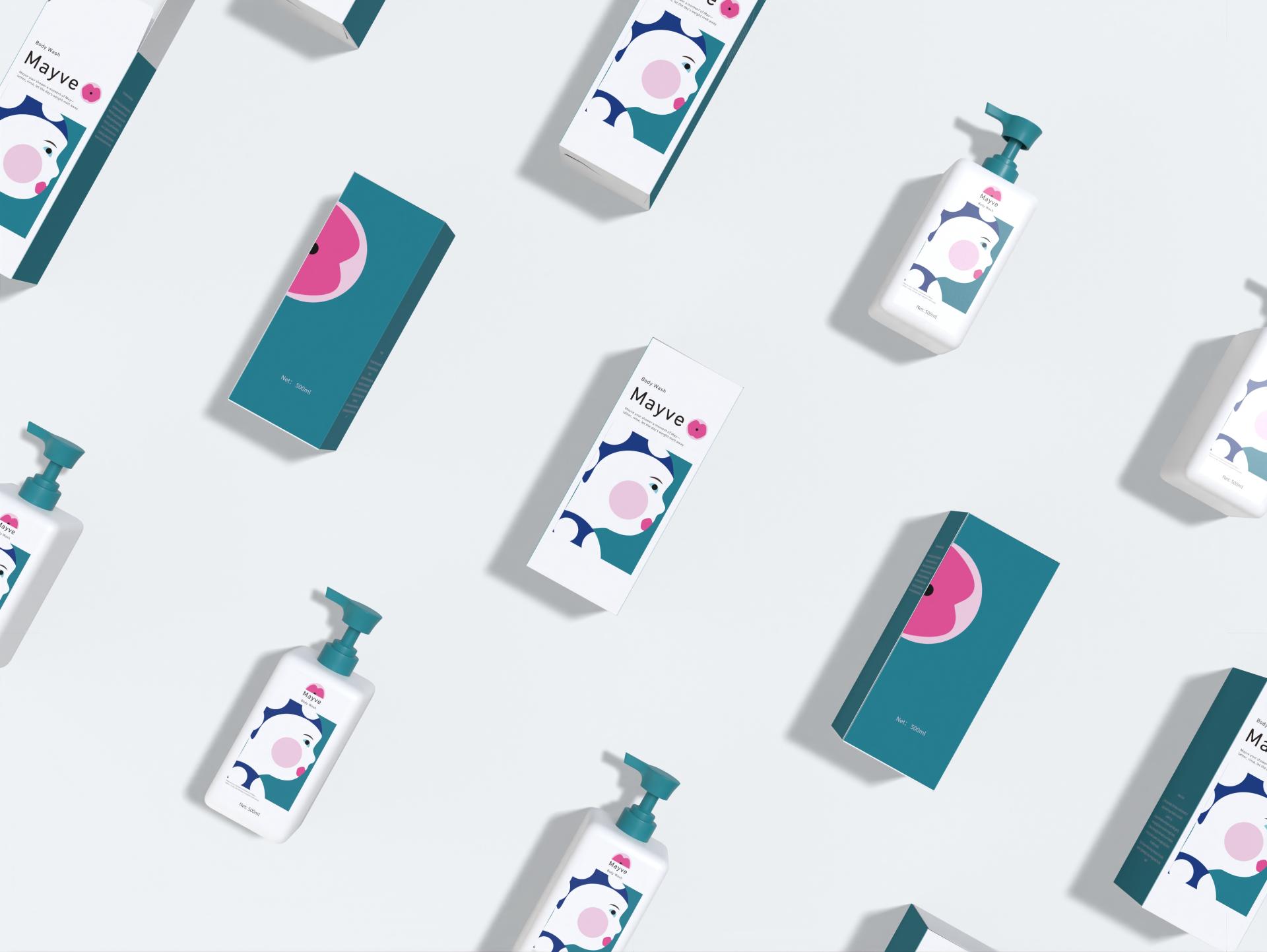
In today’s personal care market, consumers increasingly seek products tailored to specific skin needs. Adults with sensitive skin and children with delicate skin often struggle to find options that are both mild and effective. This packaging design addresses that need by creating a visual language that speaks directly to these audiences, conveying safety, gentleness, and emotional warmth.
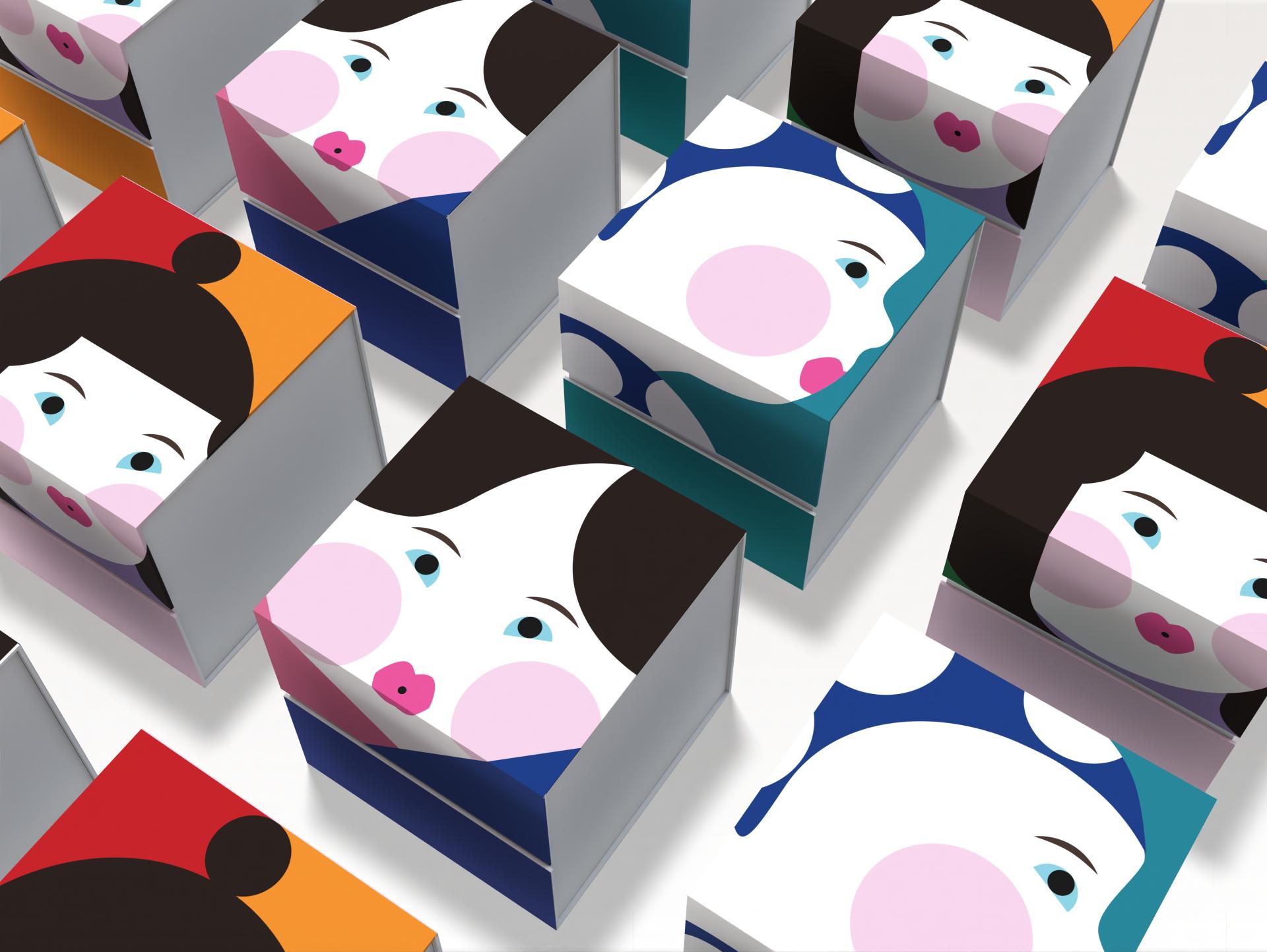
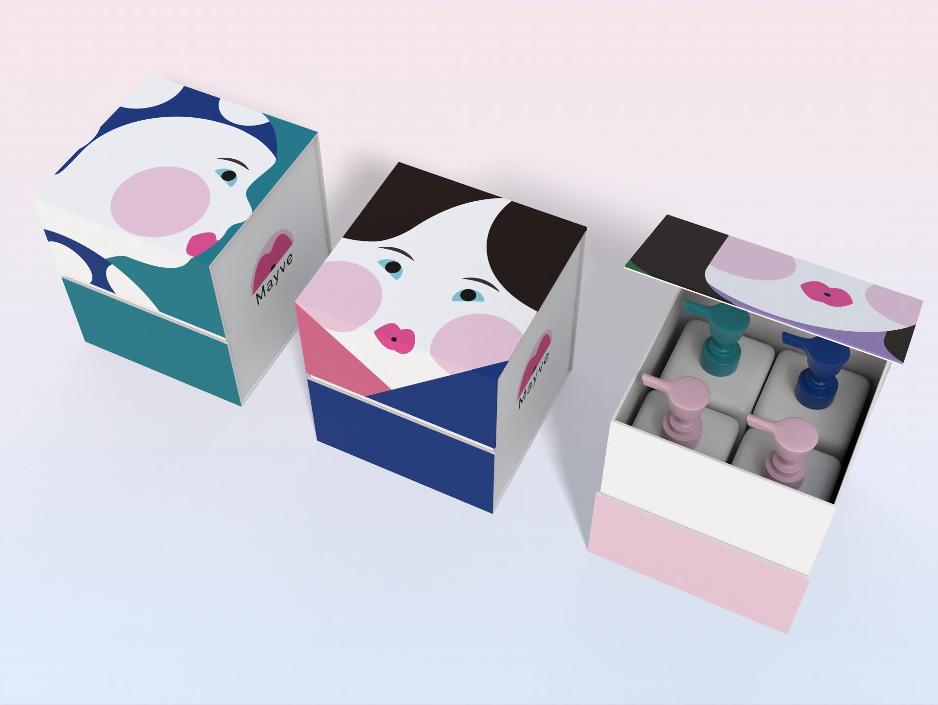
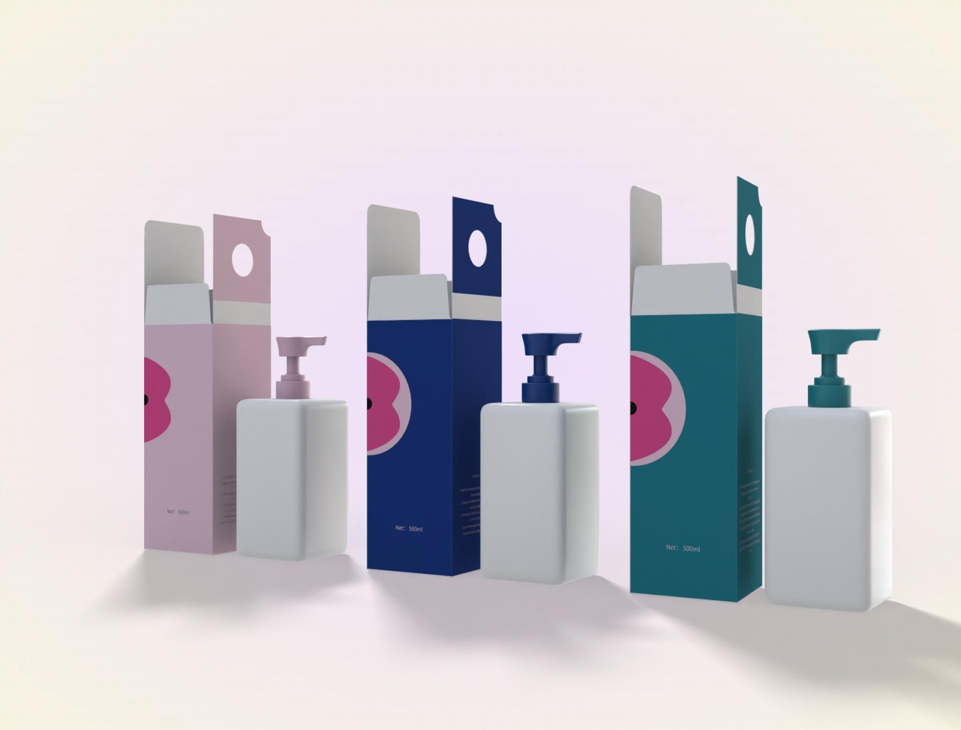
The core concept is "Caring for Sensitive Skin." The design focuses on users with easily irritated skin and uses visual elements to reflect the product’s mild and comforting nature. A geometric, minimalist style is adopted, featuring a central image of a face composed of simple shapes and distinct color contrasts. This approach balances visual impact with emotional subtlety. The blush on the cheeks represents the typical redness of sensitive skin, allowing users to instinctively relate to the product.
The character image is inspired by the creator’s child. Facial features are abstracted through geometric processing, merging artistic expression with emotional authenticity. The warm palette and soft blush reinforce the product’s gentle positioning, while subtle references to Eastern aesthetics add cultural depth and elegance.
Several challenges arose during the design process. One was expressing warmth through geometric forms without making the image appear cold or rigid. This was resolved by referencing techniques from Oriental art, such as freehand brushwork and the use of negative space. These methods helped preserve facial proportions and rhythm, conveying both modernity and warmth.
Another challenge was integrating color contrast with the idea of skin sensitivity. Bold contrasts could contradict the product’s mild positioning. This was resolved with a large circular blush in soft pink, mimicking natural redness and serving as the visual focal point. It adds charm and emotional resonance while maintaining harmony.
Lastly, the image had to appeal to both adults and children. A universal face was created using round eyes and full lips—features that feel friendly to children but not overly childish for adults. Adjustments in line and color fine-tuned this balance, ensuring the design evokes a sense of care, comfort, and inclusivity for both audiences.
Credits
Entrant
enjoydesign
Category
Interior Design - Commercial
Entrant
M + Arquette
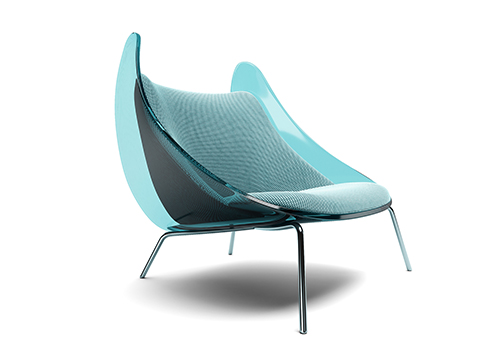
Category
Conceptual Design - Furniture

Entrant
LuXun Academy of Fine Arts
Category
Product Design - Student Design

Entrant
Sofar
Category
Conceptual Design - Interaction