2025 | Professional

Bellycious – Pasta Meal Kits for Sensitive Bellies
Entrant Company
QNY Creative
Category
Packaging Design - Prepared Food
Client's Name
My Cooking Box
Country / Region
United States
Born from the passion of My Cooking Box to spread Italian food worldwide, Bellycious was created to make authentic Italian cuisine accessible to those with dietary sensitivities. The brand founder’s mission was simple yet powerful: No bloating, no gluten, no lactose—just flavor. With Bellycious, the joy of eating pasta becomes inclusive, gut-friendly, and delicious, making it not just a personal revolution, but one shared by a growing community of health-conscious food lovers.
QNY Creative partnered with Bellycious to design its brand identity and packaging system for its U.S. launch. Targeting a predominantly female, Gen Z and Millennial audience, the design takes inspiration from 2025 packaging trends where color is hero. Each pack features a vibrant, colorful background that instantly pops on shelves and helps differentiate flavors.
The Bellycious logo embodies a bold, retro spirit with soft curves and a slightly nostalgic personality, resonating with younger consumers who value fun and authenticity. QNY also consulted on the product naming strategy, creating witty and memorable titles such as In Penne We Trust. These names bring humor and approachability to what could otherwise be seen as a restrictive “special diet” food.
Design Features
Vibrant Color Coding: Each variant is defined by a strong, trend-forward color palette, ensuring instant recognition and shelf impact.
Illustrative Touches: Minimalist hand-drawn illustrations of hands interacting with the pasta connect human warmth to the product experience.
Clean Label: Icons for “Gut Friendly,” “Low FODMAP,” “Gluten Free,” and “Dairy Free” are prominently displayed, giving clarity and reassurance at first glance.
Premium Cues: High-quality photography of the pasta plated with sauce highlights indulgence and taste appeal—showing that healthy can also be satisfying.
Bellycious breaks the mold of traditional “diet” or “free-from” food packaging by embracing boldness, color, and fun. It balances Italian authenticity with modern inclusivity, creating a strong emotional connection with its audience while standing out as a disruptive, future-facing brand in the meal kit category.


Credits

Entrant Company
BAOSHAN UNIVERSITY
Category
Interior Design - Home Décor
Entrant Company
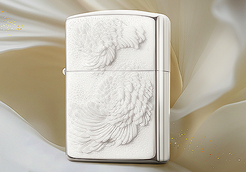
Zippo (China) Outdoor Products Co., Ltd.
Category
Product Design - Hobby & Leisure
Entrant Company
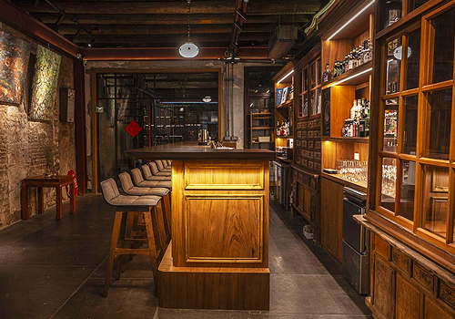
DongYan
Category
Interior Design - Restaurants & Bars
Entrant Company
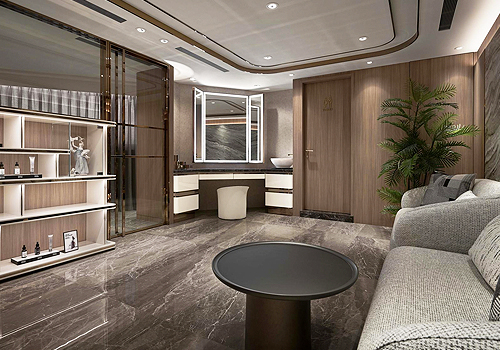
CHING CHIH MA
Category
Interior Design - Beauty Salon