2019 | Professional

Sintagma
Entrant Company
SHUMI LOVE DESIGN (TM) Branding Agency
Category
Packaging Design - Wine, Beer & Liquor
Client's Name
Equinox
Country / Region
Moldova
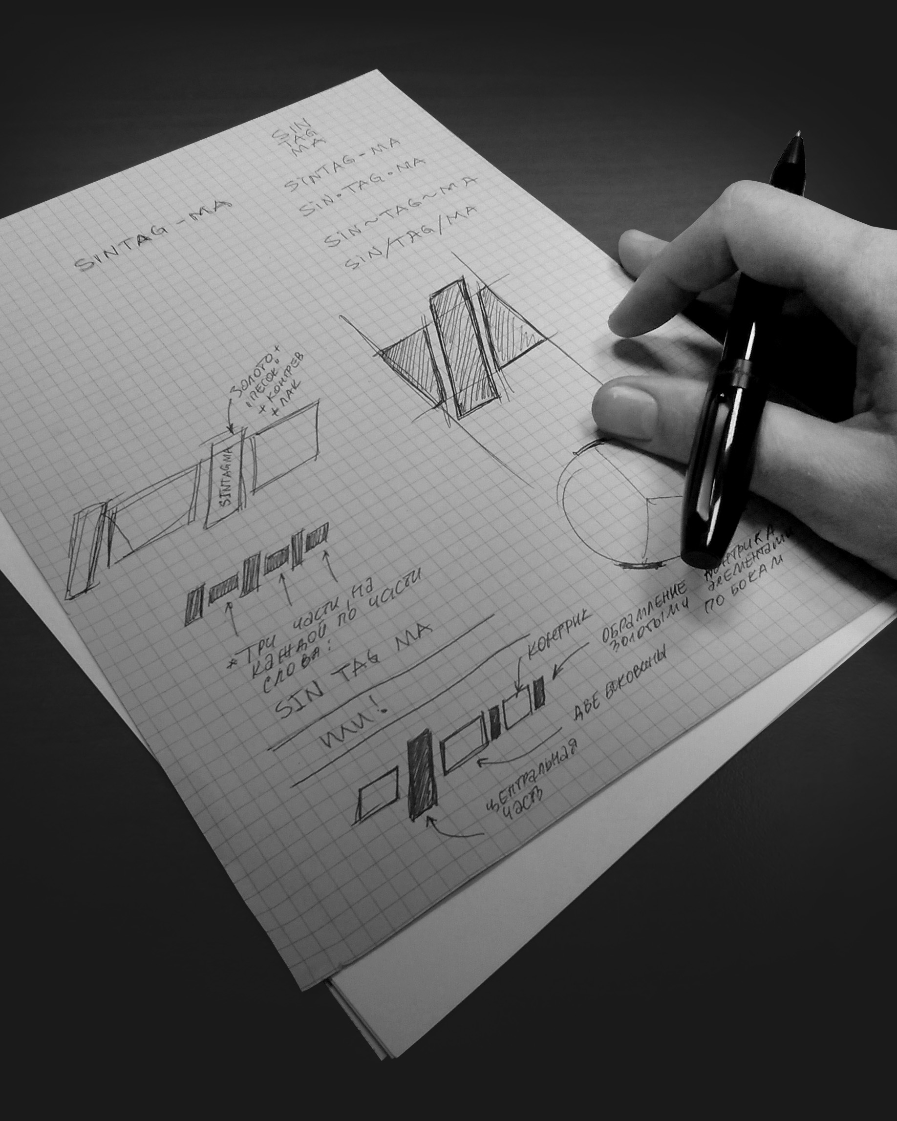
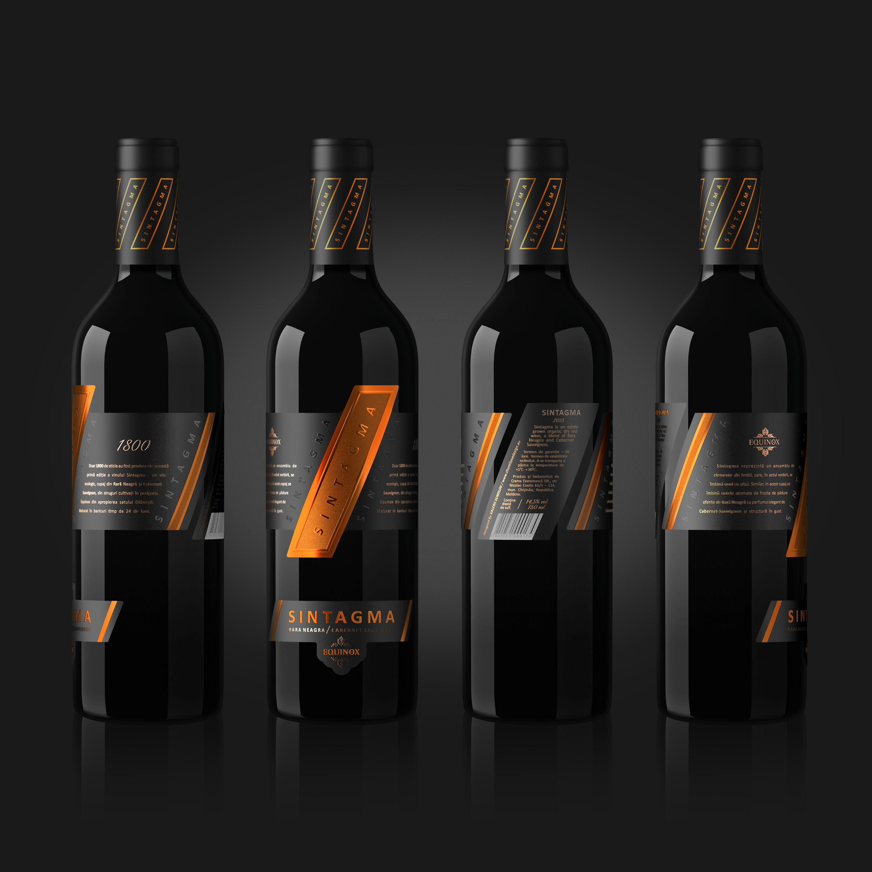
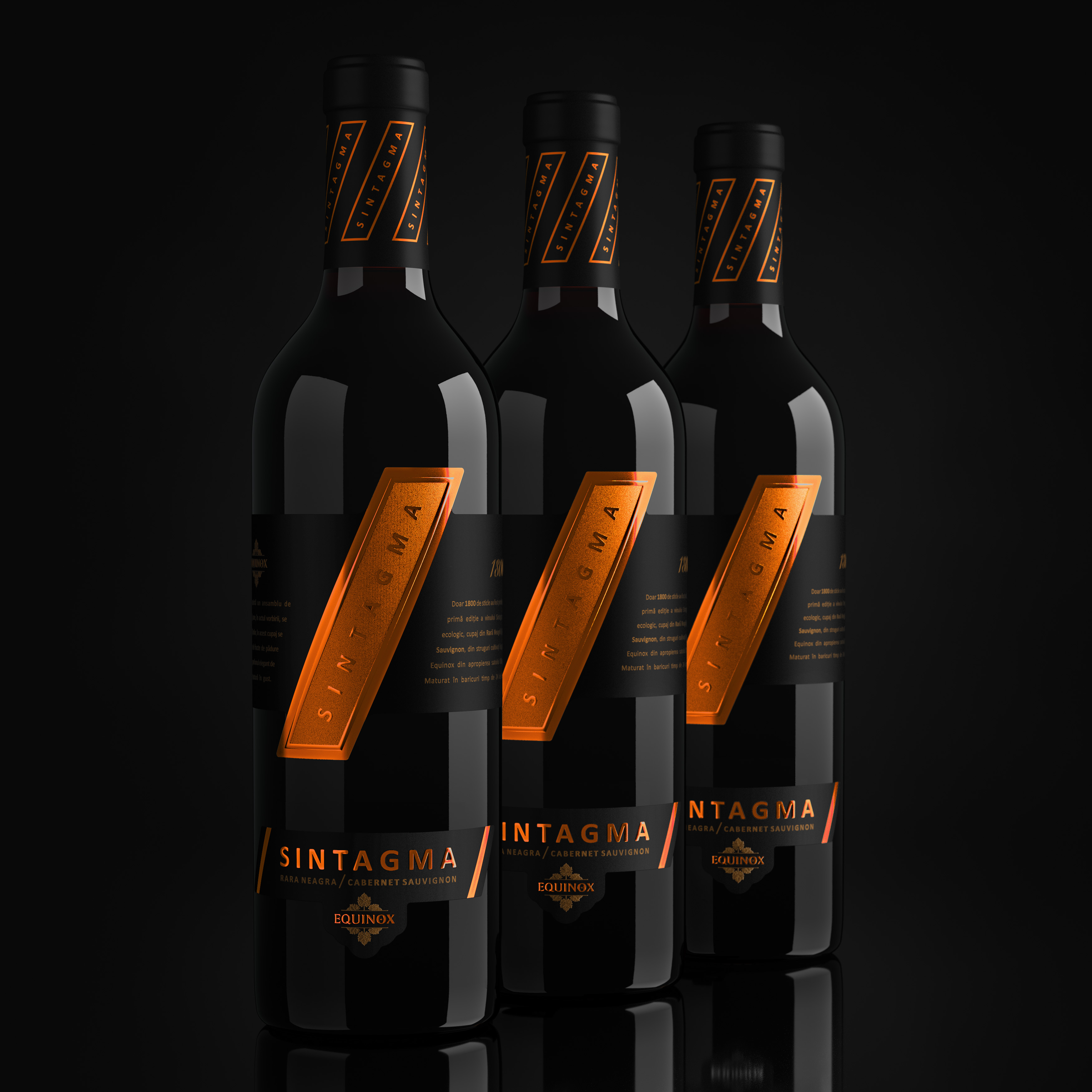
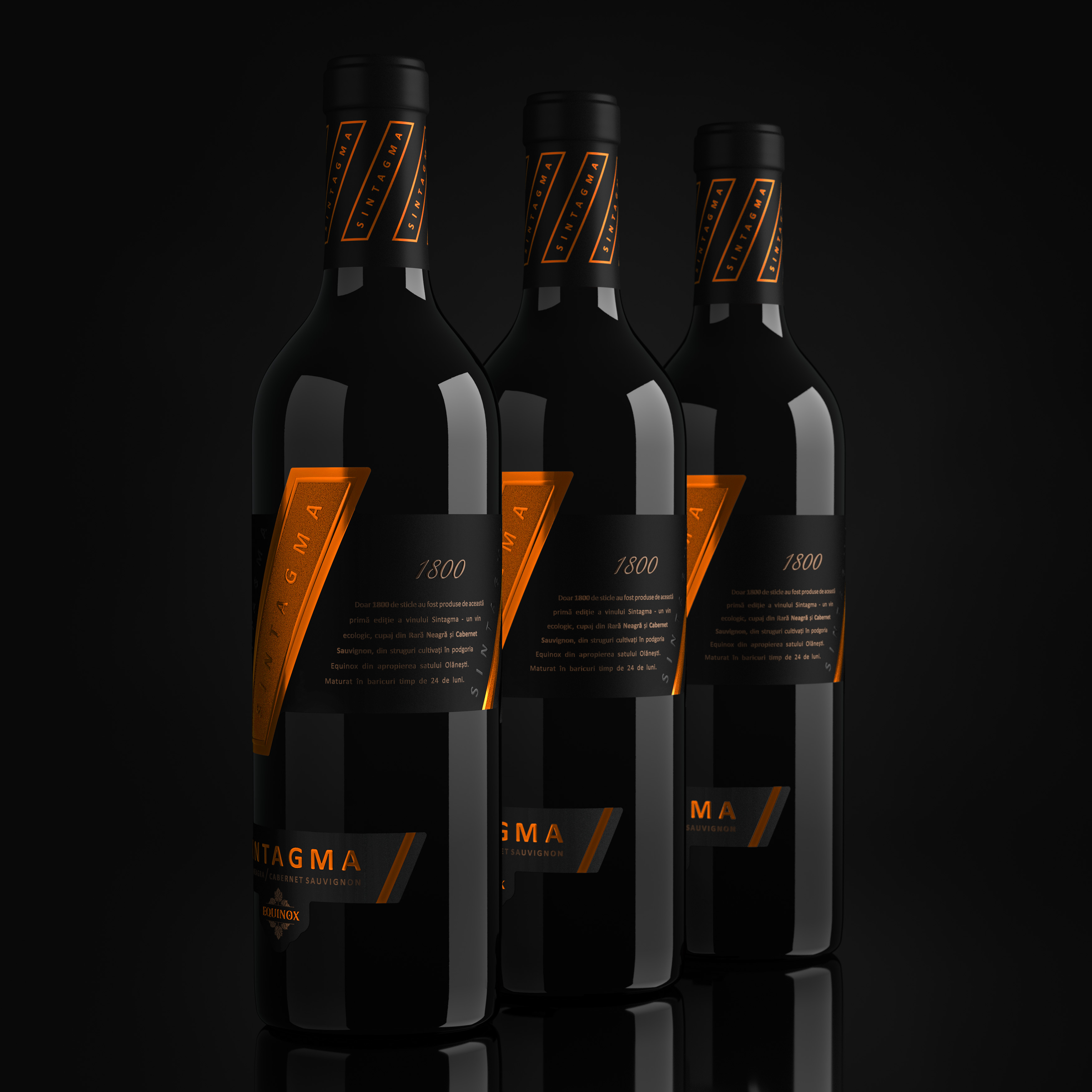
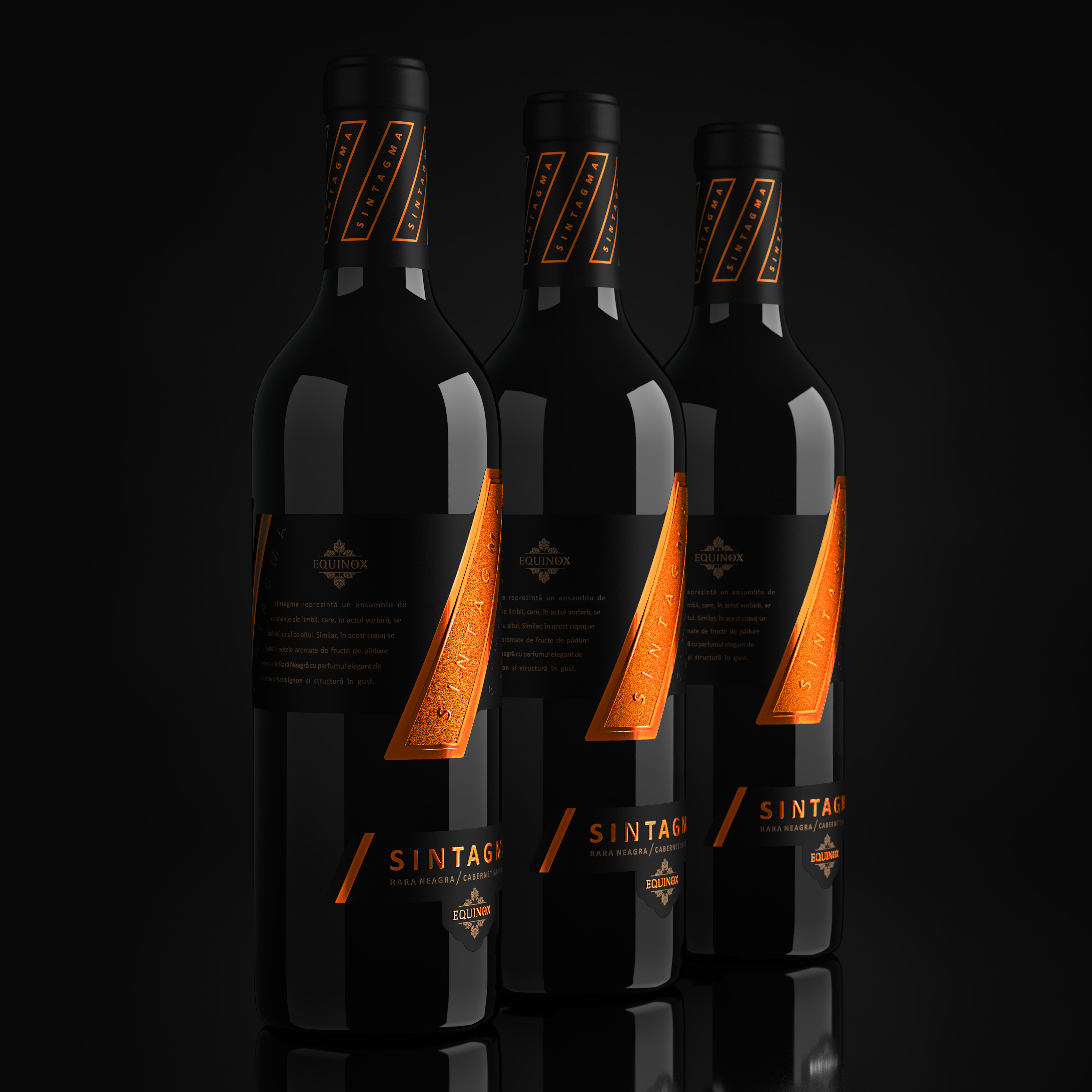
The project of complex branding for Sintagma TM is different from everything else on the food shelf. The concept of the label contains the original idea of the very meaning of Sintagma. In linguistics, this literary tool is symbolized through an inclined dash (/). It was this symbol that laid down the concept as a core element. The label fully emphasizes this idea, smoothly combining, articulating and mixing various elements and parts of a design with this single central concept.
During the development of this design we made full use of modern printing and post-printing technologies, such as embossing, stamping and special tactile polish. Printing was executed on high-quality paper, which, in combination with the use of a whole range of techniques, made it possible to achieve a perfect accomplishment of visual design and to deliver pleasant tactile sensations at the direct contact with the product in the store.
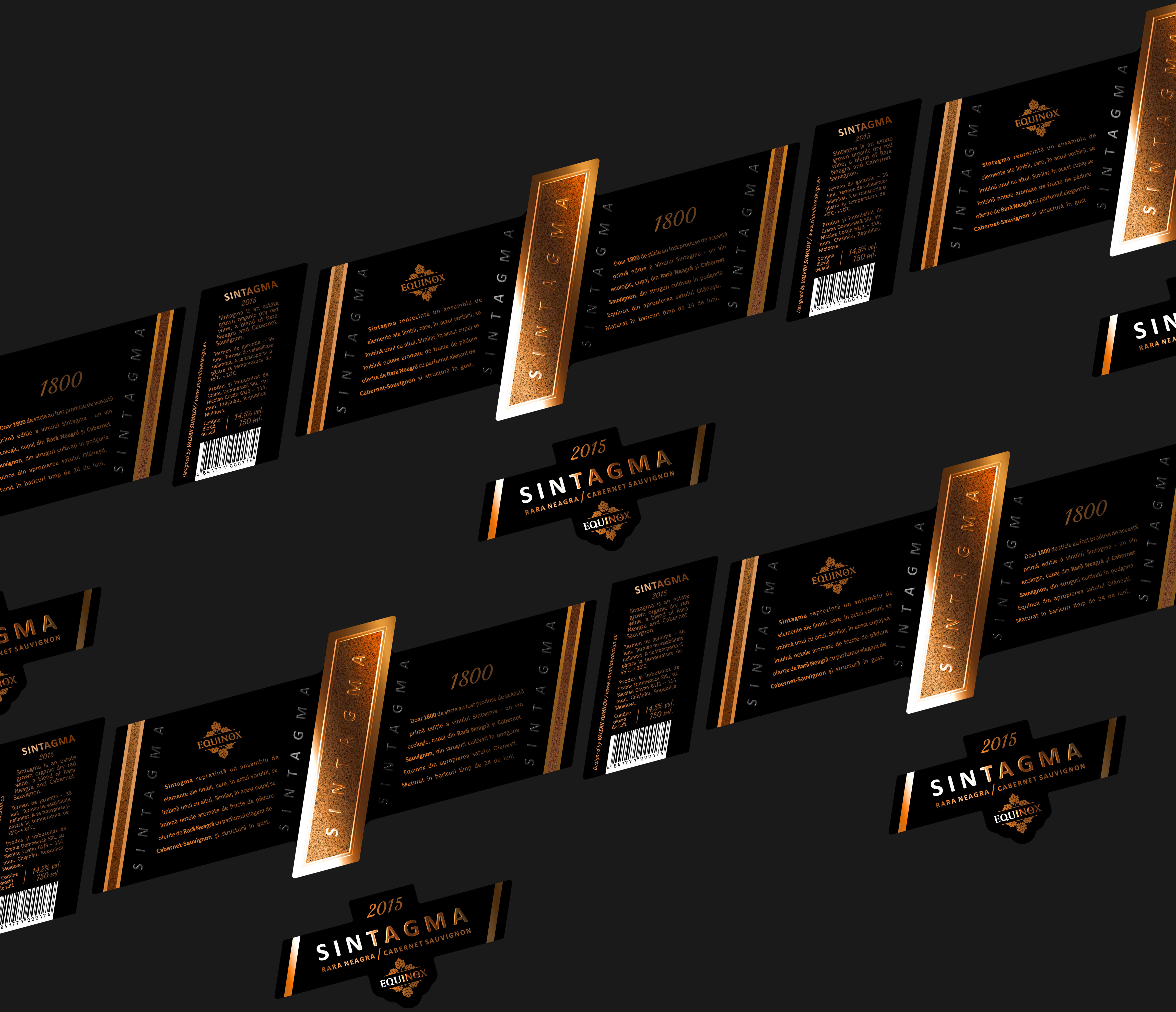
Label dimensions: 266 mm Х 148 mm. The label fully encircles the bottle. At the same time, it is a complex structure that consists of several parts. As a result, when glued on the bottle, the label ensures a continuous consistent single composition, a unique design in which the front and the reverse labels are harmoniously combined.
The label completely encircles the bottle. This interesting, exclusive design will undoubtedly catch the eye of the consumers, making them take the bottle into their own hands to examine it in more detail. Thus, the consumer interacts with the product even before its purchase, which will certainly boost product sales.
Entrant Company
Macro Vision Design Co., Ltd.
Category
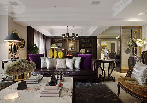
Interior Design - Other Interior Designs

Entrant Company
Fayi Interior Design Co., Ltd.
Category
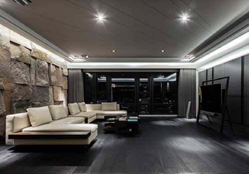
Interior Design - Residential

Entrant Company
INKDESIGN space interior renovation CO,. Ltd
Category
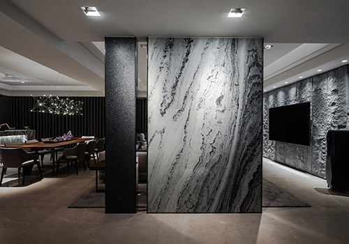
Interior Design - Living Spaces

Entrant Company
KEVIN CHU INTERIOR DESIGN STUDIO
Category
Interior Design - Living Spaces
