2021 | Professional
明园
Entrant
深圳市之明设计有限公司
Category
Packaging Design - Health & Wellness
Client's Name
深圳旗晟电子有限公司
Country / Region
China
Gallery


About The Entry
The design of Mingyuan honey packaging is intended to visualize the industrious nature of bees in an intuitive and authentic way. Therefore, the honey displayed in the glass jar seems to flow sweetly on the edge with its classic golden brown, which serves as a visual sensory stimulation and metaphorically transmits the wonderful taste of honey from the taste buds to consumers directly. The upper part of the jar is wrapped with a piece of pure white tissue paper with a perforation so that it can be easily torn apart by pulling it upwards. Underneath, the real lid is exposed. Hidden on the jar is a group of small bees. They are busy looking for the source of honey as always. It is not only a large sunflower, but also pollen and nectar. The honeycombs in the honeycomb, where busy insects store the healthy nutrients they have collected hard. These different levels are intended to surprise consumers when they open the special paper for the first time, because the jar below truly reflects the natural qualities of honey.
Credits
Entrant
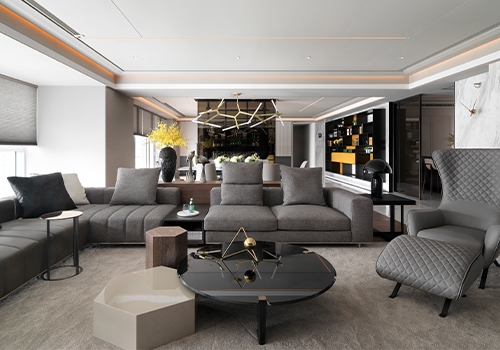
SECURE STONE ARCHITECTURAL SPACE PLANNING FIRM
Category
Interior Design - Residential

Entrant
LOGAN
Category
Landscape Design - Residential Landscape
Entrant
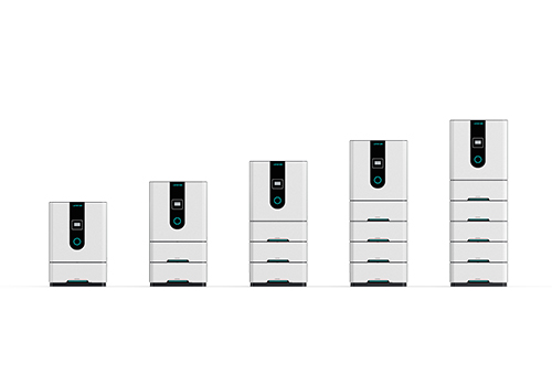
HUNAN LENERCOM TECHNOLOGY CO.,LTD.
Category
Product Design - Energy Products & Devices
Entrant
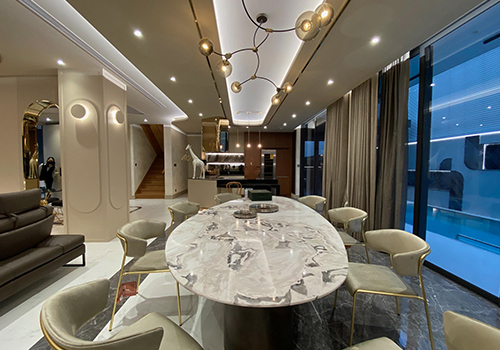
K.R.Decorate.Co.,Ltd.
Category
Interior Design - Residential