2022 | Professional
Katie's Kombucha Drinks Range
Entrant Company
Clare Lynch Creative
Category
Packaging Design - Non-Alcoholic Beverages
Client's Name
Katie McCann, Katies Kombucha
Country / Region
Ireland
Katie’s Kombucha is a healthy probiotic drink, which is good for the gut and immune system. This unpasteurised kombucha is a delicious, refreshing vegan soft drink. They operate sustainably using 100% recyclable packaging and locally sourced ingredients, supporting a circular economy. When it comes to health, the gut is a key focus area, known as the body’s ‘second brain’ – it is trusted to support the body to fuel our happiness, health and wellness. The drink contains healthy bacteria which is beneficial to our bodies.
Katie’s Kombucha is naturally fermented in small batches to 'refresh, rebalance and replenish' the body. There are two flavours – ‘Raspberry’ (flavoured with 100% raspberries) and ‘Apple & Dandelion’ (flavoured with 100% organic apples). It's unpasteurised, sustainably produced, vegan, gluten-free.
Some key factors Katie wanted to communicate with the brand was her passion for creating kombucha, how it's a healthy product that’s good for you, wholesome and natural. As the passion she has for kombucha is the essence of the brand, the design outcome created for the brand packaging design uses the silhouette of a woman, representing Katie. The silhouette of a woman has the fruits which the kombucha consists of intertwined into the shape of her hair, in a natural and organic style. To make the word ‘kombucha’ easy to read, the three syllables are displayed in a stacked block in the logo, reading ‘KOM-BU-CHA’. The hand-tailored font in the logo is earthy and rustic, communicating the natural ethos and ingredients of the kombucha. A texture with a subtle grain has been integrated with the typography and silhouette to further accentuate the wholesome qualities of the brand.
Each favour is differentiated by colour and its own fruit icon. A hand-written font is used for the flavour descriptions, emphasising the hand-made quality. An additional detail created is the unique barcode, showcasing the silhouette of leaves and berries. A hand-drawn heart '100% Vegan' icon communicates this USP. Katie’s Kombucha is sustainable and environmentally-conscious. We chose a uniquely-shaped glass bottle and used earthy, recycled ‘Shiro’ paper stock, for easy re-use and recyclability.


Credits
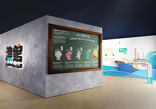
Entrant Company
IOIO Creative
Category
Conceptual Design - Exhibition & Events
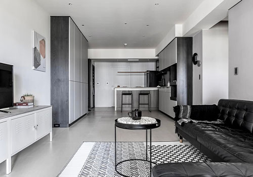
Entrant Company
National Taipei University of Business
Category
Interior Design - Residential
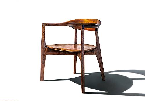
Entrant Company
KOMA.co.,ltd
Category
Furniture Design - Seating & Comfort Furniture
Entrant Company
Haolangyuan Brand Management Co., Ltd.
Category
Interior Design - Showroom / Exhibit