2022 | Professional

realpromise - Target Support Collection
Entrant
Real Promise Co. Ltd.
Category
Packaging Design - Health & Wellness
Client's Name
-
Country / Region
Taiwan
Gallery


About The Entry
In the mind of ordinary people, dietary supplements exist in the gray area between food and drugs. Unlike mouth-watering food, dietary supplements generally give people a sense of distance. How to decrease this gap? The main challenge is to breakthought the traditional, standardized, boring and cold impression of the supplement packaging design. Using artistic approach to overturn the negative stereotype of supplement packaging, our mission is to create modern, fresh and memorable product looks and high-end brand image beyond professional.
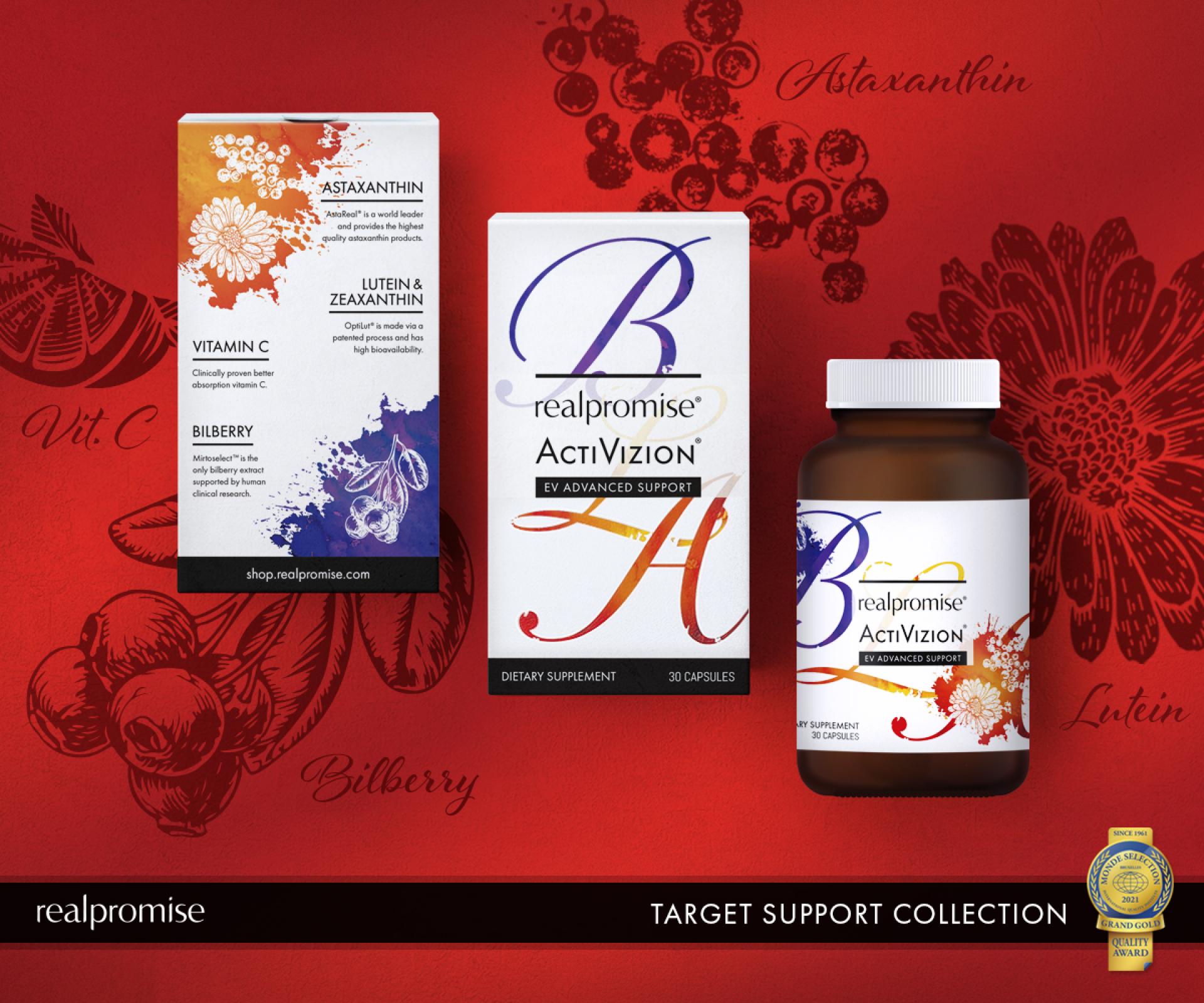
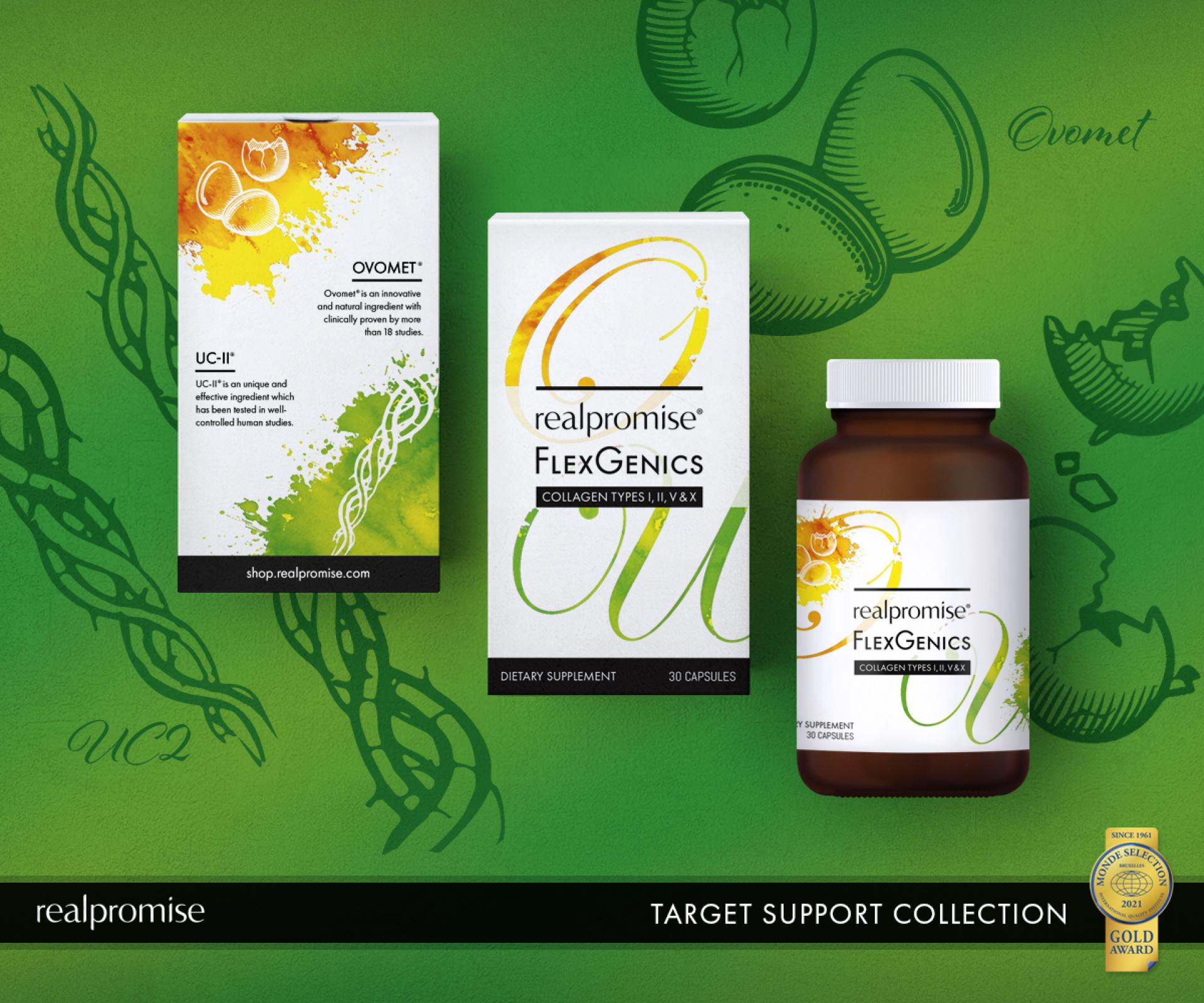
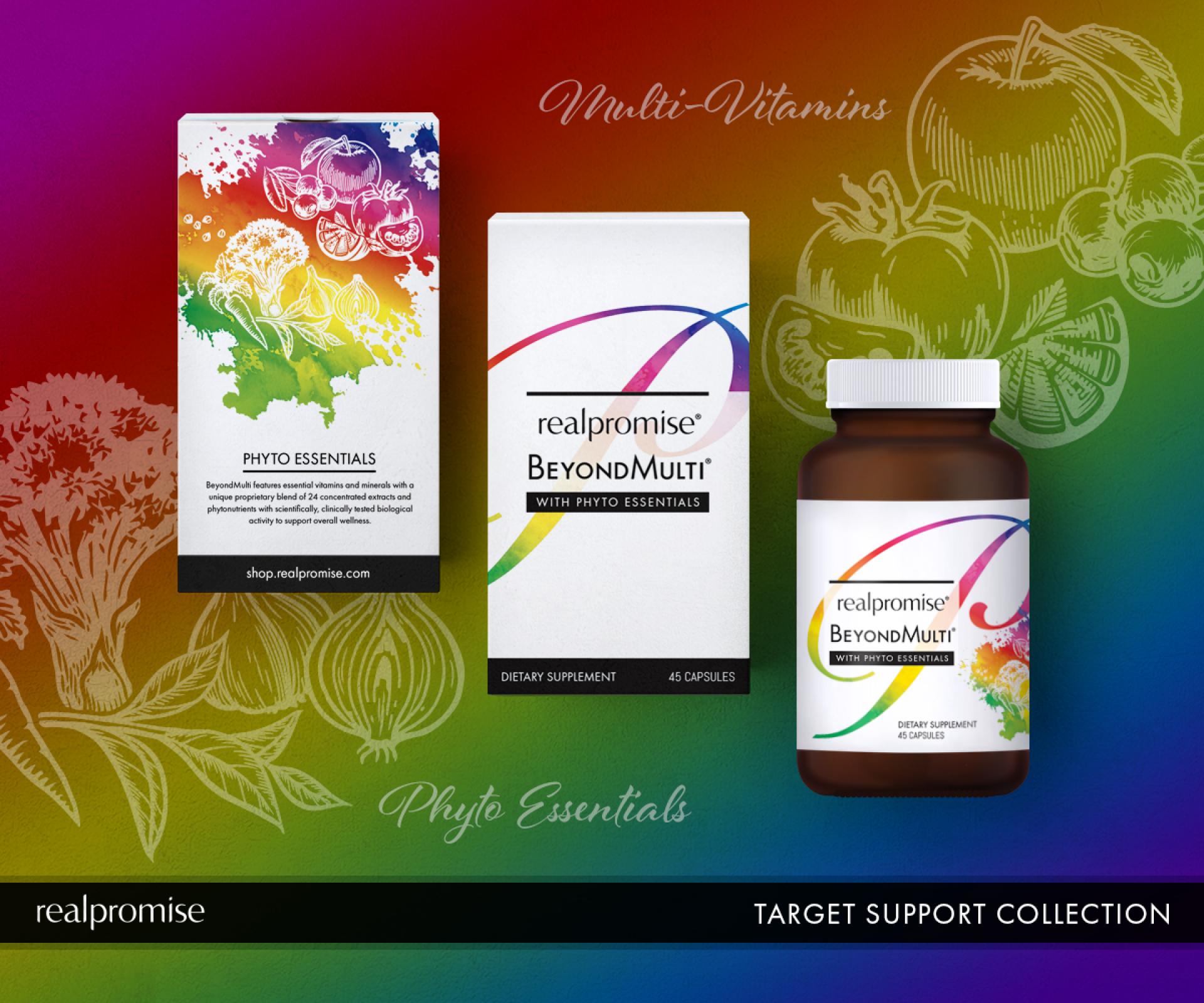
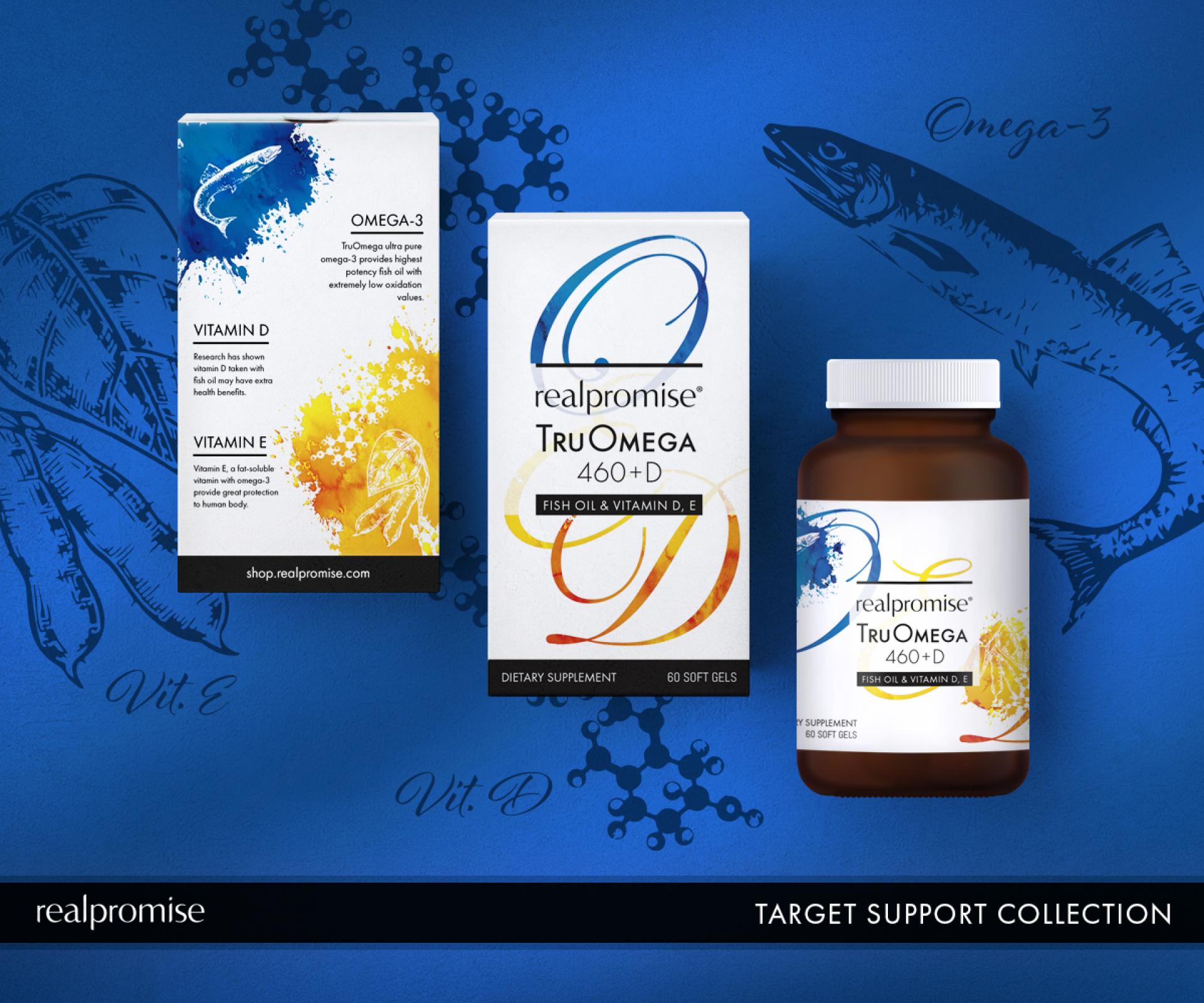
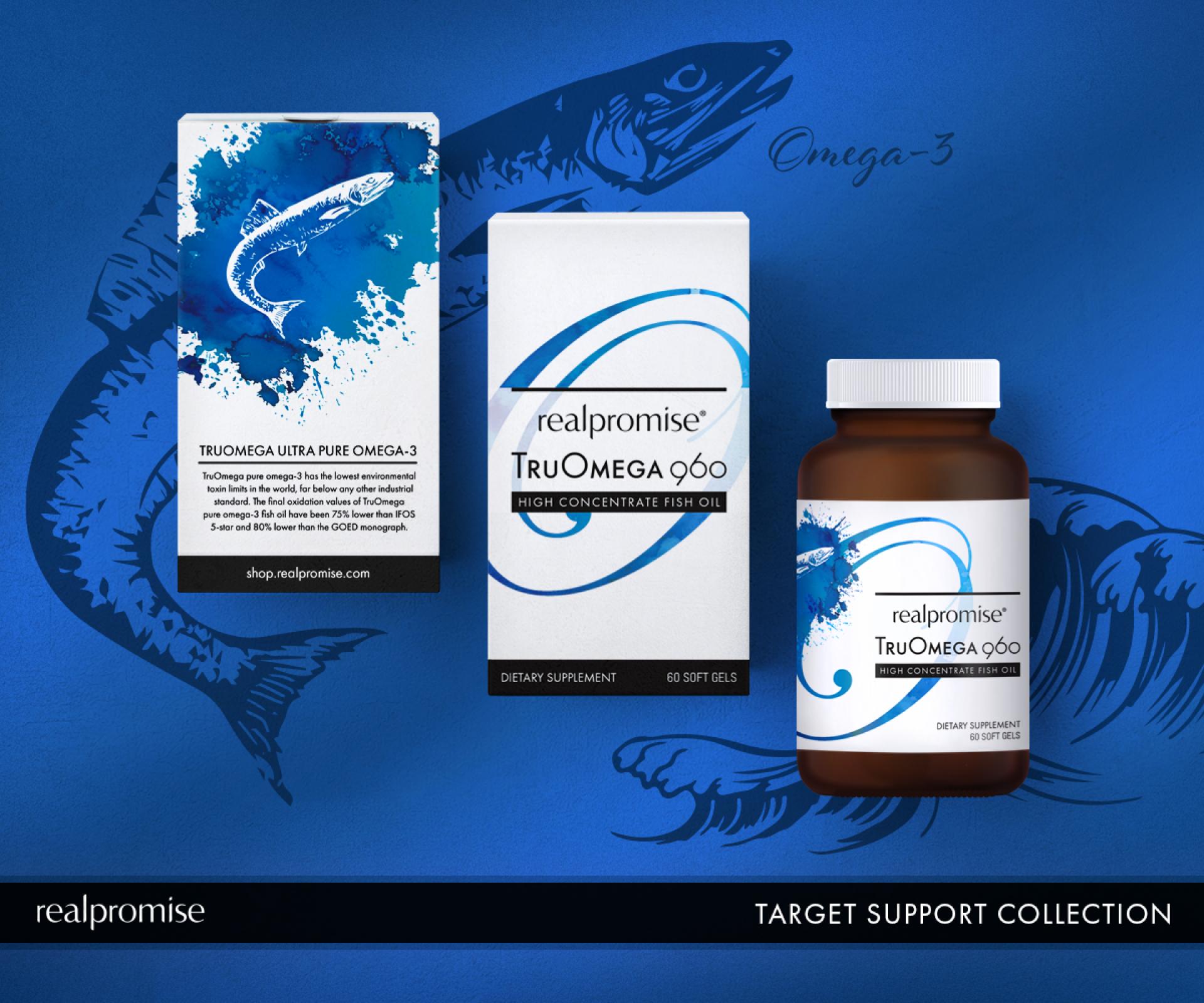
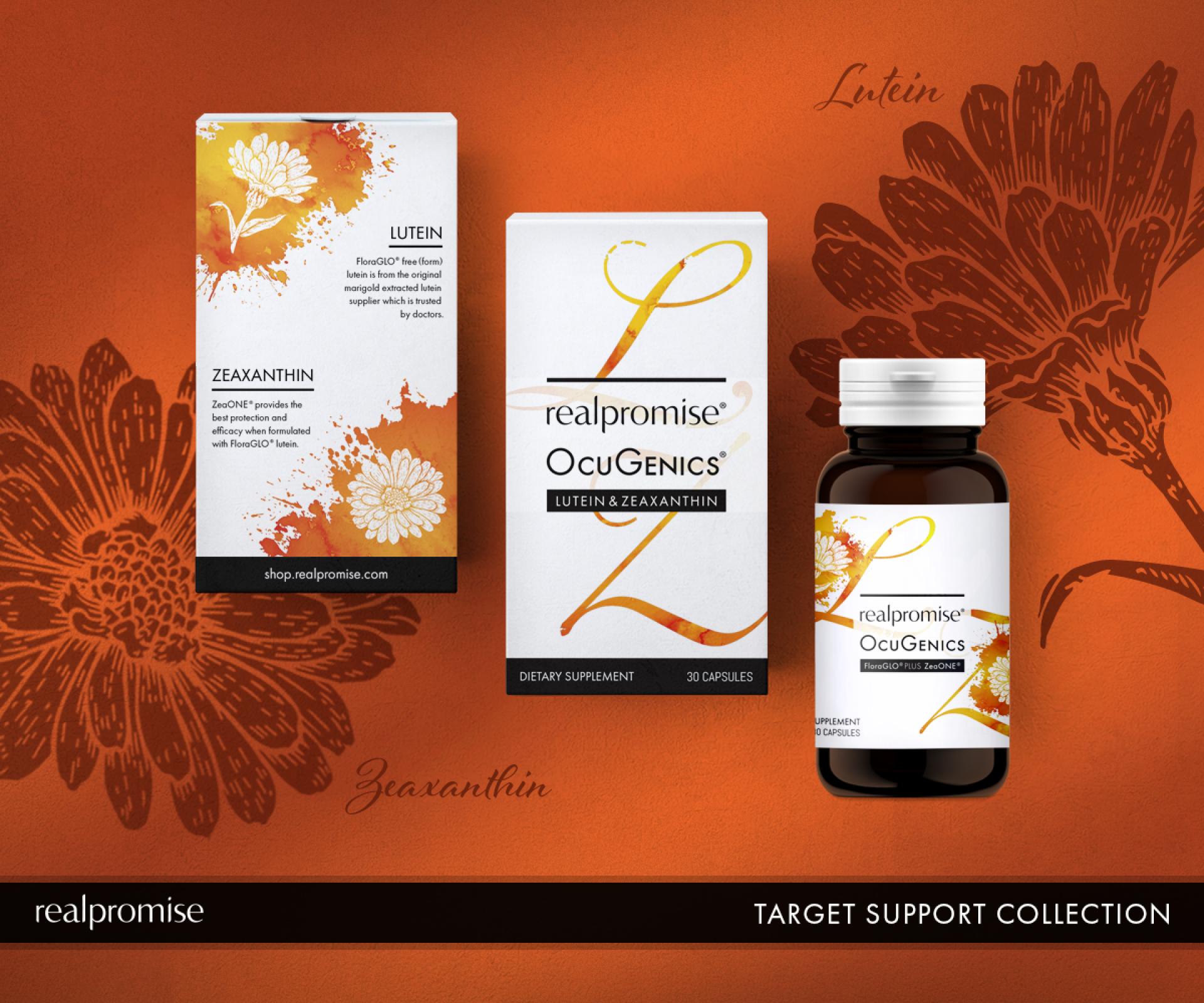
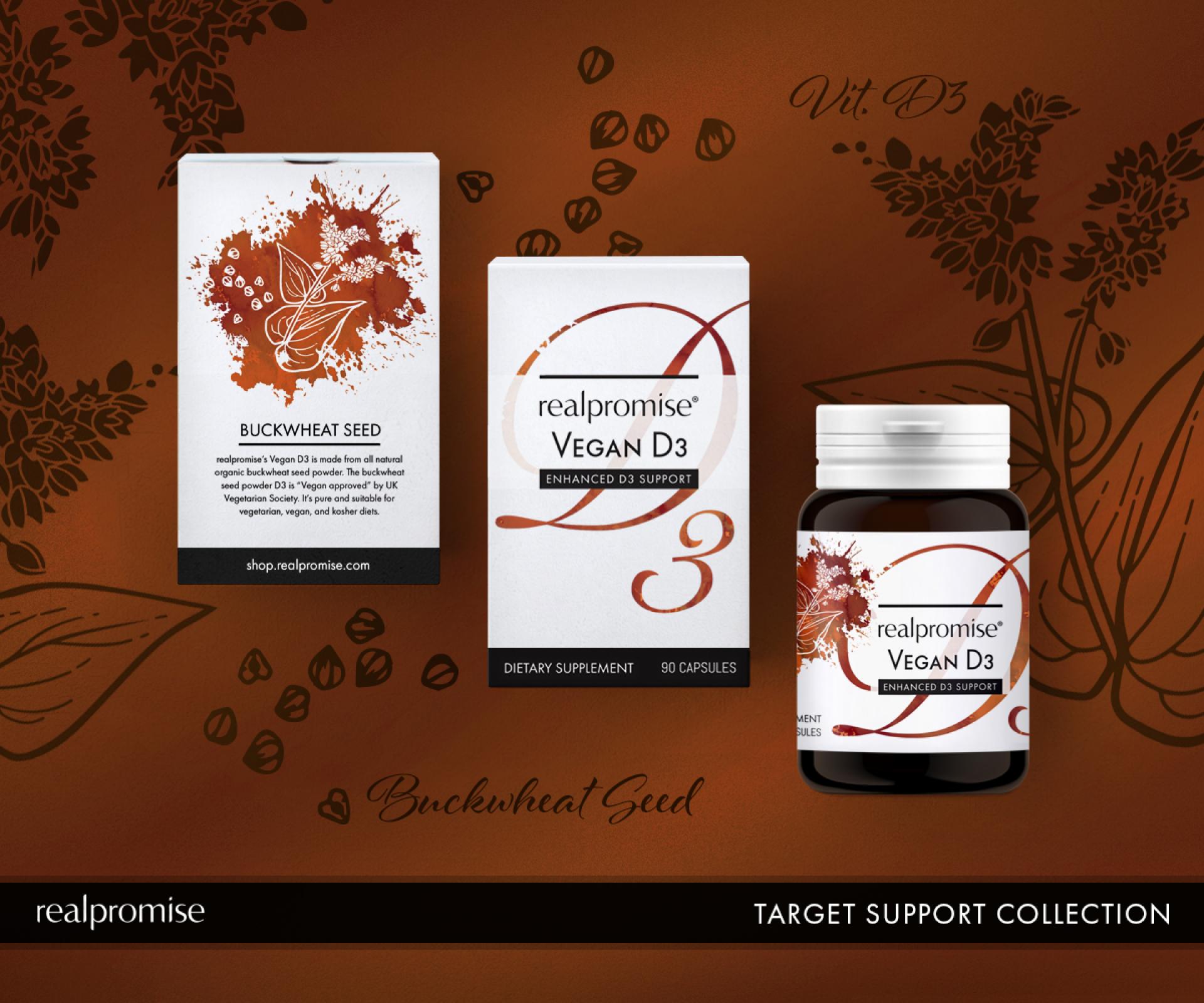
Our new product line "TARGET SUPPORT COLLECTION" is developed to target on the specific needs of the human body, such as eyes, joints, immune system, physiological function and more. The essence of this series is the quality of the ingredients, only the scientifically-proven, clinically-verified and well-known branded raw materials are chosen in order to achieve the optimal efficacy. Each product selects the highest quality, natural and active form of raw materials that could benefit the specific body part.
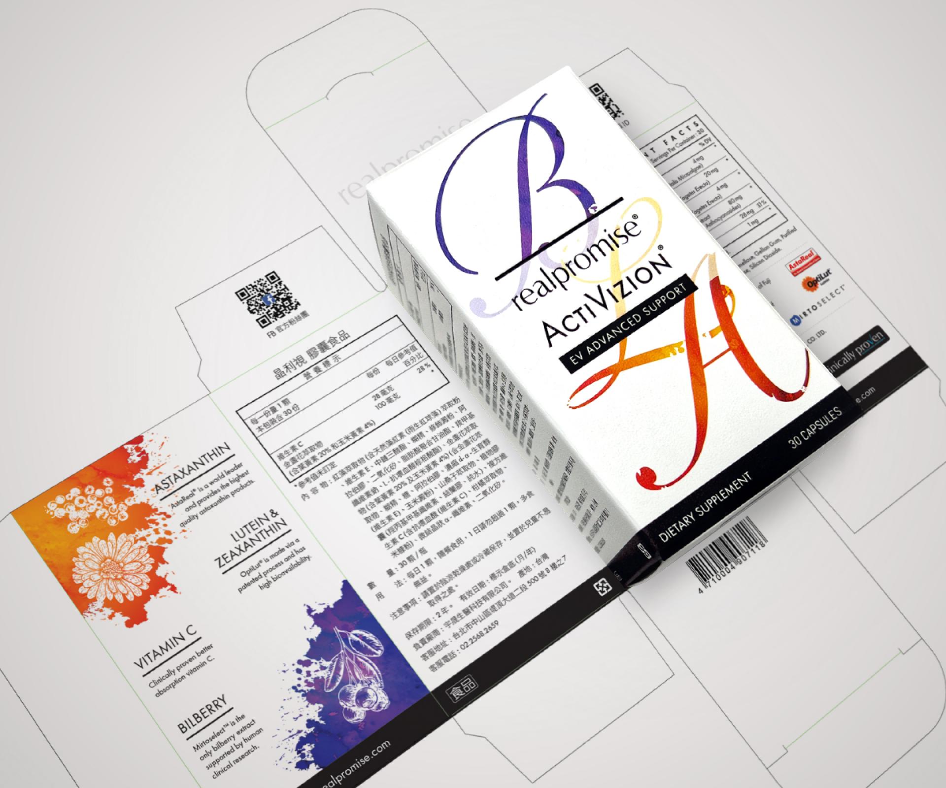
For the packaging, we echoed the core concept of the product line by using the first letter of the name or brand name of the main ingredients of each product. For example, the main ingredients for the sight improvement supplement - ACTIVIZION are Lutein, Astaxanthin, and Bilberry, so the letter “L”, "A" & "B" were used. To express the people-oriented sensibility, we chose the elegant, sensuous and smooth typeface. Each letter design was accompanied with the illustration of the ingredient in the form of woodcut prints. The woodcut art was presented by white lines to symbolize the naturalness and purity of the materials. For the base of the letters and illustrations, the shades of smudged watercolor were applied to enrich the visual effects, and delivered the beauty of softness and sensibility with warmth. Furthermore, exquisite printed on fine art paper, we hope to create a memorable moment for our customers when the product reaches their hands.
For the labelling section, we also pushed the limits to combine the aesthetics, practicality and professionalism. After all, to demonstrate the information in a clear, transparent and easy-to-understand way is a must.
Credits
Entrant
Shanghai United Design Group Co., Ltd.
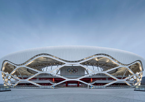
Category
Architectural Design - Rural Design
Entrant
Shenzhen Shanchun Environmental Art Design Co., Ltd.
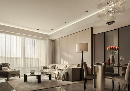
Category
Interior Design - Home Décor
Entrant
YU WEN YUAN + Associates Architects Planners Inc.
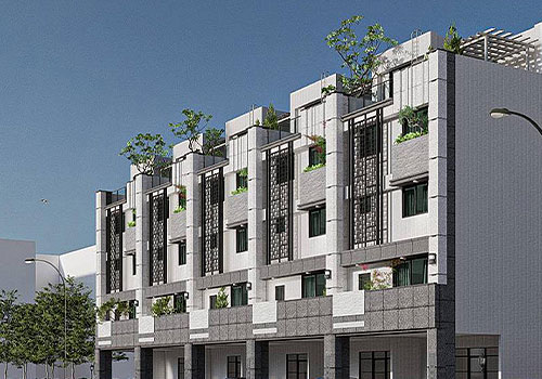
Category
Architectural Design - Residential

Entrant
Padmate
Category
Product Design - Digital & Electronic Devices