2026 | Professional

Ugly Monster Chocolate
Entrant
GOLDEN MONKEY FOOD CO., LTD.
Category
Packaging Design - Snacks, Confectionary & Desserts
Client's Name
-
Country / Region
China
Gallery

About The Entry
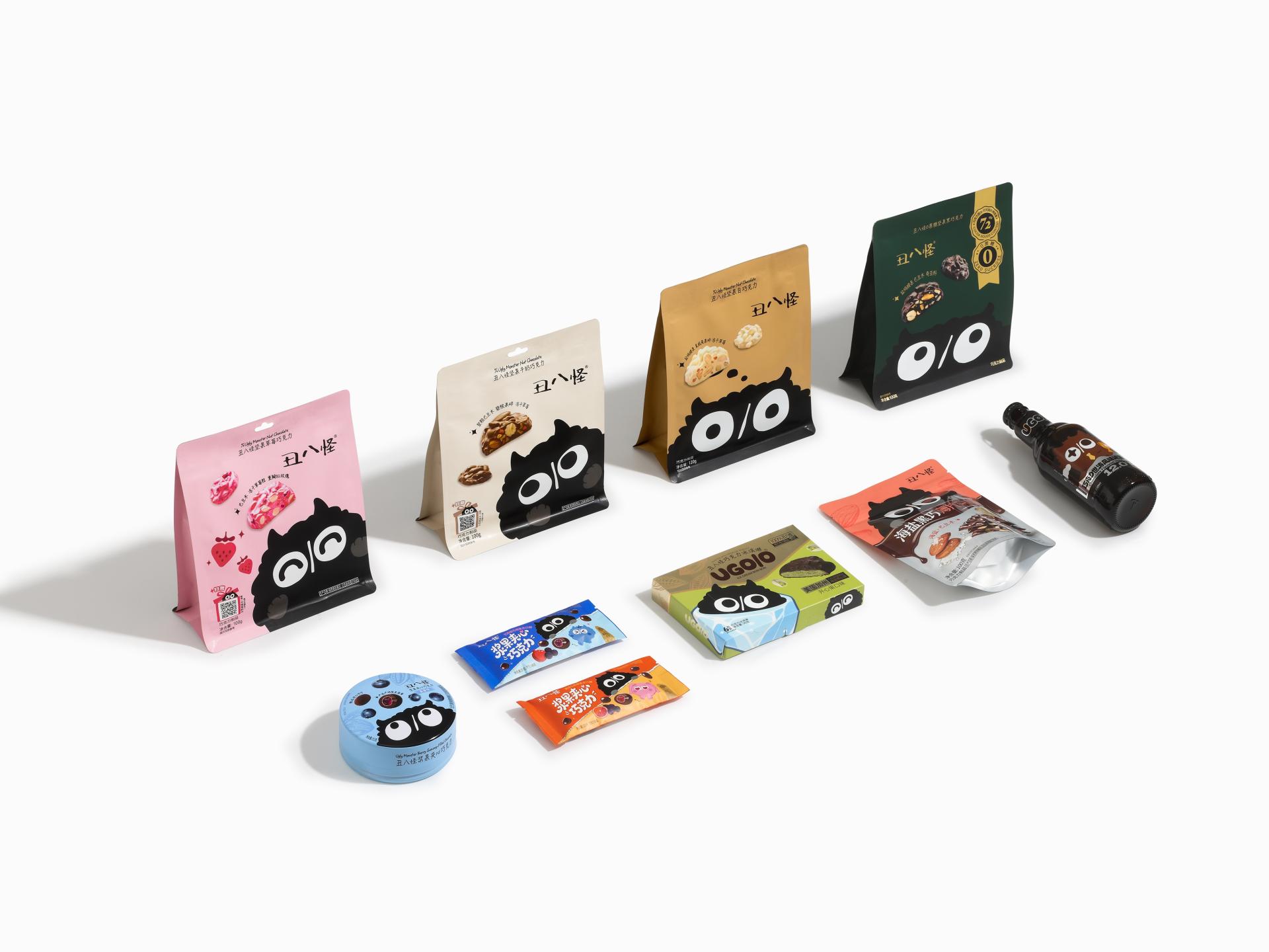
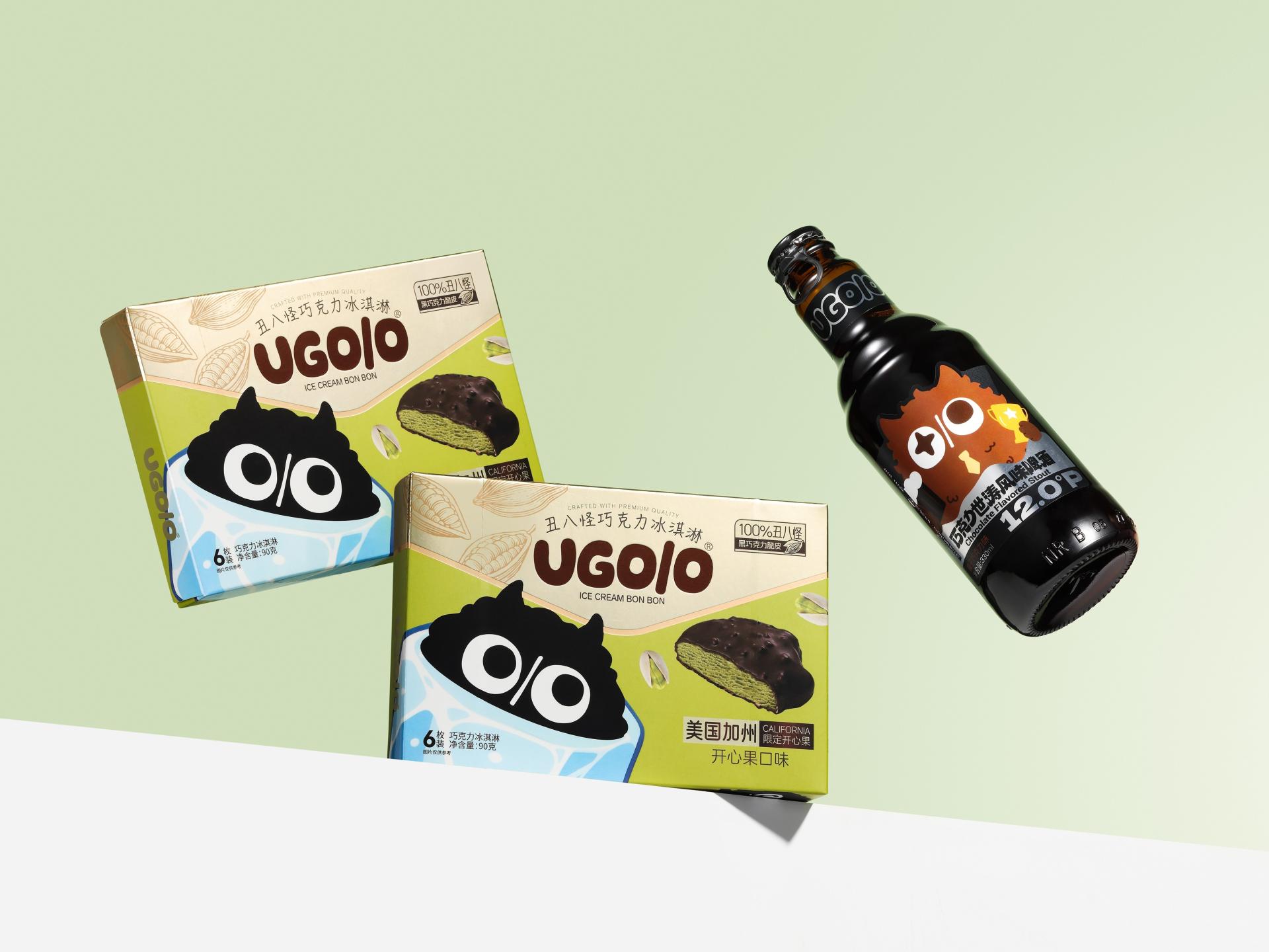
The packaging design is built around the concept of “weird fun.” It breaks away from traditional chocolate packaging styles that are either overly luxurious or cartoonish, instead embracing an “ugly-cute” aesthetic to respond to the younger generation’s pursuit of authenticity, self-expression, and a rejection of perfectionism.
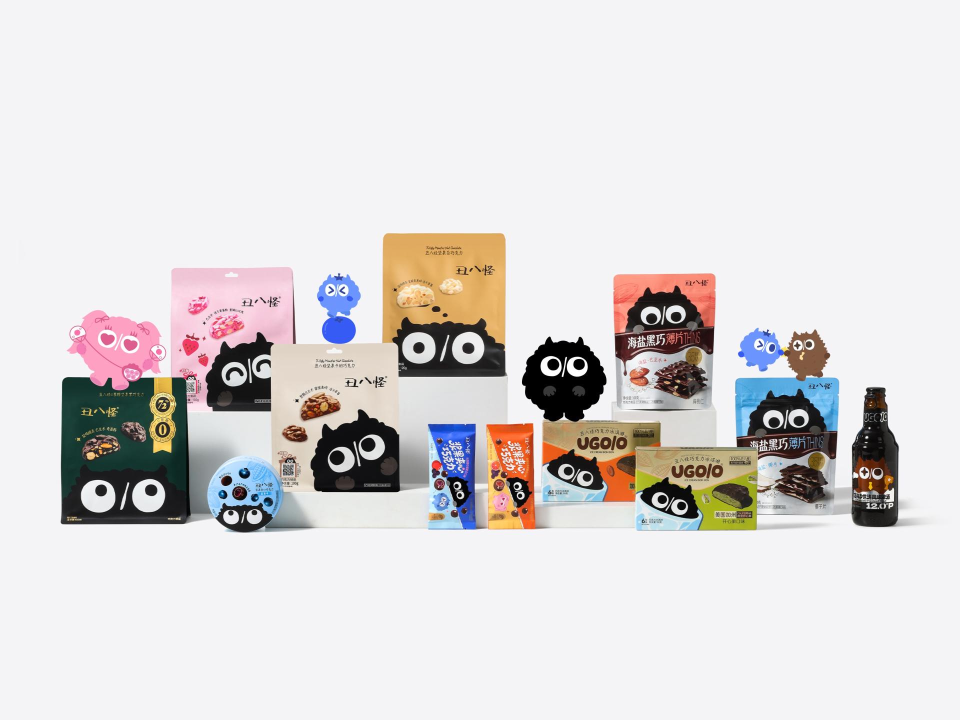
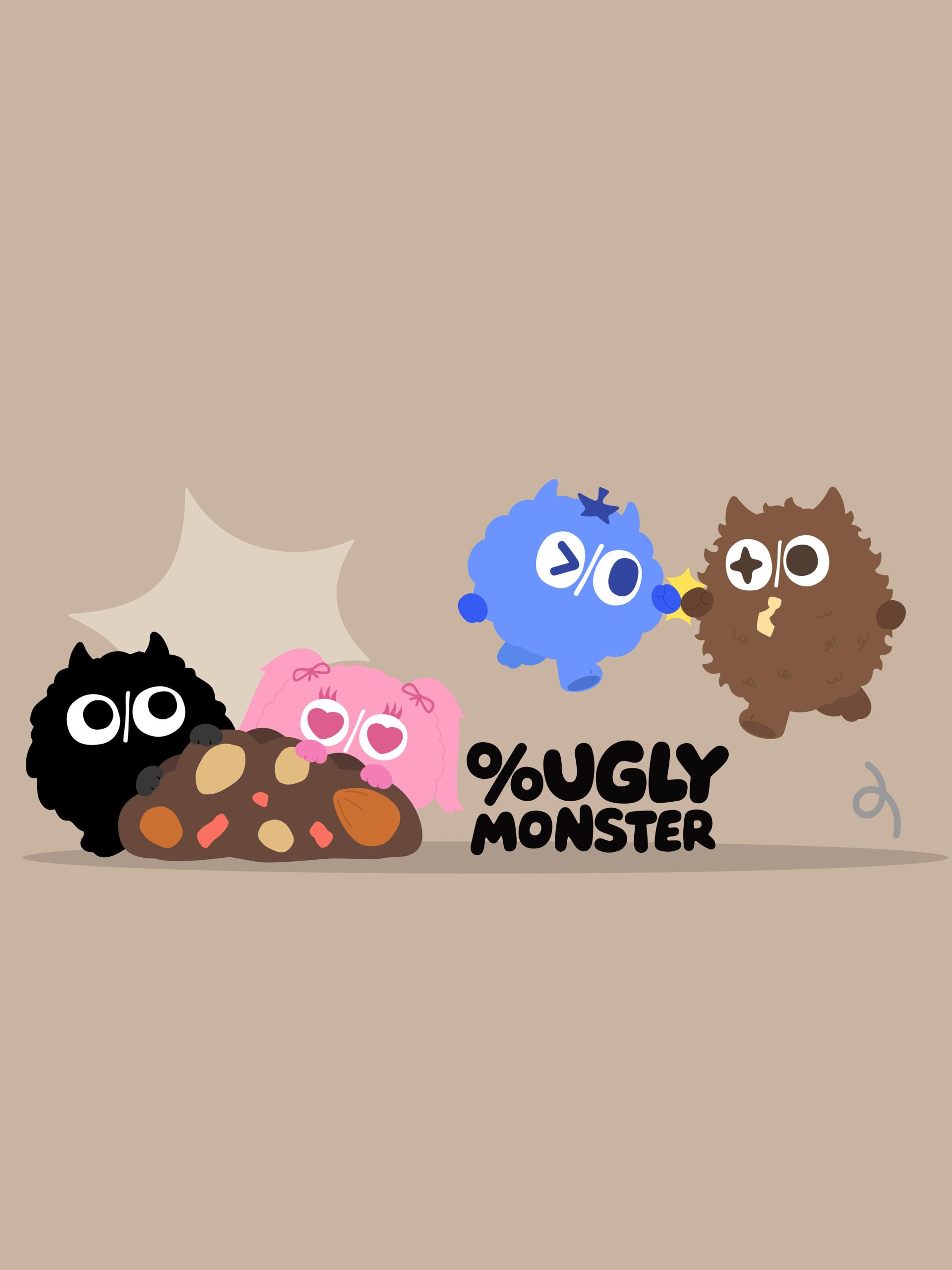
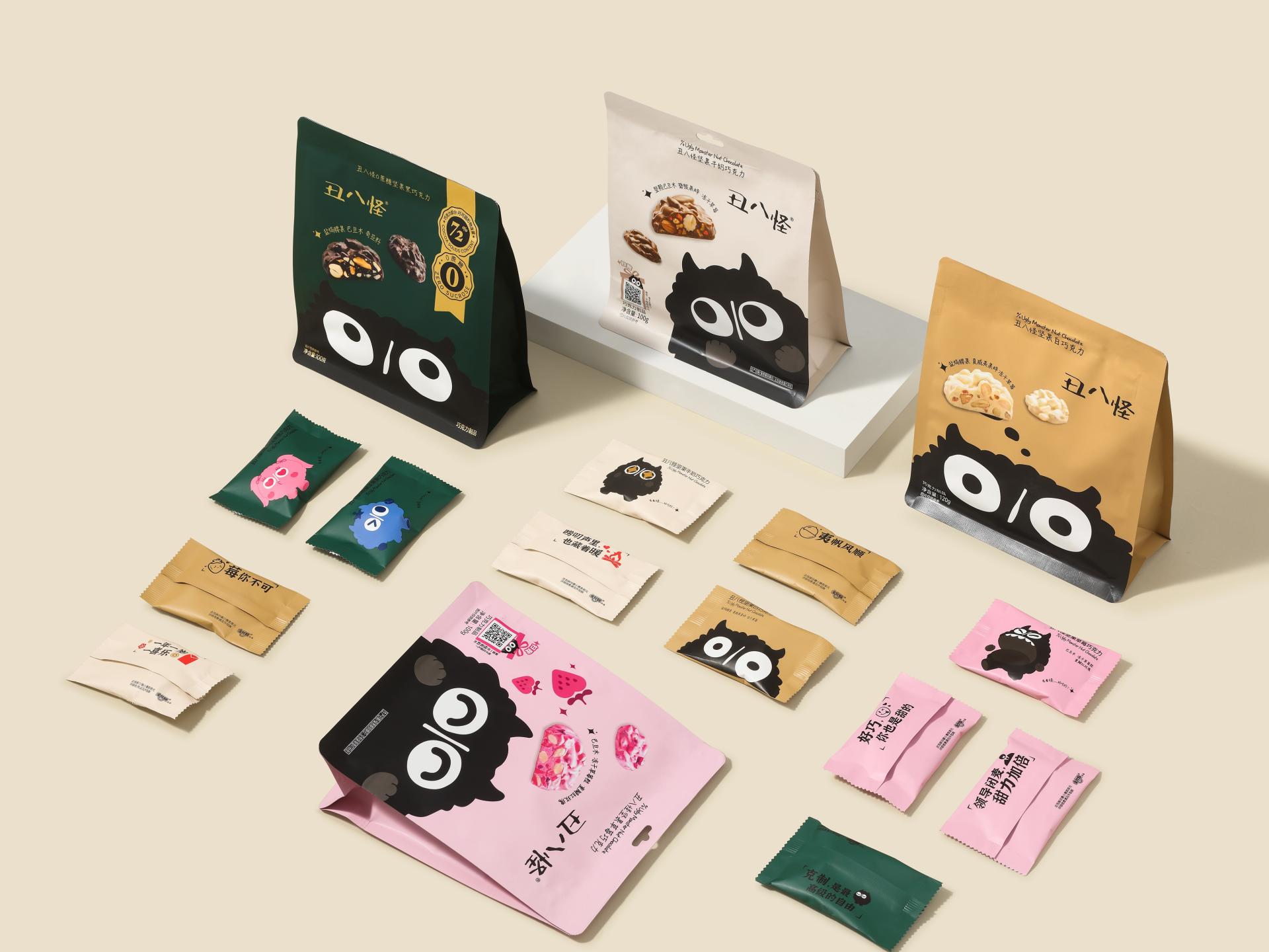
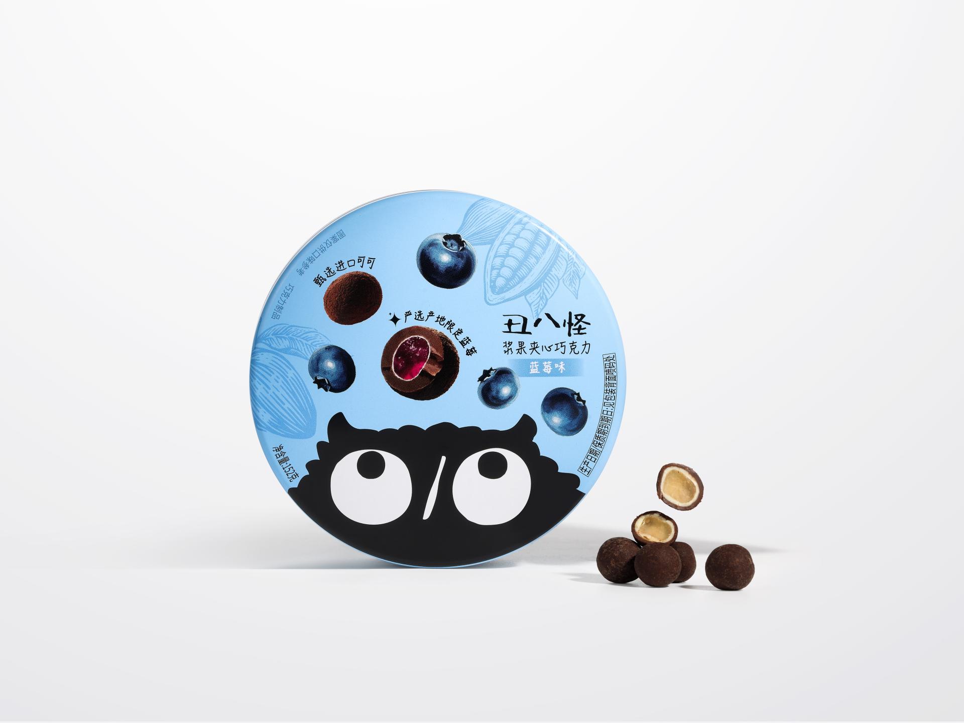
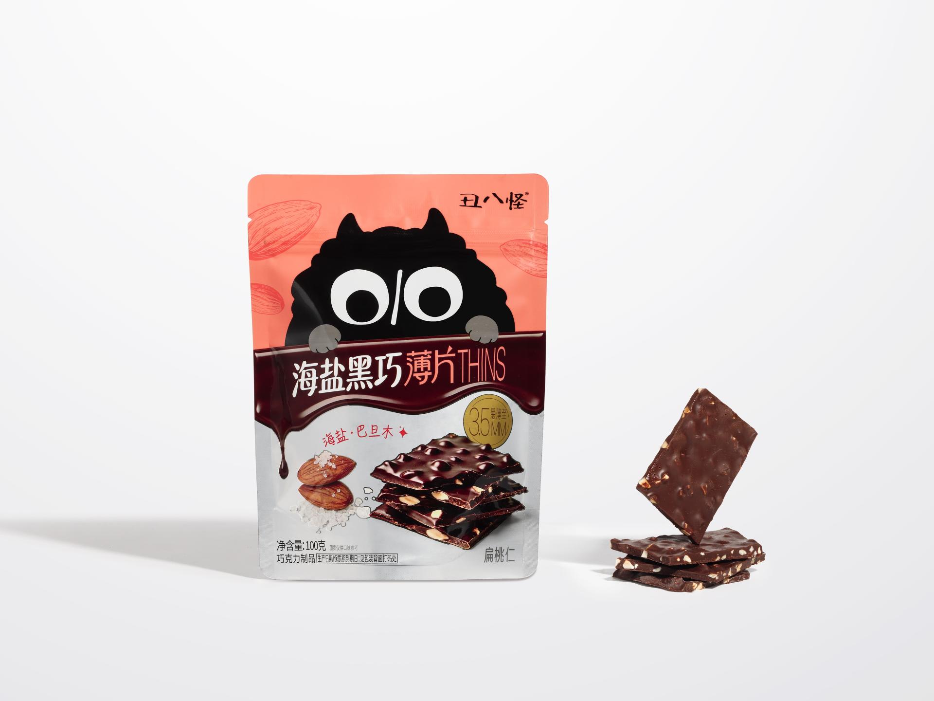
Drawing on the naturally irregular forms of chocolate, the packaging reinterprets the purity symbol “%” as a pair of signature “O/O” eyes, creating a black plush monster character with a rounded body and oversized eyes. Through playful micro-expressions such as blinking and side glances and a curious “peeking out” pose, the character feels like a friendly companion eager to share delicious chocolate, creating an engaging storytelling experience. The inner wrappers feature a collection of unique monster characters and playful taglines. With different monsters hidden across the individual packs, each unwrapping offers a new discovery, bringing the excitement of a blind-box experience to everyday chocolate enjoyment. In this way, the packaging evolves beyond a simple product container into a medium for expressing personality and emotions.
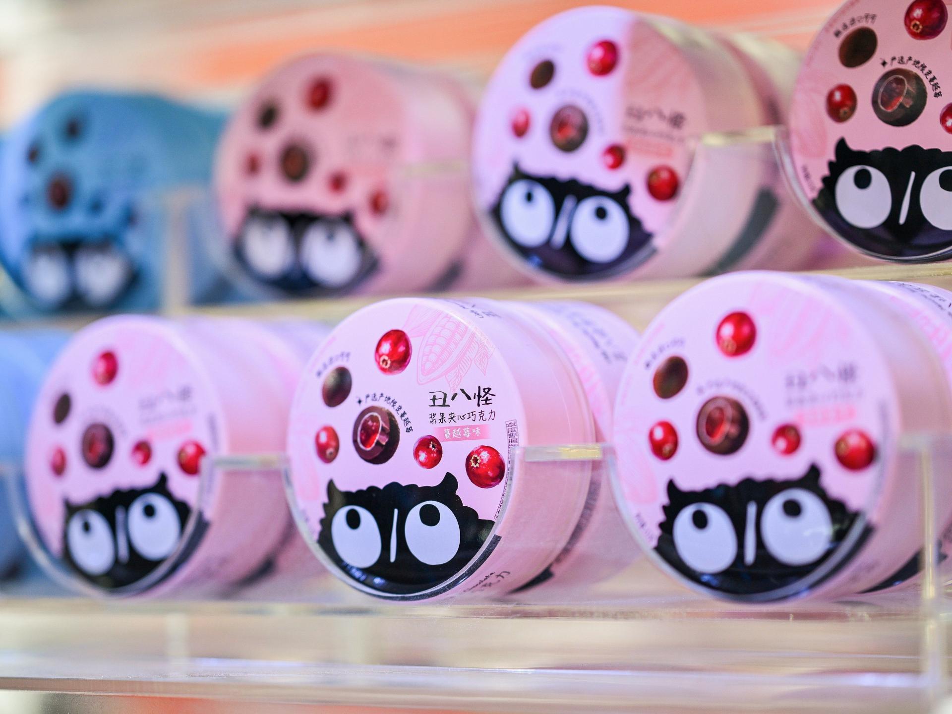
From a functional design perspective, the outer packaging adopts a clean and structured layout to establish a clear information hierarchy, with the product name and flavor prominently displayed for quick recognition on the shelf. The monster’s expressive gaze naturally directs attention toward the product image and key information, creating a playful visual connection with consumers. Real product images and ingredient illustrations are integrated into the negative space, building trust through a “what you see is what you get” experience. In addition, the packaging uses different colors for different series and flavors. The nut series adopts natural, understated tones to convey classic richness and premium quality, while the berry series uses vibrant blue and pink hues to represent different flavors and emphasize a fresh sweet-and-tart flavor. The design achieves a balance between aesthetic appeal and efficient product recognition.
Credits

Entrant
Design Action
Category
Interior Design - Educational
Entrant
SYC Architects
Category
Architectural Design - Industrial

Entrant
LANSONG DESIGN GROUP
Category
Landscape Design - Residential Landscape

Entrant
HUANG JUNXIN
Category
Interior Design - Stage