2023 | Professional
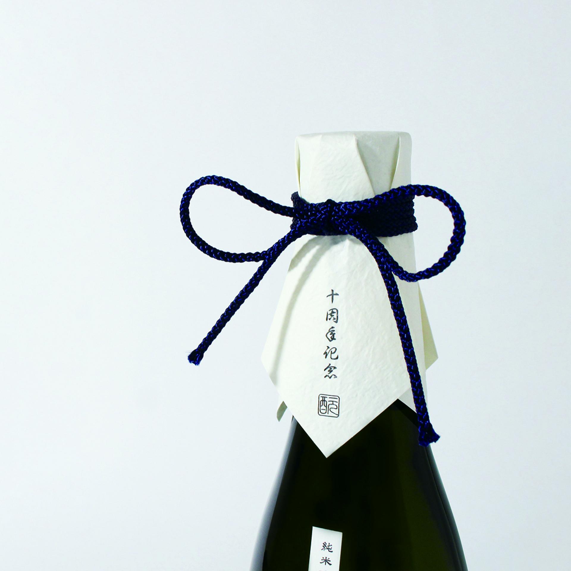
Moto Impression Japan 10th Anniversary Sake Bottle
Entrant
aizawa office Inc.
Category
Packaging Design - Wine, Beer & Liquor
Client's Name
MOTO IMPRESSION JAPAN
Country / Region
Japan
Gallery

About The Entry
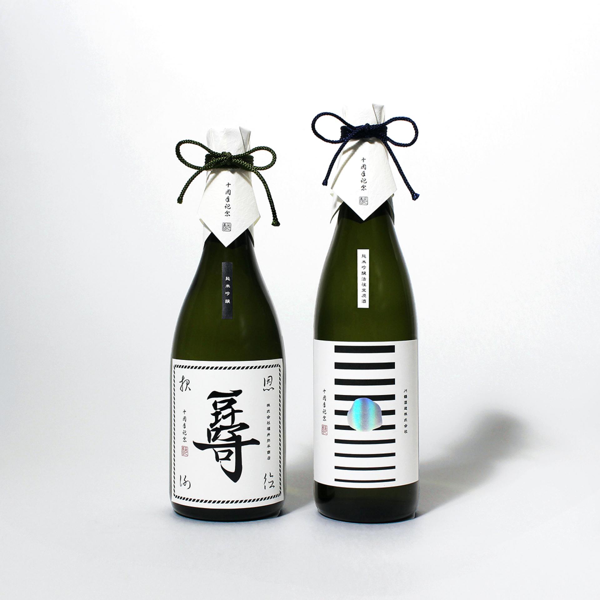
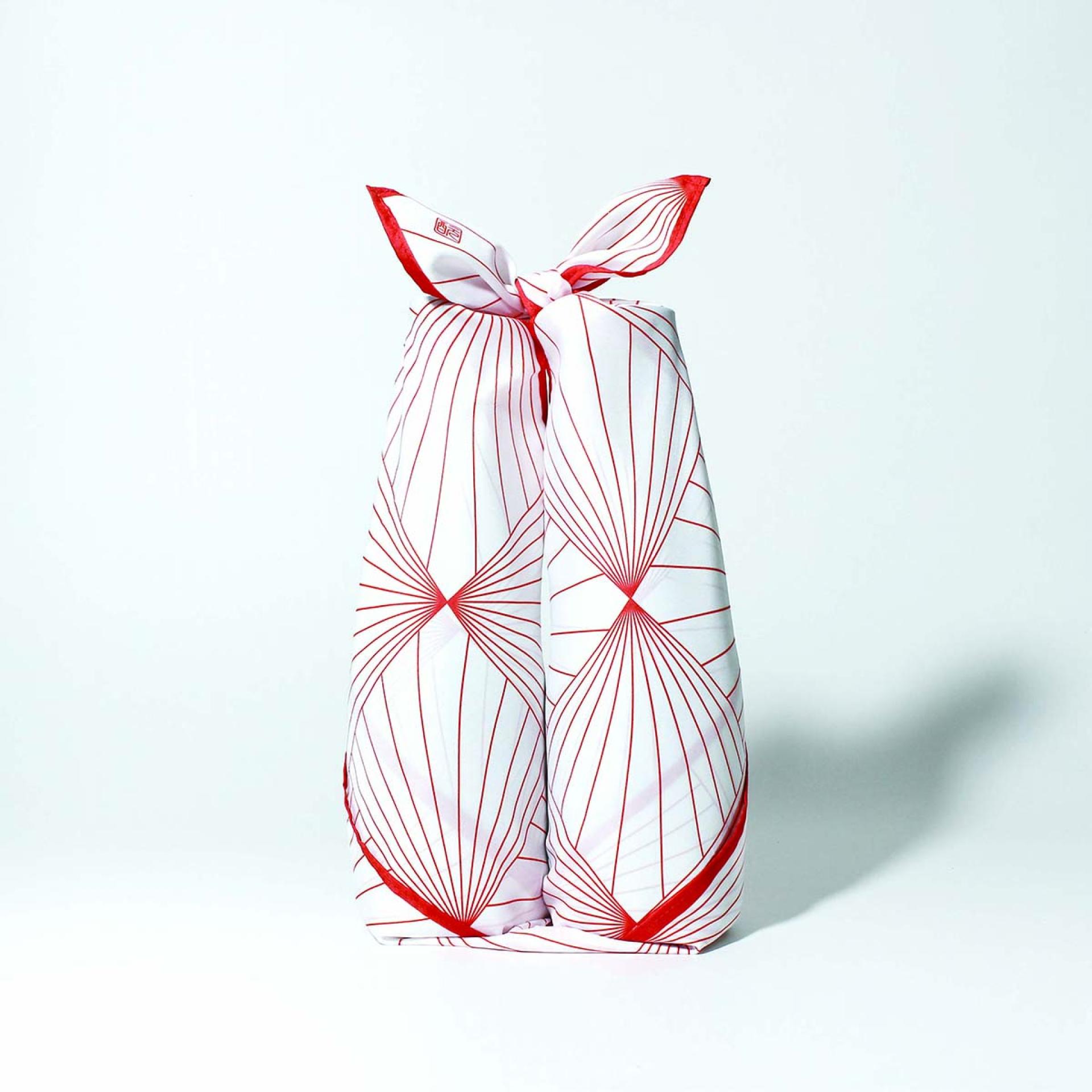
This is the 10th Anniversary Sake Bottle for the brand that conveys Japanese culture to customers through sake.
We attempted to create a neat and clean impression that is appropriate for the brand's spirit and sake.
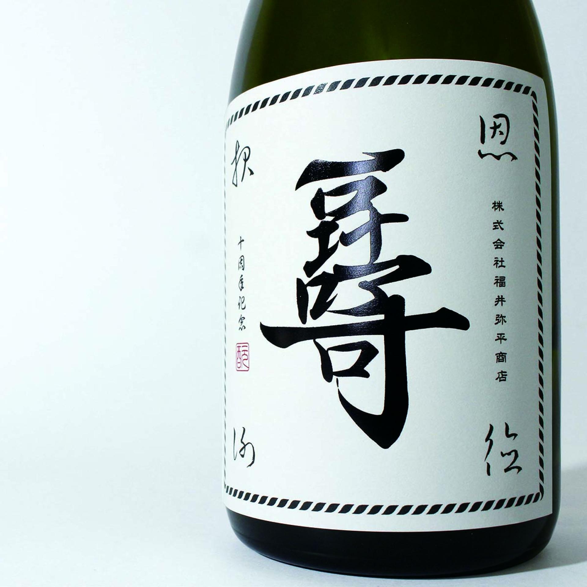
The letter in the center of the label looks like a single Chinese character, but it incorporates the English alphabet "10th moto" representing the 10th anniversary of the brand, taking into account the cultural nature of sake.
The kanji characters in the four corners are " Ho-on-sha-toku," meaning "gratitude, and are intended to express gratitude to the customers and those involved in the sake-making process. The rope border suggests the "bonds" with people through sake.
The other is a symbolic visualization of the ten years of accumulation in the form of ten lines.
The lines, which thicken from the bottom to the top, represent the brand's development and bonds.
The holographic foil stamping in the center is inspired by the North Star, which stands for "serve others with sincerity," meaning that the brand will continue to be a bright star, spreading sake to many people with sincerity.
Credits
Entrant
CadenceCo Creative Advisory
Category
Interior Design - Renovation
Entrant
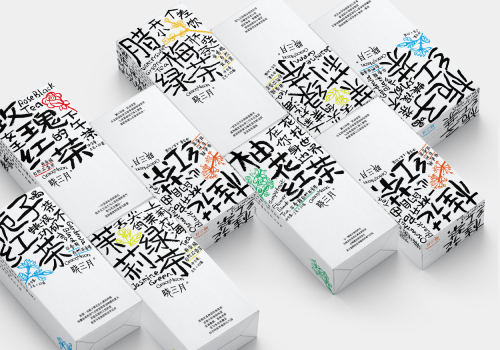
Beijing institute of graphic communication
Category
Packaging Design - Wine, Beer & Liquor
Entrant
Design Plus Design
Category
Interior Design - Flagship Store (NEW)
Entrant
DesignOut Lab.
Category
Packaging Design - Promotional