2024 | Professional
Easeye brand and packaging upgrade
Entrant
BYHEALTH Co., Ltd.
Category
Packaging Design - Health & Wellness
Client's Name
BYHEALTH Co., Ltd.
Country / Region
China
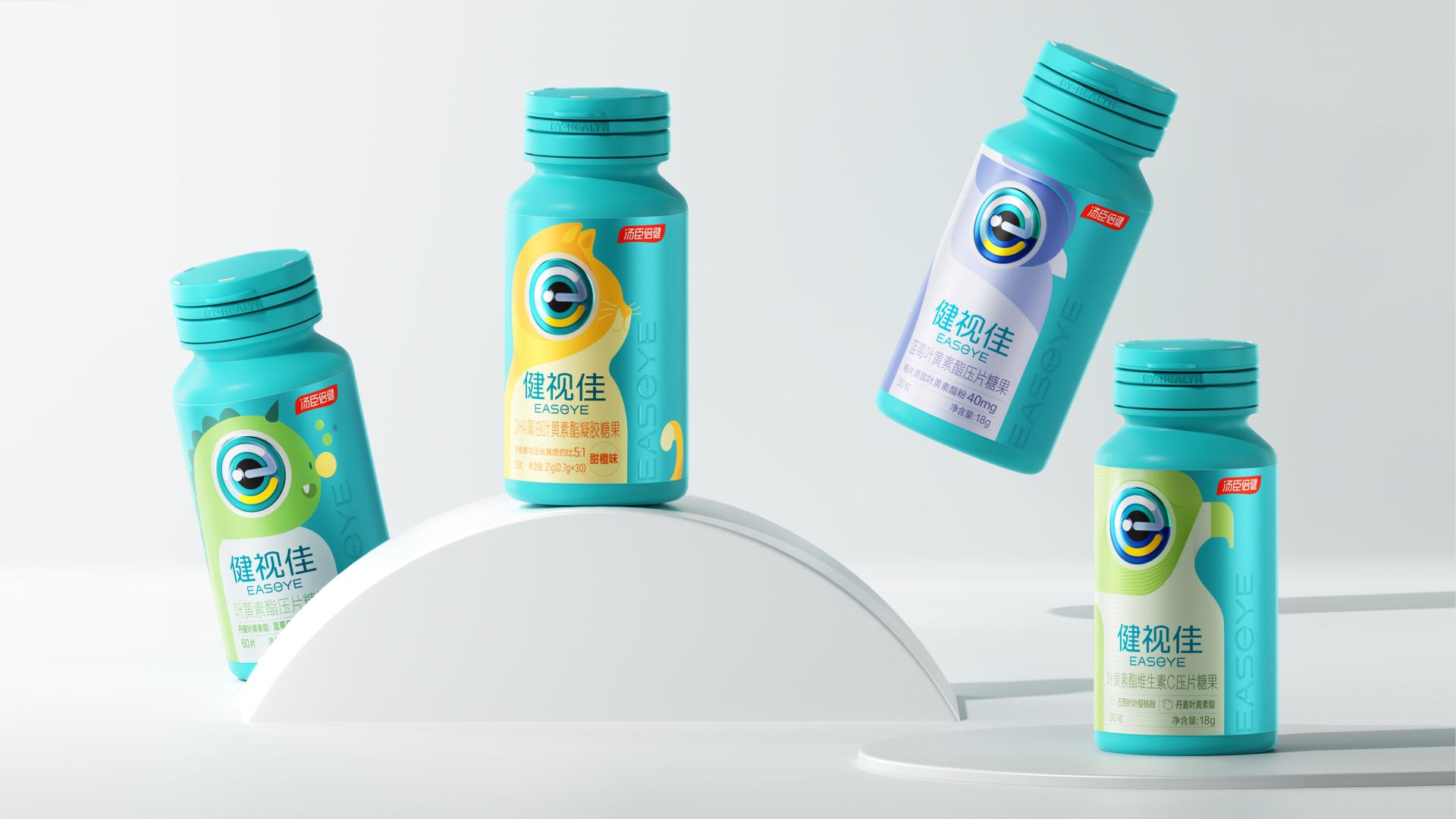
This is a brand and packaging upgrade from eye health and nutrition brand Easeye.
Easeye is a brand focused on eye health and nutrition. In this brand upgrade, we took the letter "e" in the brand name Easeye, as the core visual element to create a unique brand graphics,which look like smart big eyes. This graphic will be flexibly applied to all Easeye product packaging and different media to make the packaging vision of each product more orderly and help consumers better understand the brand. Among them, professional dietary supplement products use strict eye patterns, and the design style requires more professional. The packaging of ordinary food uses a variety of animals with excellent vision as the core pattern, such as the packaging of ordinary food customized for children uses a cute kitten pattern, the packaging clearly expresses the product function, and the design style is relatively young and fashionable, and is favoured by consumers. The eye-ball pattern adopts a variety of special printing processes, which is vivid and three-dimensional, and is very attractive, effectively strengthening the consumer's understanding of the product. .In addition, Easeye's packaging uses environmentally friendly materials and printing inks certified by SGS, which is conducive to the sustainable development of the planet.


Credits
Entrant
Hangzhou Zhiyuan Research Institute Co., Ltd
Category
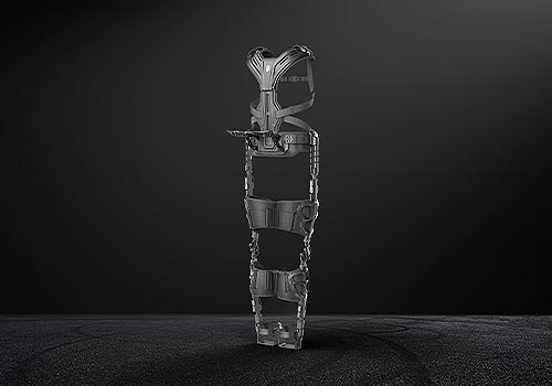
Product Design - Wearable Technologies

Entrant
Crydit Inc
Category
Packaging Design - Other Packaging Design
Entrant
Playkids
Category
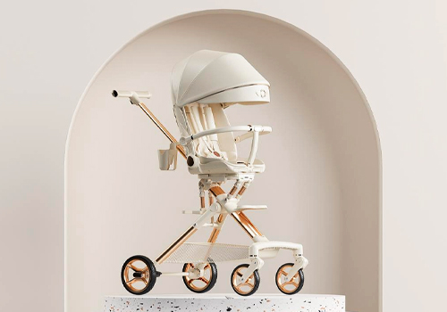
Product Design - Baby, Kids & Children Products
Entrant
Xiao Lin Ou
Category
Interior Design - Showroom / Exhibit