2024 | Professional
EASTROC Shang Cha Tea Series
Entrant
EASTROC BEVERAGE GROUP CO.,LTD.
Category
Packaging Design - Non-Alcoholic Beverages
Client's Name
JIANG WEIWEI, ZHUANG WEIQIANG
Country / Region
China
"Good tea for friends" is the true portrayal of the creative concept behind EASTROC Shang Cha Tea Series. The series brings a touch of Eastern tranquility and elegance in the bustling city, offering each consumer friend with a selection of healthy, sugar-free teas including Oolong Shangcha, Jasmine Shangcha, and Pu'er Shangcha. The phrase "Shang Tea" in the product name signifies "fine tea", serving as the epitome of the brand's pursuit of excellence in quality.
This series utilizes packaging design as a medium to concretely embody the essence of tea culture from top to bottom. The design intends to use Wei-style calligraphy to write the product names, with thick strokes and tight structures, portraying the rich taste and profound aroma of the tea. The abstract lines delineate the tea district on the northern Fujian mountains, faithfully recreating the scenario of "tea within the mountains". Visually connected to the lower part of the bottle, which looks like a vertical lined tea cups, it seems as if the "color of the mountains and tea flavor" have been infused into the cup, perfectly aligning with the concept of tea culture that seeks to merge the beauty of nature and the spiritual essence of the earth into a single cup.
This design, rooted in Chinese minimalism, pursuits technological innovation: a 72% extreme shrinkage rate makes the labels tight to the bottle, showcasing the pursuit of perfection in detail; meticulous craftsmanships guarantee a light-blocking rate of over 90%, with a texture rivaling that of white paper. Extensive whitespace exudes a rich cultural resonance. Each tea drink employs proprietary color schemes, embodying the fragrant Oolong tea, the graceful Jasmine tea and the rich flavor of Pu'er. This not only creates an immersive visual feast but also tantalizes the taste buds with its utmost allure. The semi-transparent bottle cleverly reveals the true colors of the tea, ensuring “what you see is what you drink”, instilling consumers with the utmost trust and reassurance.
Each selection features premium tea leaves paired with unique sugar-free formula, preserving the essence of tea while meeting modern health standards.


Credits

Entrant
Sichuan Wangjiadu Food Co., Ltd.
Category
Packaging Design - Dairy, Spices, Oils, Sauces & Condiments

Entrant
China Southwest Architectural Design and Research Institute Corp.Ltd
Category
Architectural Design - Public Spaces

Entrant
Her Guang Interior Design Co.,Ltd.
Category
Interior Design - Residential
Entrant
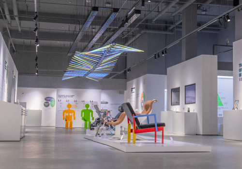
M&Partner
Category
Interior Design - Showroom / Exhibit