2025 | Professional

PMPM Exploration Series
Entrant
SHIN GROUP
Category
Packaging Design - Beauty & Personal Care
Client's Name
PMPM
Country / Region
China
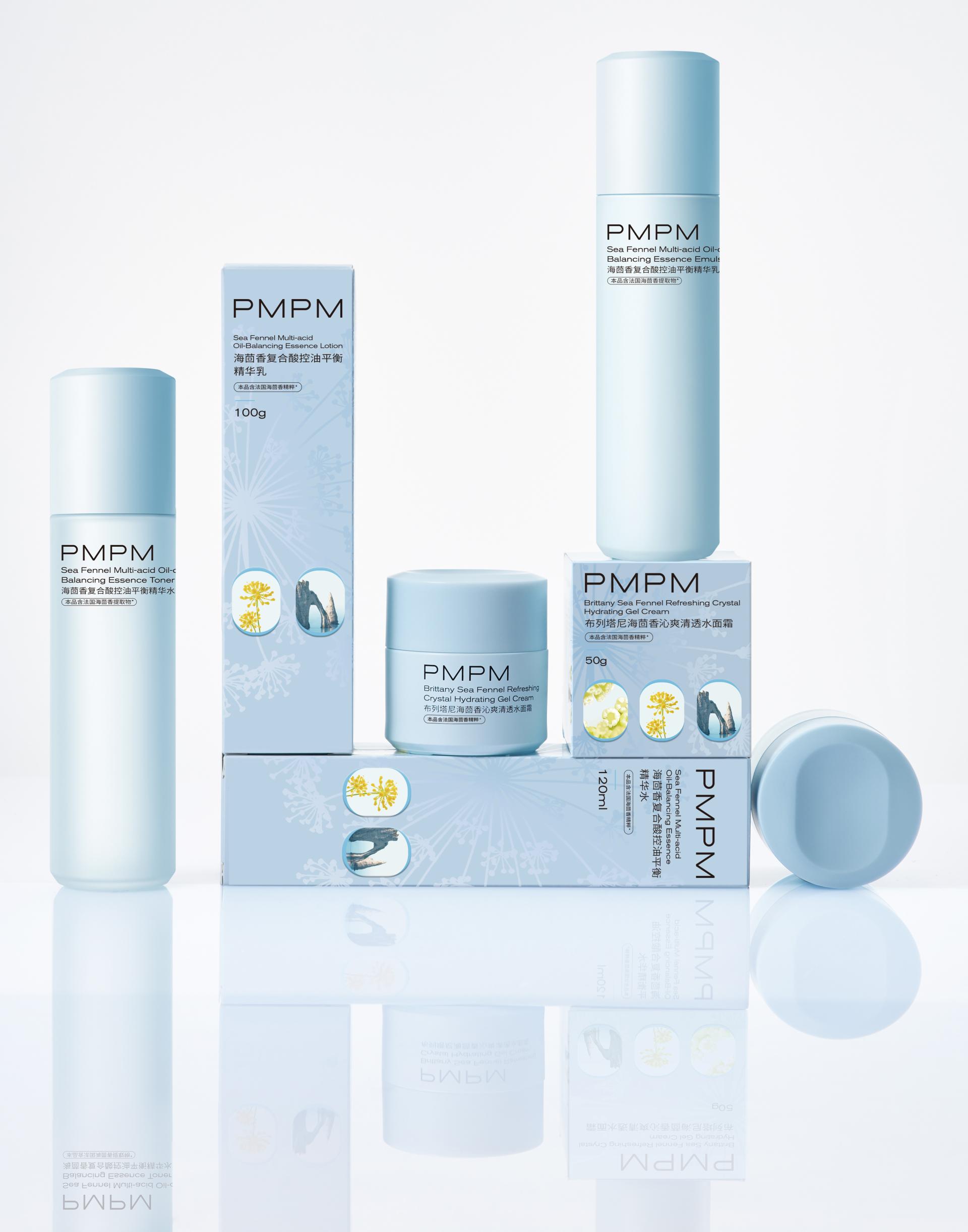
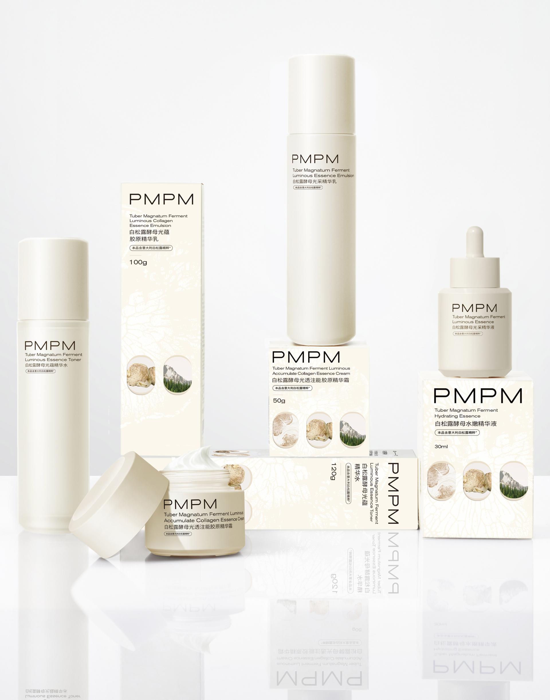
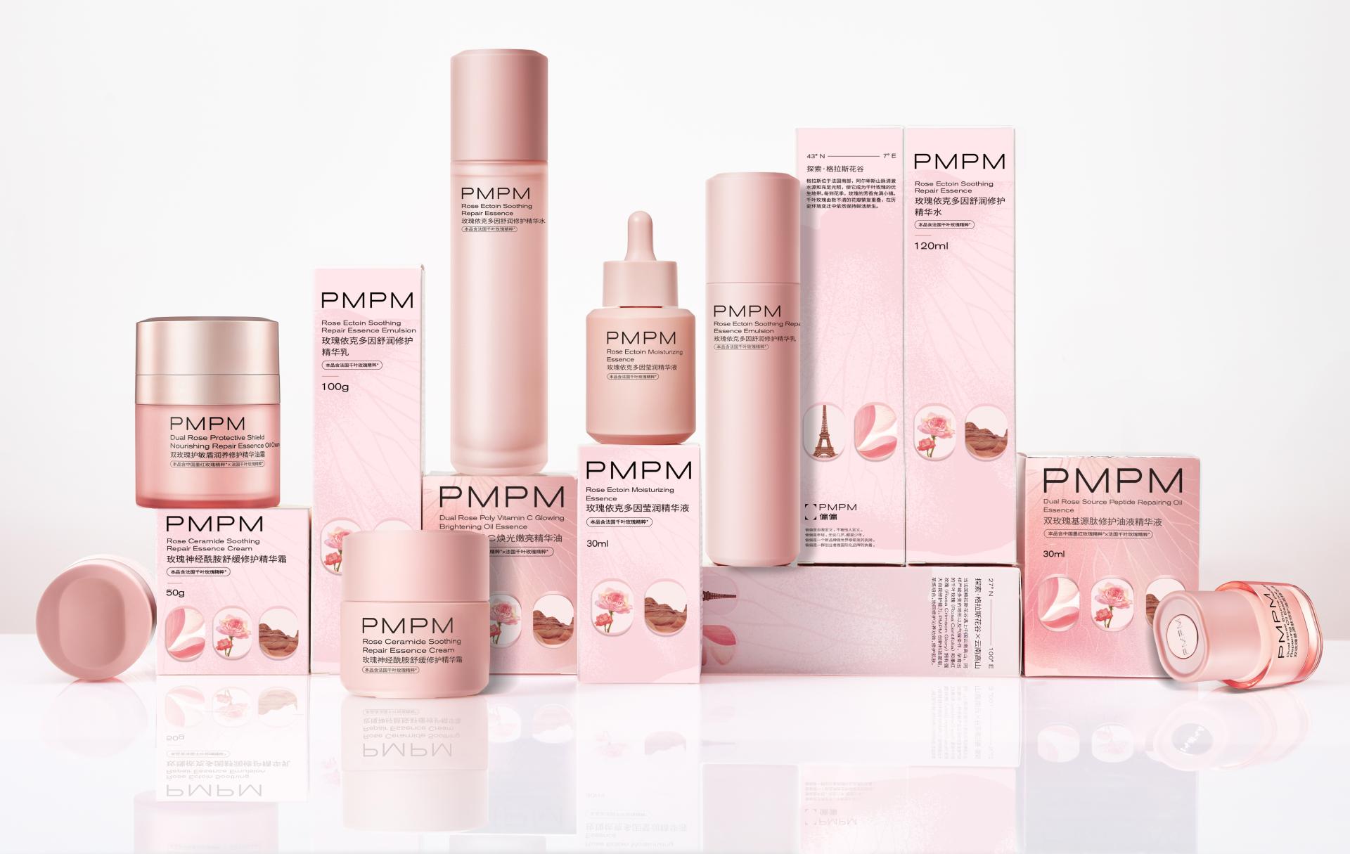
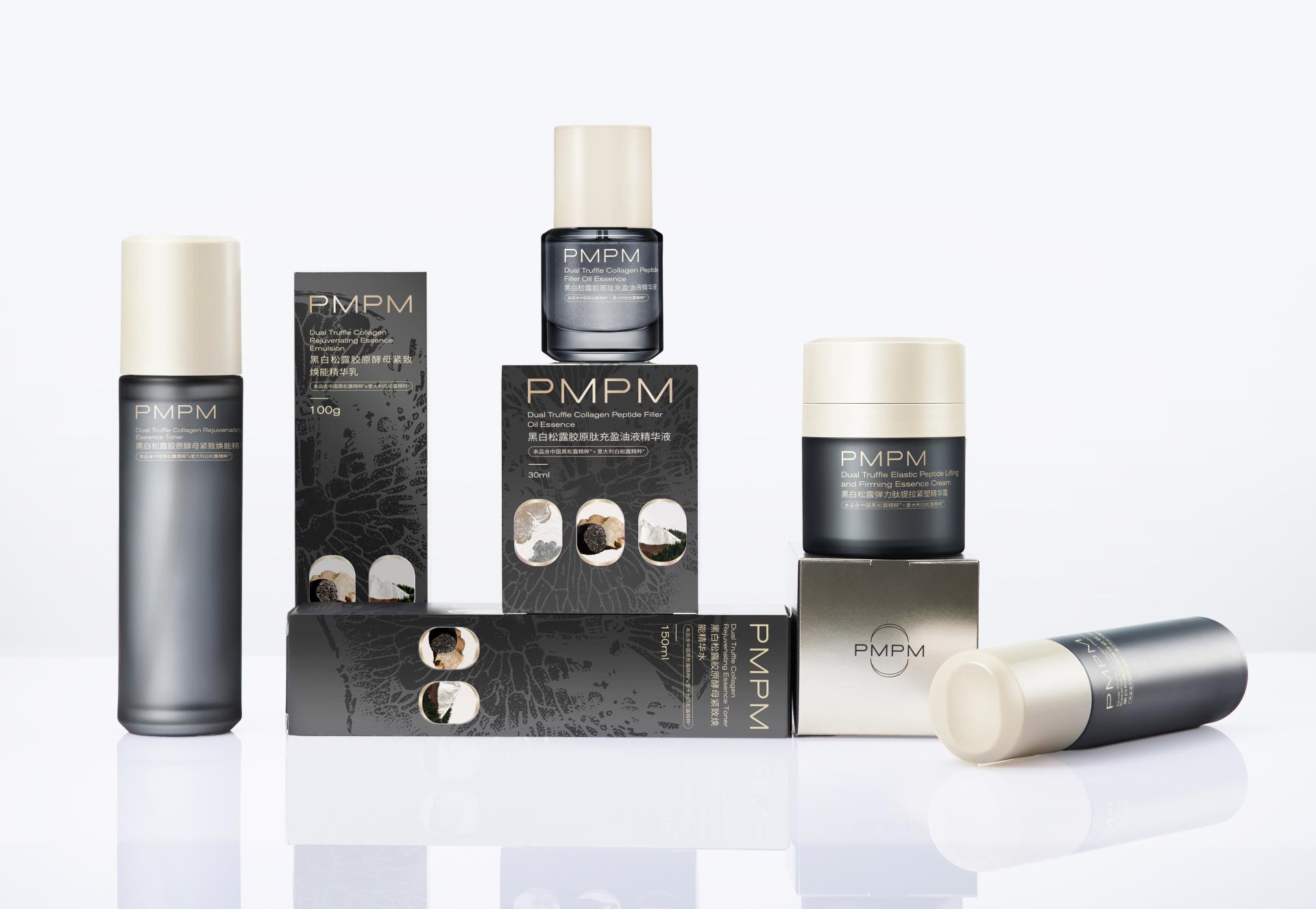
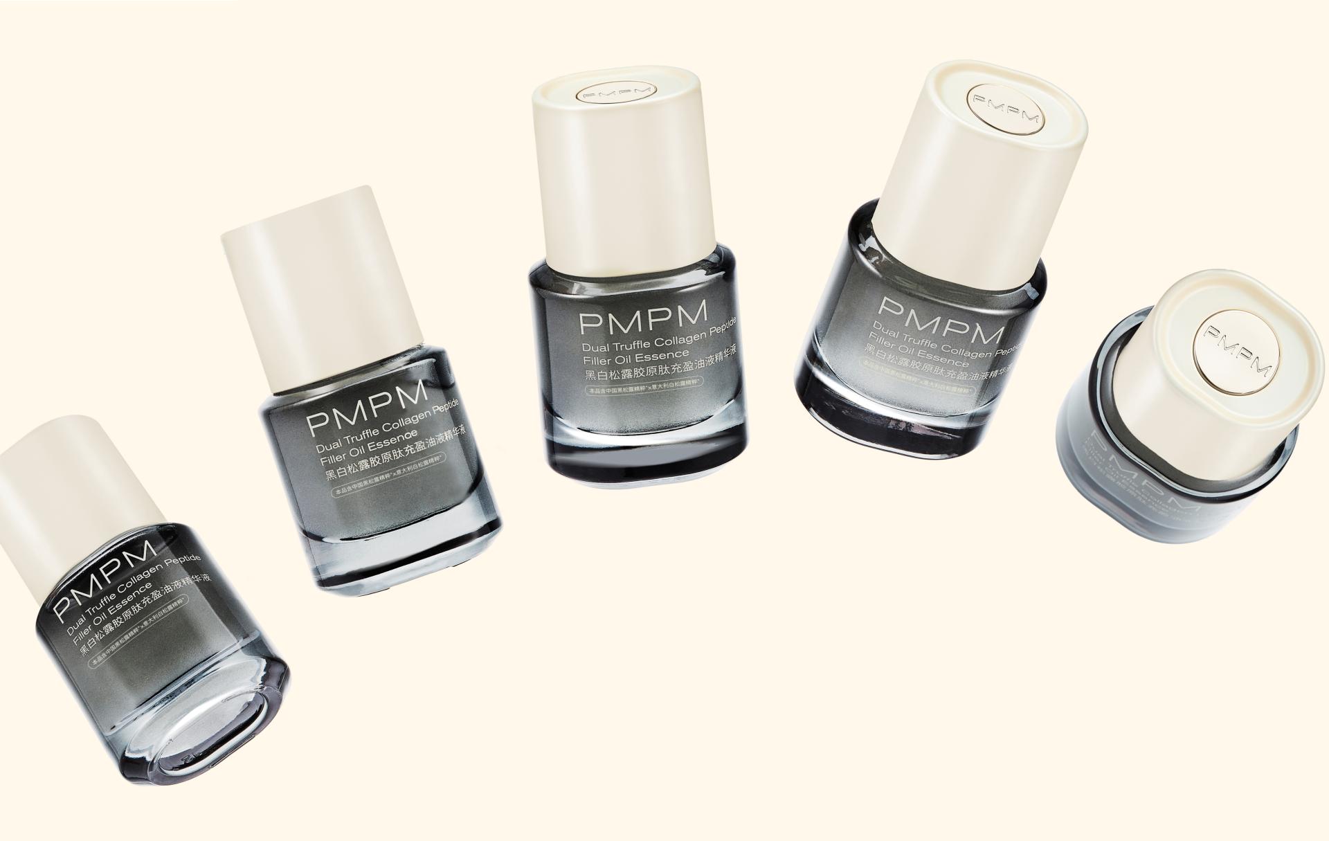
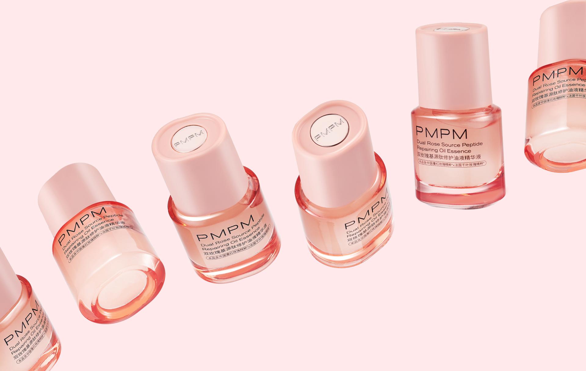
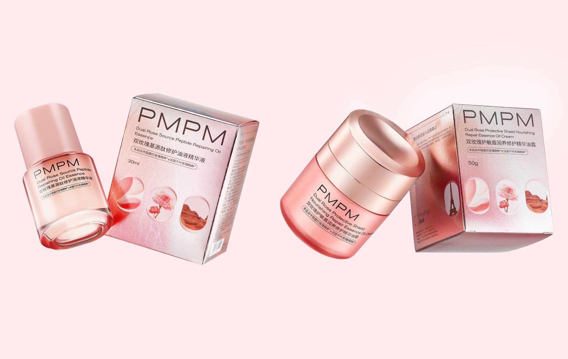
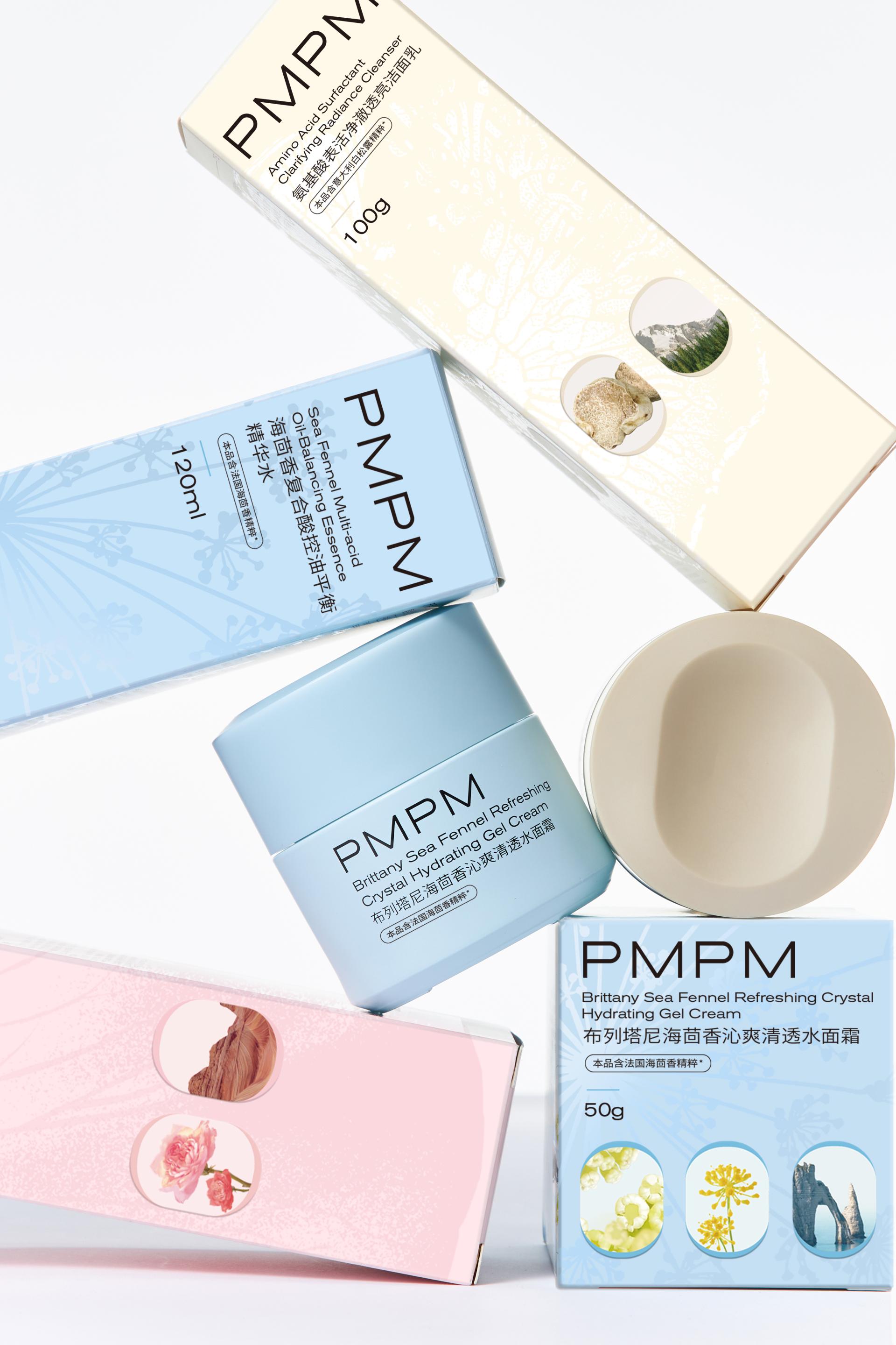
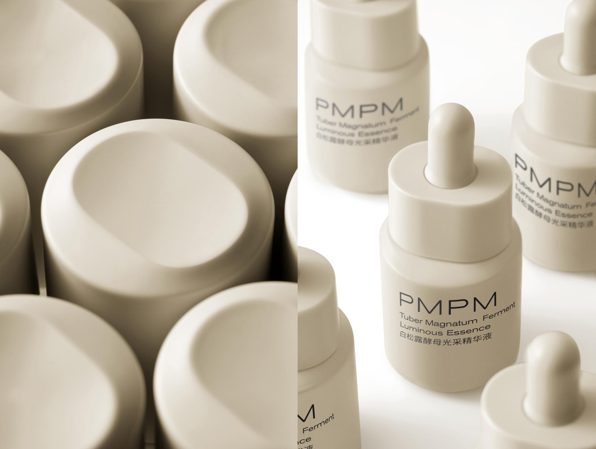
PMPM, a skincare brand embodying the spirit of a “Global Explorer,” strives to be a “window to the world” for consumers. This philosophy is reflected in its unique cultural attributes in the packaging design, where the “window” visual motif—from bottle caps to vessels—anchors the brand’s narrative. More creatively, the outer boxes feature layered windows to show the origins (local landmarks and natural scenery) and core ingredients of the products, inviting consumers on an exploratory journey across the globe. Such design also highlights the brand’s unremitting pursuit and innovative application of rare, premium ingredients from around the world. Each product series is matched with a special color palette to its specific function:
The Dual Truffle Series features deep gray and gold to emphasize its luxury anti-aging efficacy;
the White Truffle Series, designed in warm beige, suggests gentle yet potent skin revitalization;
the Rose Series adopts romantic pale pink to evoke efficient skin renewal;
the Sea Fennel Series takes fresh light blue as the main color to convey soothing effects and oil-control.
Moreover, sustainability is woven into the design ethos: FSC-certified recyclable paper and glue-free, tear-open airplane cartons minimize environmental impact. Paired with complimentary travel-themed postcards and magnetic souvenirs, the packaging transforms into a tactile keepsake—a miniature world delivered to the doorstep—that deepens the bond between global exploration and daily skincare rituals.
Credits

Entrant
SCAD Museum of Art
Category
Interior Design - Showroom / Exhibit
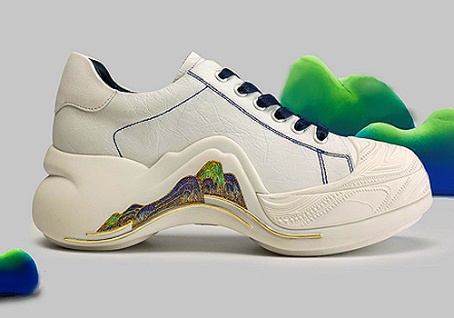
Entrant
Wu Jun
Category
Fashion Design - Footwear
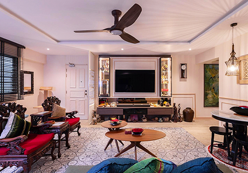
Entrant
AR-kee Design Studio Pte Ltd
Category
Interior Design - Living Spaces

Entrant
Communication University of China
Category
Product Design - Healthcare