2022 | Professional

Van Sha
Entrant
Cowan
Category
Packaging Design - Non-Alcoholic Beverages
Client's Name
Van Sha
Country / Region
United Kingdom
In the rapidly growing category of Non-Alcoholic Spirits, VAN SHA launched their inaugural product, a dark aromatic spiced non-alcoholic spirit with a difference. Batch distilled with exquisite spices of India, VAN SHA offers a uniquely complex and layered taste experience.
Founder Sharan Bal decided as a non-drinker, she could use her knowledge and understanding of how spirits are distilled to create an intriguing non-alcoholic spirit versus the gin alternatives she had tasted to date. A spirit that would give people a greater and deeper flavor experience, whatever it was mixed with.
Three years of research and 27 attempts later, VAN SHA was born. Sharan wanted to capture the bold and vivid flavors of India and began experimenting with different ingredients. Scouring vibrant spice markets and exploring the rich Indian countryside, Sharan eventually found the ingredients she needed. Neroli, Galangal and Saffron give VAN SHA its distinctive taste, deep red color and long, layered finish.
As a disruptor into the market of Non-Alcoholic Spirits and a creation built out of the founder’s passion, the brand identity and packaging of VAN SHA had to reflect the boldness of the product.
Originally a family of farmers, Sharan’s relatives in India are famous for growing botanicals including fruit, vegetables, herbs and spices for generations. This story plays a key role within the brand world and the design of the imagery on the bottle is an interpretation of the family grove. This creates a sense of origin and place behind the brand, the crocus flower representing saffron, neroli blossom flowers, chillis and spices. The lioness, birds and reptiles can be discovered, bringing life and energy to the spirit of the VAN SHA grove.
The beautiful ruby red bottle is intended to reflect the aromatic, spiced profile of the drink as well as a nod towards one of the key ingredients, Saffron, capturing its richness and depth. By contrast, the label is exquisitely simple, with elegant typography, textured paper and golf foil, reflecting the craft, quality and precision used to create VAN SHA.


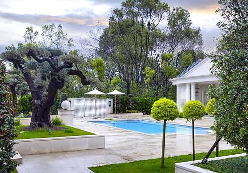
Entrant
Hangzhou CIOUDSUN Garden Design engineering Co., LTD
Category
Landscape Design - Residential Landscape

Entrant
line+
Category
Architectural Design - Residential
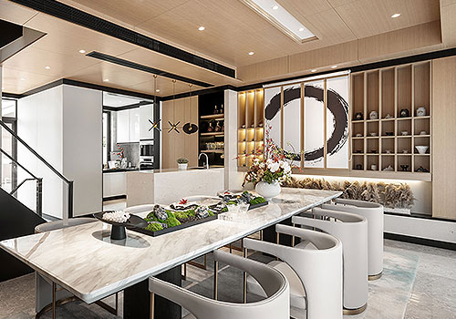
Entrant
SHANGHAI G&E DESIGN CO.,LTD
Category
Interior Design - Residential
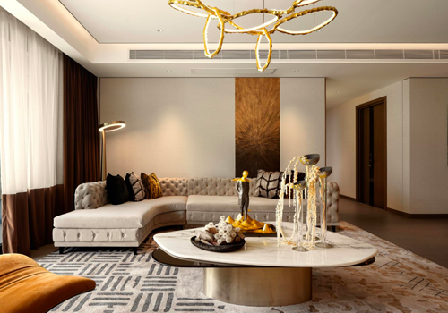
Entrant
A.RK Interior Design Pte Ltd
Category
Interior Design - Residential